You finally did it. You sat under the little cape, faced the mysterious stack of fabric swatches, and discovered whether you are a Spring, Summer, Autumn, Winter, or one of the many delightfully specific subcategories that sound like they belong on a candle label. Now you know which colors make you look fresh, polished, and alive. Fantastic. But here comes the decorating question: can your personal color palette work in your home?
The answer is yeswith one tiny warning label. Your home is not your face. A lipstick shade that makes you glow may not need to cover all four living room walls unless you want your guests to feel like they have stepped inside a cranberry. Still, personal color analysis can be an incredibly helpful starting point for building a home color palette that feels natural, cohesive, and emotionally “you.”
This guide will show you how to translate your best colors into paint, furniture, textiles, lighting, art, and accents without turning your house into a giant walk-in closet. We will use practical interior design ideas, color theory, undertones, the 60-30-10 rule, and real-life examples to help you decorate with confidence.
What Does “Getting Your Colors Done” Mean for Home Design?
Personal color analysis usually identifies the color family that works best with your natural coloring. Most systems organize colors by temperature, depth, clarity, and contrast. In simple terms, some people shine in warm, bright shades; others look best in cool, soft, deep, or high-contrast palettes.
In home design, those same ideas still matter, but the goal changes. Instead of asking, “Does this blue flatter me?” ask, “Does this blue create the mood I want in this room?” Your seasonal color palette can become a design compass. It gives you a curated group of colors that already feels familiar and personal, which is extremely useful when you are standing in front of 1,437 paint chips pretending you are “just browsing.” We have all been there. The paint wall is a trap with fluorescent lighting.
Start With Your Season, Then Translate It for Interiors
Each color season has a recognizable mood. You do not have to follow it like a law, but it can guide your decisions when choosing wall colors, upholstery, rugs, curtains, and decor.
Spring Palettes: Fresh, Warm, and Cheerful
Spring palettes usually include clear, warm, lively colors such as peach, coral, butter yellow, aqua, grass green, warm ivory, and light camel. In a home, Spring colors work beautifully in breakfast nooks, kitchens, sunrooms, children’s spaces, guest rooms, and any room that needs a friendly little wink.
For walls, try warm white, soft cream, pale peach, or a fresh green-blue. For accents, bring in coral pillows, yellow ceramic lamps, light oak furniture, botanical prints, and woven textures. The trick is to keep the room airy. Spring color schemes can become candy-shop sweet if every piece is bright, so balance them with natural wood, linen, rattan, and simple shapes.
Summer Palettes: Soft, Cool, and Calm
Summer palettes often include muted, cool, gentle colors such as dusty blue, lavender, rose, sage, soft gray, powder pink, and cool taupe. These colors are excellent for bedrooms, bathrooms, reading corners, and living rooms where the goal is “peaceful adult” rather than “laundry explosion with seating.”
Use cool whites, misty blues, gray-greens, and soft mauves as your foundation. Add texture through velvet, brushed cotton, pale wood, silver-toned metals, and matte ceramics. Summer interiors tend to look best when contrast stays low. Instead of black, consider charcoal, slate, pewter, or deep navy for grounding details.
Autumn Palettes: Warm, Earthy, and Cozy
Autumn palettes are rich, grounded, and warm. Think olive green, terracotta, mustard, camel, rust, chocolate brown, warm cream, paprika, deep teal, and golden beige. These colors are made for cozy living rooms, dining rooms, libraries, entryways, and kitchens with personality.
Autumn-inspired interiors love texture. Leather, aged brass, walnut, clay pottery, nubby wool, woven baskets, linen, and vintage wood all fit naturally. If your personal palette is Autumn, you may find that your home feels best when it has warmth and depth instead of crisp minimalism. You are probably not here for an all-white room with one lonely chair and a bowl of decorative stones. You want a room that looks like it knows how to make soup.
Winter Palettes: Crisp, Dramatic, and High-Contrast
Winter palettes usually include high-contrast, cool, vivid colors such as black, white, navy, emerald, sapphire, ruby, icy pink, charcoal, fuchsia, and true red. In interiors, Winter colors can look elegant, modern, and bold when used with intention.
Try crisp white walls with black window frames, navy built-ins, jewel-toned velvet chairs, chrome finishes, graphic artwork, or a dramatic emerald powder room. Winter palettes thrive on contrast, but they still need softness. Add rugs, drapery, upholstery, books, plants, and layered lighting so the room feels designed, not like a very stylish airport lounge.
Use Your Palette as Inspiration, Not a Decorating Prison
Your color season is a tool, not a tiny boss wearing a paint-splattered blazer. You do not have to ban every color outside your palette. Homes need flexibility. A person can look wonderful in cool blues and still love a warm wood dining table. A warm Autumn can absolutely own a navy sofa. The goal is not to match every item perfectly. The goal is to create harmony.
Instead of copying your wardrobe palette directly, translate its qualities. Is your palette warm or cool? Light or deep? Soft or bright? Low contrast or high contrast? Those qualities matter more than exact color names. A Soft Summer home may use gentle, gray-based colors. A Bright Spring home may use clearer hues with warm whites. A Deep Winter home may use contrast, shine, and saturated accents. A True Autumn home may lean into earthy warmth and natural materials.
Apply the 60-30-10 Rule to Your Personal Color Palette
The 60-30-10 rule is a classic interior design guideline that helps a room feel balanced. It works especially well when you are bringing personal colors into a space because it prevents your favorite accent shade from taking over like it pays the mortgage.
60 Percent: Your Main Color
This is usually the color of walls, large rugs, major upholstery, or large surfaces. For most homes, the 60 percent color works best as a neutral or gentle version of your palette. A Spring palette might use warm ivory. A Summer palette might use soft gray-blue. An Autumn palette might use oatmeal, camel, or warm taupe. A Winter palette might use crisp white, cool gray, or deep navy in a dramatic room.
30 Percent: Your Supporting Color
This color appears in curtains, accent chairs, cabinets, bedding, rugs, or secondary furniture. It should have more personality than your main color but still feel livable. Examples include sage green for Summer, olive for Autumn, aqua for Spring, or charcoal for Winter.
10 Percent: Your Accent Color
This is where you can have fun. Use your strongest personal colors in smaller doses: throw pillows, vases, lampshades, artwork, books, flowers, trays, and decorative objects. Coral, ruby, mustard, lavender, emerald, or cobalt can look fabulous when they are sprinkled in like seasoning. Nobody wants to eat a spoonful of paprika, but a little makes the dish sing.
Pay Attention to Undertones Before Buying Paint
Undertones are the sneaky background colors inside a paint, fabric, tile, or wood finish. A white paint can lean yellow, pink, blue, gray, or green. Beige can look warm and creamy in one room but oddly pink in another. Gray can feel calm, cold, blue, green, or muddy depending on the light and nearby finishes.
This matters because your personal color palette is usually built around undertones. Warm palettes tend to look better with cream, camel, golden wood, brass, terracotta, and olive. Cool palettes often work better with crisp white, gray, silver, blue, plum, and cool green. Mixing undertones can work, but it needs intention. If your walls are cool gray and your sofa is warm beige, the room may feel slightly “off,” like two people at the same party having completely different conversations.
Consider Lighting Before You Commit
Light changes everything. A paint color that looked perfect on a tiny card can look completely different on a wall. North-facing rooms often feel cooler and dimmer, so warm neutrals can help balance them. South-facing rooms usually get stronger, warmer light, which can intensify color. East-facing rooms may look bright in the morning and cooler later in the day. West-facing rooms can become warm and golden in the afternoon.
Before painting, test large swatches on multiple walls. Look at them in morning light, afternoon light, evening light, and artificial light. Also compare the color beside your flooring, trim, countertop, and furniture. Paint does not live alone. It has roommates, and some of them are bossy.
Choose the Right Colors for the Right Rooms
Your personal palette can guide the mood of each room, but function still matters. A bright, energizing color may be perfect in a mudroom or home office but too stimulating for a bedroom. A deep, cozy color may feel luxurious in a dining room but heavy in a tiny hallway with poor lighting.
Living Room
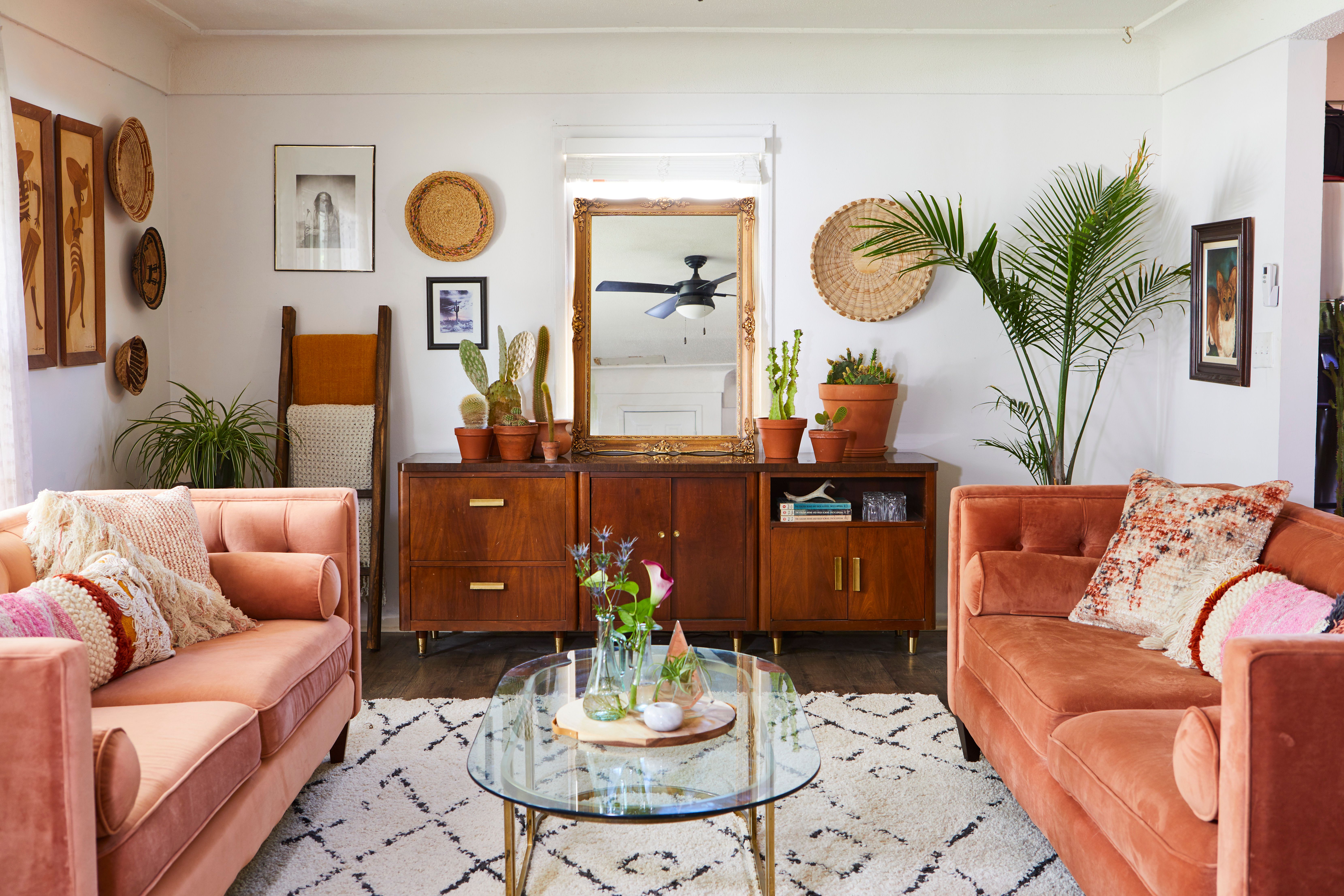
The living room usually needs comfort, flexibility, and personality. Use your palette in layered ways: a neutral wall color, a sofa in a forgiving shade, curtains that connect the room, and accents that show your personal colors. A Summer palette might include soft blue-gray walls, a cream sofa, sage pillows, and rose-toned art. An Autumn palette might include warm taupe walls, a caramel leather chair, olive curtains, and rust textiles.
Bedroom
Bedrooms often benefit from softer colors. Even if your palette includes bold shades, consider using quieter versions near the bed. A Winter palette can use navy, icy blue, crisp white, or charcoal instead of bright red on every wall. A Spring palette can use warm white, peach, and pale aqua instead of neon coral. The goal is rest, not a visual marching band.
Kitchen
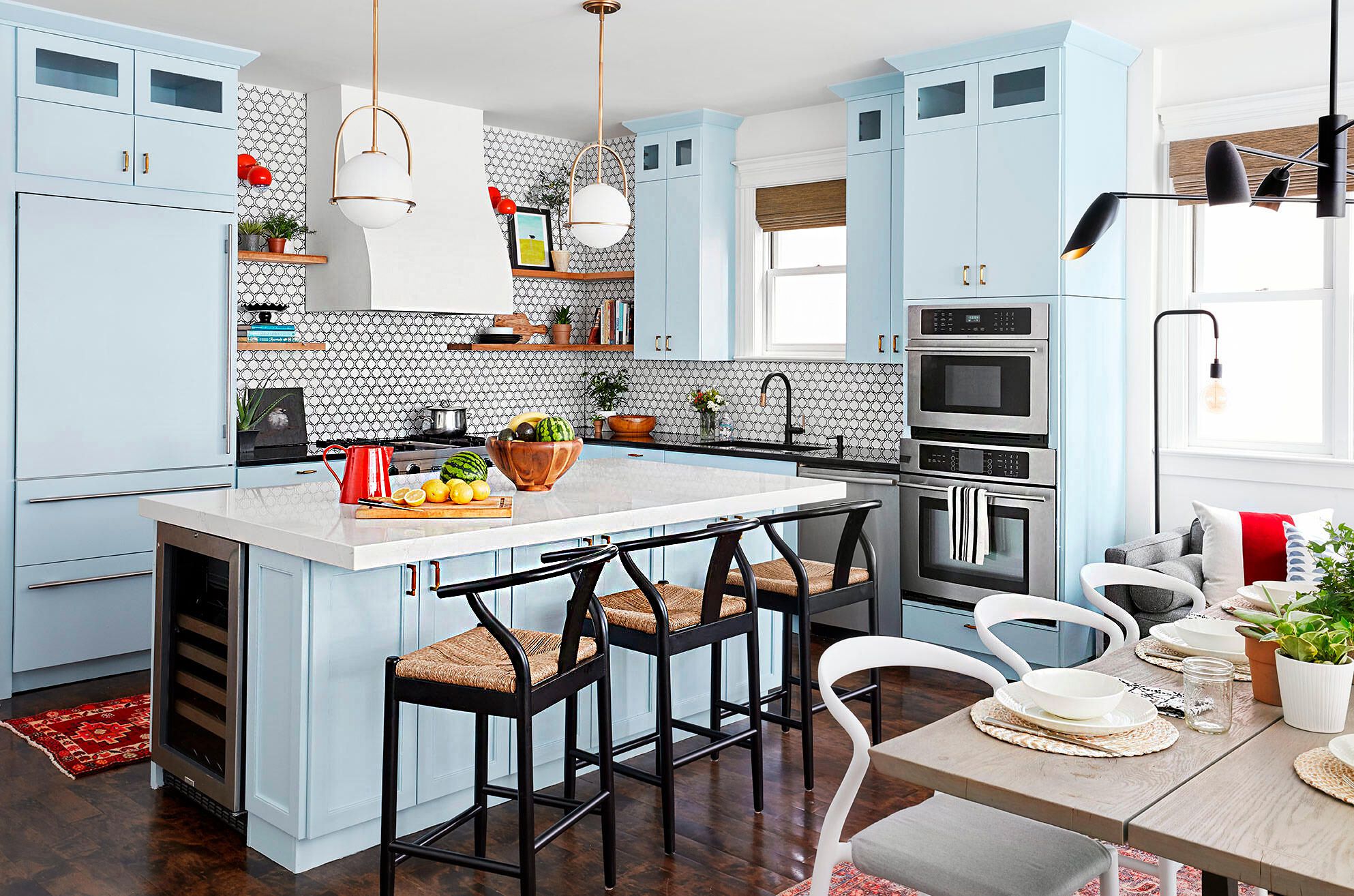
Kitchens are excellent places to use palette-based color through cabinets, tile, stools, dishware, runners, and hardware. Warm seasons may love cream cabinets, butcher block, brass, terracotta tile, or sage green. Cool seasons may prefer white cabinets, blue-gray tile, polished nickel, navy islands, or marble-inspired surfaces.
Bathroom
Bathrooms can handle slightly bolder color because they are smaller and separate from main living spaces. Try a jewel-toned powder room for a Winter palette, dusty blue tile for Summer, peachy plaster for Spring, or olive walls with brass accents for Autumn. A small room is often the perfect place to experiment without making your entire home file a complaint.
Use Textiles to Test Your Palette First
If you are nervous about paint, start with textiles. Curtains, bedding, pillows, throws, slipcovers, table linens, and rugs let you explore your colors without a weekend of taping trim and questioning your life choices. Textiles also soften color. A mustard velvet pillow feels different from mustard paint. A navy rug feels different from navy cabinets. A lavender throw can be graceful, while lavender walls may be too sweet for your taste.
Textiles also make seasonal updates easy. If your home base is neutral, you can rotate accent colors throughout the year while staying within your personal palette. Spring types might bring in coral and aqua in warmer months. Autumn types may deepen the room with rust and olive in fall. Winter types can use emerald, ruby, or icy metallics for a polished holiday look without buying decor that screams “seasonal aisle, emergency purchase.”
Let Existing Finishes Have a Vote
Your home already has a palette, whether you chose it or inherited it from a previous owner with a deep emotional commitment to orange oak. Floors, countertops, cabinets, tile, brick, stone, and trim all influence what colors will work.
If your fixed finishes are warm, such as honey oak floors or beige tile, warm palettes may blend easily. If your finishes are cool, such as gray stone or white marble, cool palettes may feel more natural. If your personal palette conflicts with your home’s fixed elements, bridge the gap. For example, a cool Summer who lives with warm wood floors can use soft green, warm gray, muted teal, or dusty rose to connect both worlds. A warm Autumn with cool gray tile can add walnut, brass, cream textiles, and olive accents to reduce the chill.
Create Flow From Room to Room
A cohesive home does not mean every room must match. It means the rooms should feel related, like members of the same familynot identical twins wearing matching sweaters. Choose a whole-home foundation color, then vary your secondary and accent colors by room.
For example, a Soft Summer home might use cool white trim throughout, pale gray walls in hallways, blue-green in the bedroom, dusty rose in the guest room, and slate accents in the living room. A True Autumn home might use warm cream trim, camel walls, olive cabinetry, rust textiles, and dark wood furniture. Repeating materials, metals, and undertones will make the home feel intentional.
Do Not Forget Texture, Pattern, and Finish
Color is not only about hue. Texture changes how color feels. A glossy emerald tile looks bold and glamorous. An emerald velvet pillow looks plush and cozy. An emerald linen curtain looks relaxed. The same color can behave like three different guests depending on the material.
Pattern also helps your personal colors feel collected rather than overly matched. Use florals, stripes, plaids, block prints, abstract art, or patterned rugs to combine several palette colors at once. Finish matters too. Cool palettes often pair beautifully with chrome, polished nickel, glass, and black accents. Warm palettes often glow with brass, bronze, copper, leather, cane, clay, and natural wood.
Common Mistakes to Avoid
Mistake 1: Painting First, Planning Later
Paint is important, but it is not always the best first decision. If you already have a sofa, rug, artwork, or tile you love, build the palette around those pieces. It is easier to match paint to fabric than to find the perfect sofa for a random wall color named “Cloudy Biscuit.”
Mistake 2: Using Only Your Favorite Color
A favorite color can lose its charm when it appears everywhere. Use stronger shades strategically. Let neutrals, woods, metals, and textures give the eye a place to rest.
Mistake 3: Ignoring Contrast
If your palette is naturally high contrast, your home may need darker and lighter elements to feel alive. If your palette is soft and muted, too much contrast may feel harsh. Match the contrast level to the atmosphere you want.
Mistake 4: Copying Trends Without Checking Your Palette
Trends are fun, but not every trend belongs in every home. Chocolate brown, terracotta, butter yellow, sage, and jewel tones can all be beautiful, but they should support your space, light, and existing finishes. A trend should be invited in like a guest, not handed the deed to the house.
Practical Examples: Turning Personal Colors Into Rooms
Example 1: The Soft Summer Bedroom. Start with pale gray-blue walls, white bedding, a muted lavender throw, brushed nickel lamps, and artwork with dusty rose and sage. Add a medium-gray upholstered headboard for quiet contrast. The result feels calm, cool, and gentle.
Example 2: The Warm Autumn Living Room. Use warm taupe walls, a brown leather sofa, olive curtains, rust pillows, a walnut coffee table, brass lighting, and a patterned rug with cream, deep teal, and terracotta. The room feels layered and cozy without becoming dark.
Example 3: The Bright Spring Kitchen. Choose creamy white cabinets, light wood stools, a pale aqua backsplash, coral dishware, and cheerful yellow flowers. Keep countertops simple so the colors stay fresh rather than frantic.
Example 4: The Deep Winter Office. Try crisp white walls, a black desk, navy built-ins, emerald accessories, chrome hardware, and bold black-framed art. Add a soft rug and warm lighting so the room feels productive, not intimidating.
Experience Section: What It Feels Like to Use Your Personal Colors at Home
The most surprising part of using your personal color palette in your home is how quickly decision fatigue drops. Before, every shopping trip may have felt like a battle between “This is cute,” “This is on sale,” and “Why am I suddenly considering a purple lamp shaped like a bird?” Once you understand your palette, you get a filter. Not a boring filter, but a helpful one. You can walk past the wrong colors faster and focus on the pieces that actually belong in your space.
Imagine someone who discovers they are an Autumn. Their closet suddenly makes sense: olive jackets, camel sweaters, cream shirts, rust scarves. Then they look at their living room and realize the cool gray walls and blue-white rug have always felt a little chilly. Instead of replacing everything overnight, they start small. A warm cream throw lands on the sofa. Then come olive pillow covers, a terracotta planter, a wooden tray, and a brass floor lamp. Nothing dramatic happens in one day, but the room begins to feel warmer and more personal. It starts to look less like a rental listing and more like a place where actual humans might read books, eat snacks, and argue lovingly over thermostat settings.
Or picture a Summer palette person who loves soft, cool, quiet colors. They once tried decorating with trendy orange accents because a magazine said it was “energizing.” It was energizing, yesin the same way a car alarm is energizing. After getting their colors done, they realize they feel better around misty blues, sage greens, soft grays, and muted rose. They repaint the bedroom a gentle blue-gray, switch harsh black frames for pewter, add linen curtains, and choose bedding in layered cool neutrals. Suddenly the room feels restful. Not plain. Not dull. Restful. There is a difference, and your nervous system absolutely knows it.
The same idea works for people with Winter palettes. A person who loves crisp contrast may feel bored in an overly beige home. They might not need to paint every wall black, but they may need clearer contrast: white walls, dark furniture, jewel-toned artwork, polished metal, or a deep navy accent cabinet. The home begins to reflect their natural preference for definition and drama. It feels polished instead of random.
For Spring palettes, the experience can be joyful. A home with warm whites, pale aqua, light wood, peach, coral, and fresh green can feel sunny even on ordinary weekdays. The key is editing. Spring colors are cheerful, but too many bright colors at once can make a room feel like a birthday party that forgot to end. When balanced with natural materials and breathing space, the palette feels optimistic and easy to live with.
The biggest lesson from using personal colors in home decor is this: your palette should support your life, not perform for strangers. A beautiful home is not just photogenic. It makes mornings easier, evenings softer, meals warmer, work more focused, and rest more possible. When your colors are chosen with intention, your home starts to feel like it recognizes you when you walk in the door. That is the magicnot the label, not the season name, not the perfect paint chip. The magic is creating a space that quietly says, “Yes, this feels right.”
Conclusion
Getting your colors done can do more than improve your wardrobe. It can help you understand the shades, undertones, contrast levels, and moods that feel most natural to you. When you bring that knowledge into your home, decorating becomes less overwhelming and more personal.
Start with your season, translate it into interior-friendly colors, test undertones in real light, use the 60-30-10 rule, and let your existing finishes guide the final choices. Whether your palette is soft and cool, warm and earthy, crisp and dramatic, or bright and cheerful, your home can reflect it beautifully without looking overly themed.
Note: This article was created by synthesizing current interior color guidance from reputable American home design, paint, and decorating sources. Source links are intentionally not included, as requested.