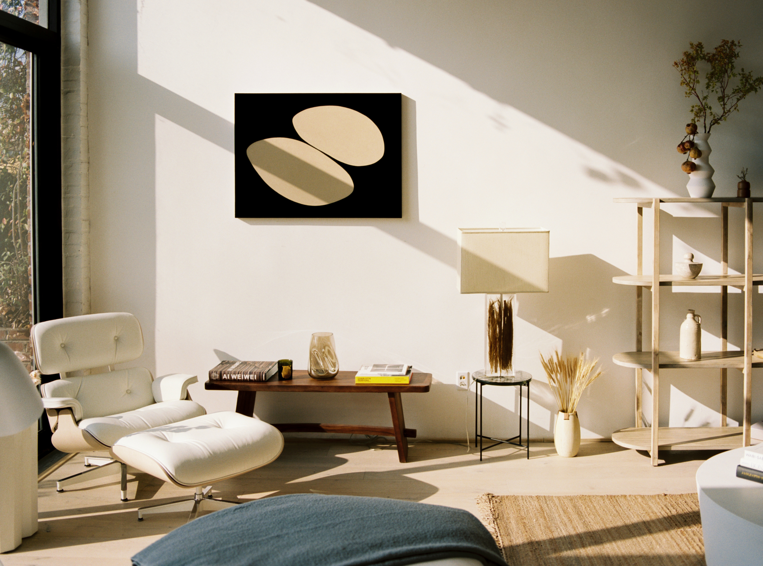
Downtown Los Angeles is not famous for whispering. Delivery trucks reverse with operatic enthusiasm, construction crews begin their percussion practice before breakfast, and the Arts District hums with restaurants, studios, warehouses, and traffic. Yet inside a former biscuit bakery, one renovated loft manages to lower the volume without pretending the city has disappeared.
The Biscuit Loft, redesigned by Los Angeles architecture and design firm OWIU, is a study in productive contrast. Its shell is unmistakably industrial: high ceilings, exposed brick, concrete surfaces, visible mechanical systems, and the generous proportions of a building once designed for manufacturing. Within that muscular framework, the designers introduced pale wood, warm lighting, flexible rooms, restrained furnishings, and Japanese-inspired spatial ideas.
The result is not a themed apartment or a museum of minimalism where touching a pillow feels illegal. It is a practical two-bedroom home that demonstrates how thoughtful interior architecture can produce urban quiet even inside a large, historically industrial space.
Project facts synthesized from Remodelista, Metropolis, OWIU, and Architizer.
From Biscuit Factory to Los Angeles Loft
The Biscuit Company Lofts occupy a seven-story building constructed in 1925 for the National Biscuit Company, now better known as Nabisco. The structure served as a West Coast bakery and headquarters, built during an era when industrial architecture was expected to be durable, efficient, and unapologetically substantial.
That durability later became an advantage. Thick masonry, large factory windows, high ceilings, maple flooring, terrazzo, metalwork, and strong structural systems gave the property enough character and physical integrity to support adaptive reuse. During its conversion into residential lofts, many original features were retained rather than polished into historical amnesia.
There is an appealing bit of architectural comedy here. A building once organized around producing crackers eventually became desirable because people wanted fewer walls, fewer conventional rooms, and more room for sculptural lamps. Industrial necessity accidentally created a residential luxury decades later.
The transformation also reflects the broader evolution of Downtown Los Angeles. Former factories and warehouses in the Arts District have gradually become homes, studios, restaurants, galleries, and creative workplaces. Instead of erasing the neighborhood’s manufacturing past, successful conversions allow that history to remain visible through brick, concrete, windows, columns, and irregular floor plans.
Building history checked against Architectural Record, the Los Angeles Times, HistoricPlacesLA, and Nabisco history.
A Loft That Needed More Than Good Furniture
Before OWIU’s renovation, the approximately 1,620-square-foot unit had impressive volume but lacked the intimate organization needed for everyday domestic life. This is a common loft problem. An open plan photographs beautifully, but a resident still needs places to sleep, work, eat, store linens, host guests, and occasionally hide from a video call.
OWIU founders Amanda Gunawan and Joel Wong approached the project as both designers and hands-on builders. The loft became Gunawan’s home as well as an early design-build project for the studio. That dual role encouraged an unusually practical level of experimentation. Every intervention had to look considered, but it also had to survive breakfast, work deadlines, houseguests, and ordinary clutter.
The design team did not attempt to defeat the original architecture. Instead, they treated the industrial shell as the deeper, rougher background layer and inserted a quieter domestic system within it. Japanese and Scandinavian influences appear through natural materials, simple forms, disciplined storage, multipurpose spaces, and an emphasis on atmosphere rather than decoration.
How OWIU Created Urban Quiet
1. The Open Plan Was Divided Without Being Chopped Up
A successful loft renovation must solve a paradox: preserve openness while creating separation. Build too many full-height walls and the loft loses its drama. Build none, and every activity takes place in one enormous room where the dishwasher, television, office call, and sleeping guest become unwilling collaborators.
OWIU created smaller functional zones while maintaining visual continuity. The living room occupies the bright double-height area. The kitchen and dining zone sit beneath and beside the expanded mezzanine. A study is positioned upstairs, while private sleeping spaces are more carefully screened.
These zones are defined by ceiling height, furniture placement, built-ins, platforms, lighting, and partial partitions rather than a maze of corridors. The approach makes the home legible. On entering, a person can understand where to gather, where to work, and where to retreat without encountering a forest of signs reading, “Tea happens here.”
2. The Mezzanine Became Architecture, Storage, and Sculpture
The existing mezzanine was extended by roughly 130 square feet, improving both the upper and lower levels. Above, the expansion created more usable space for a compact study and helped establish privacy around the primary bedroom. Below, the new overhang gave the dining area a lower, more intimate ceiling.
This change demonstrates why volume matters as much as floor area. The double-height living room feels expansive because the ceiling soars. The dining zone feels sheltered because the mezzanine lowers the overhead plane. Nothing needs to announce that one space is formal and another is cozy; the architecture does the explaining.
The staircase and guardrail are composed of custom-fabricated plywood panels arranged in an angular geometric form. From one direction, the assembly reads as a relatively calm wooden plane. From another, it becomes sculptural and dynamic. It also incorporates useful elements, including shelving, proving that a safety barrier does not have to behave like an apologetic fence.
Mezzanine and stair details supported by Remodelista, Metropolis, and Architizer.
3. Pale Wood Softened the Industrial Shell
Exposed brick, concrete, ducts, and pipes can give a converted warehouse authenticity, but too many hard surfaces may also make a home feel cold and acoustically lively. OWIU balanced those materials with birch, plywood, light-colored finishes, woven textures, and restrained upholstery.
The wood is not heavily stained or disguised. Its grain remains visible, allowing it to provide warmth without becoming rustic. This distinction is important. The loft does not look like an industrial apartment wearing a farmhouse costume. The woodwork is precise, geometric, and contemporary, so it belongs naturally beside concrete and painted brick.
A limited palette also reduces visual noise. White surfaces reflect daylight, pale timber adds warmth, and occasional dark accents provide definition. Because the colors remain quiet, changes in texture become more noticeable: smooth concrete, fibrous paper lighting, wood grain, upholstery, and rough masonry each contribute without shouting over the others.
4. Lighting Was Treated as Atmosphere
Large factory windows bring valuable daylight into the loft, especially around the double-height living space. Yet natural light alone does not create serenity. Uncontrolled brightness can produce glare, heat, and uncomfortable contrast, while a single overhead fixture can make a sophisticated interior feel like a late-night convenience store.
The Biscuit Loft uses multiple layers of illumination. Natural light establishes the daytime rhythm. Sculptural Noguchi Akari lamps introduce a warm glow and a softer visual scale beneath the high ceiling. Smaller task lights support reading, cooking, and work.
The paper lanterns are particularly effective because they counter the loft’s industrial mass. Concrete looks heavier beside delicate paper; exposed pipes appear more purposeful beside rounded forms. The fixtures occupy the air without visually filling it, an important quality in a room where the ceiling is part of the experience.
For homeowners adapting this lesson, the goal is not to purchase one famous lamp and declare the project spiritually complete. It is to combine ambient, task, and accent lighting so different activities can occur without flooding the entire home with equal brightness.
Daylighting principles cross-checked with the Whole Building Design Guide.
5. A Guest Room Was Designed to Work Every Day
One of the loft’s most intelligent spaces is the guest room inspired by Japanese inns. Instead of installing a conventional bed that would occupy the room throughout the year, OWIU created a raised platform that can accommodate a stored futon when guests stay overnight.
When no one is visiting, the space becomes a tea room, reading area, or place for quiet conversation. The platform also contributes storage, making the room useful even when its sleeping function is inactive.
This is minimalism at its most convincing. The room does not have fewer functions; it has more. Its simplicity comes from carefully combining those functions rather than purchasing an assortment of furniture for every possible scenario.
The idea is particularly relevant to urban homes. A room used by guests ten nights a year should not spend the other 355 days guarding a mattress. A foldaway sleeping arrangement, platform, daybed, sliding partition, or built-in storage wall can turn occasional accommodation into valuable daily living space.
Quiet Design Is Not the Same as Empty Design
Minimal interiors are often misunderstood as exercises in subtraction. Remove the artwork, hide the toaster, buy a beige sofa, and wait for enlightenment. In reality, a calm home depends less on emptiness than on clarity.
Each zone needs a purpose. Objects need logical homes. Circulation paths should remain open. Frequently used belongings must be easy to reach, while occasional items can disappear into deeper storage. Materials and colors should relate to one another instead of competing for attention.
The Biscuit Loft succeeds because the architecture carries much of the visual interest. The angular stair, historic brick, generous windows, wood overhang, concrete island, and paper lanterns provide enough character. The designers did not need to scatter decorative objects across every horizontal surface like seasoning.
This restraint also permits personal belongings to matter more. A favorite chair, ceramic vessel, book collection, or artwork becomes visible because it is not surrounded by fifteen other items auditioning for the same role.
The Acoustic Challenge of Industrial Loft Living
Urban quiet is partly visual, but actual sound matters. High ceilings, exposed masonry, concrete floors, glass, and open plans can reflect noise for longer than smaller rooms with softer finishes. A conversation at the dining table may travel upstairs. Footsteps can become percussion. One dropped spoon may briefly apply for a career in theater.
Good acoustic design usually combines three strategies: absorption, blocking, and thoughtful zoning. Rugs, upholstered seating, curtains, books, fabric panels, and other porous materials absorb reflected sound. Partitions, doors, cabinetry, and enclosed rooms interrupt transmission. Spatial planning separates louder activities from quiet ones.
In a residential loft, the best solutions do not need to resemble recording-studio foam. A large rug beneath the seating area, lined drapery near windows, a fabric-covered headboard, bookshelves, upholstered dining chairs, and acoustic art panels can soften reverberation while supporting the design.
The Biscuit Loft’s compartmentalized layout also helps. Sleeping, studying, gathering, and hosting do not all occupy one undifferentiated acoustic field. The mezzanine, partial walls, built-ins, platform, and furniture groupings introduce boundaries without destroying openness.
Acoustic recommendations synthesized from U.S. General Services Administration guidance.
Why Adaptive Reuse Makes the Loft More Meaningful
The most compelling aspect of this home may be the relationship between old and new. OWIU did not create serenity by stripping away the building’s past. The firm created it by editing that past carefully.
Adaptive reuse preserves materials, craftsmanship, and cultural memory that would be expensiveor impossibleto reproduce. It can also avoid part of the environmental burden associated with demolition and new construction. Existing masonry, structural frames, flooring, and other components represent resources that have already been extracted, manufactured, and transported.
Preservation guidance in the United States generally encourages designers to identify character-defining features before making alterations. In a former factory, those features may include structural bays, industrial windows, masonry walls, heavy timber, concrete columns, open volumes, and evidence of earlier uses.
The aim is not to freeze the building in 1925. A home needs bathrooms, ventilation, electrical service, privacy, comfortable lighting, and a kitchen that does not require factory workers. The challenge is to introduce contemporary systems without making the historic shell feel like an inconvenient wrapper around a generic apartment.
In the Biscuit Loft, new wooden structures are visibly contemporary. They do not imitate old brick or pretend to be original factory elements. This honest contrast makes both periods easier to read.
Adaptive-reuse guidance synthesized from AIA, the National Park Service, and USGBC.
Design Lessons to Borrow for Any Home
Give Every Area a Clear Job
A small apartment and a large loft can suffer from the same problem: ambiguous space. Decide what activities need support, then use lighting, rugs, furniture, shelving, or ceiling changes to define them. A purposeful corner feels calmer than an empty corner waiting for a random chair.
Let One Element Perform Several Functions
The mezzanine creates floor area, privacy, a lower dining ceiling, structural rhythm, and a visual focal point. The guest platform supplies seating, storage, and sleeping space. Multifunctional design reduces the number of separate objects a home needs.
Balance Hard Materials With Soft Ones
Concrete and brick gain warmth from timber, fabric, paper, wool, and woven surfaces. This balance improves both appearance and acoustic comfort. It also prevents an industrial interior from feeling like a stylish place to store forklifts.
Use Storage to Protect the Architecture
Open plans become chaotic quickly because clutter is visible from almost everywhere. Built-in storage, closed cabinetry, under-platform compartments, and carefully planned shelves allow the main spatial ideas to remain legible.
Choose Low-Emitting Materials and Ventilate During Renovation
A peaceful room should also be healthy to occupy. Paints, adhesives, sealants, cabinetry, and flooring can introduce indoor pollutants during and after construction. Renovation plans should include source control, suitable low-emitting products, dust management, and adequate ventilation rather than treating air quality as a problem for the future resident’s houseplants.
Remodeling and indoor-air guidance based on the U.S. Environmental Protection Agency.
An Experiential Walkthrough: What Urban Quiet Feels Like
Imagine arriving from Industrial Street in the late afternoon. The neighborhood outside is active: tires crossing pavement seams, restaurant doors opening, voices bouncing between brick buildings, and a truck performing a twelve-point turn with the confidence of a ship entering port.
Then the loft door closes.
The city does not disappear, but its role changes. It becomes a muted background rather than the main event. Your attention moves upward first. The double-height volume makes the entrance feel generous, yet the pale finishes prevent the room from becoming intimidating. Paper lanterns hang within the vertical space like small moons that have agreed to indoor employment.
As you cross the living area, the concrete and brick provide visual weight. They remind you that this was once a place of machinery, ingredients, packaging, and repetitive industrial work. The newer timber elements do not compete with that history. They introduce a warmer tempo, one measured in meals, books, tea, and conversation.
The dining area beneath the extended mezzanine feels different from the living room even though no conventional wall separates them. The ceiling is lower, the light more intimate, and the table establishes a clear center. A dinner here would feel contained rather than lost in a cavernous room. Guests could speak at a normal volume instead of addressing the architecture as though giving a public lecture.
Moving upstairs, the angular staircase changes as your viewpoint shifts. What appeared flat from the dining area becomes sculptural from below. The plywood panels create privacy without becoming solid or heavy. At the mezzanine, the study feels connected to the main room but sufficiently removed for concentration. You can sense activity downstairs without having every movement occupy the center of your attention.
The primary bedroom offers a stronger retreat. Its separation is especially valuable in a loft, where the instinct to preserve openness can otherwise leave private spaces feeling temporarily assembled. Here, quiet is achieved through sequence. Public areas gradually give way to focused work and then to rest.
The most memorable experience may occur in the flexible tea and guest room. During an ordinary week, the futon remains stored and the platform becomes a place to sit with a book or share tea with a friend. There is no television demanding allegiance, no oversized bed claiming the majority of the floor, and no decorative furniture trying to justify its existence.
When a guest stays overnight, the room changes without drama. The futon appears, the platform becomes a sleeping area, and the home gains a temporary bedroom. After the visit, the room returns to daily life. This transformation feels less like operating a complicated convertible sofa and more like allowing the architecture to breathe in and out.
Morning would reveal another character. Daylight enters through the large industrial windows, reflects from white surfaces, and catches the pale wood grain. The loft feels brighter and more expansive, while the enclosed and lower-ceilinged areas remain visually grounded. Coffee at the kitchen island would place you between two histories: the durable shell of a twentieth-century bakery and a contemporary interior built around slower rituals.
That is the central experience of urban quiet. It is not complete silence, spotless minimalism, or escape from the city. It is the feeling that each part of a home knows what it is for. Light changes gradually. Materials feel balanced. Storage prevents possessions from conducting a coup. Rooms support both company and solitude.
A well-designed loft does not deny the energy outside its walls. It gives that energy a counterweight. After the city spends the day asking for attention, the home offers somewhere attention can rest.
Conclusion: Industrial History, Edited for Calm
Urban Quiet: A Redone Loft in a Former Biscuit Company Bakery illustrates how an industrial conversion can feel warm without concealing its history. OWIU preserved the scale, texture, and structural character of the former Nabisco building while introducing a carefully organized domestic interior.
The project’s success comes from decisions that are both aesthetic and practical: extending the mezzanine, defining functional zones, using pale wood against concrete and brick, layering the lighting, incorporating storage, and designing a guest room that remains useful between visits.
Most importantly, the loft shows that quiet design is not created by removing personality. It comes from reducing confusion. When rooms have clear purposes, materials support one another, and old architecture is allowed to converse with new interventions, a home can feel peaceful even in the middle of a busy city.
Note: This original article synthesizes verified information about the Biscuit Loft with established U.S. guidance on adaptive reuse, historic preservation, daylighting, acoustic comfort, and healthy renovation practices.