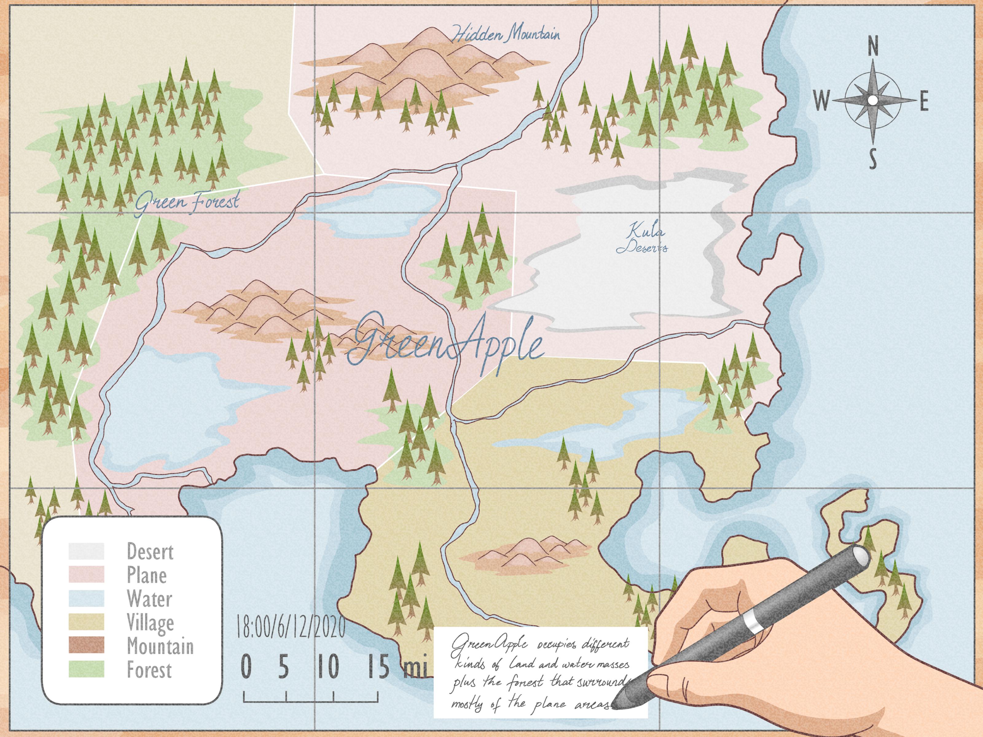
Making a map sounds simple until you actually try to do it. Suddenly, you are staring at roads, rivers, borders, labels, colors, icons, scales, data layers, and one tiny north arrow that somehow feels more judgmental than helpful. The good news is that mapmaking is not magic. It is a careful mix of purpose, geography, design, and common sense.
Whether you want to make a neighborhood walking map, a travel route, a classroom geography project, a business service-area map, or a polished GIS map for a report, the basic process is surprisingly similar. You decide what the map is supposed to do, collect reliable information, organize it into layers, choose the right style, add essential map elements, test whether people can understand it, and then export or share it.
This guide explains how to make a map from start to finish in a practical, beginner-friendly way. You do not need to be a professional cartographer, although you may begin dramatically saying “cartographic decisions” after step four. That is normal. It happens to the best of us.
What Is a Map, Really?
A map is a simplified representation of a place. It shows selected information about the real world so people can understand location, distance, direction, patterns, or relationships. That word “selected” is important. A map cannot show everything. If it tried, it would become the geographic equivalent of a junk drawer.
A road map highlights streets and routes. A weather map shows storms, temperatures, or pressure systems. A hiking map emphasizes trails, elevation, landmarks, and hazards. A demographic map may show population, income, age groups, or housing patterns by neighborhood, county, or state. The best maps are not the ones with the most information. They are the ones with the right information.
Step 1: Define the Purpose of Your Map
Before opening Google My Maps, QGIS, ArcGIS, Canva, or even a blank sheet of paper, answer one question: What should this map help someone do?
Your answer will shape every decision that follows. A map for tourists should help people find attractions quickly. A map for emergency planning should be accurate, clear, and focused on risk areas or response routes. A map for a blog post should be visually simple and easy to read on mobile. A map for a scientific report may need precise data sources, projection choices, scale bars, and formal layout elements.
Good Map Purposes
Strong map purposes are specific. Instead of saying, “I want to make a map of Chicago,” say, “I want to make a map showing the best first-time visitor route through downtown Chicago.” Instead of “a map of farms,” say, “a map showing farms within 20 miles of a farmers market.” Specific goals lead to useful maps.
Think about your audience too. A map for children, city planners, delivery drivers, hikers, tourists, and researchers should not look the same. Audience determines detail level, vocabulary, symbols, colors, and format.
Step 2: Choose the Type of Map You Need
Different goals require different map types. Choosing the right one early saves time and prevents the classic beginner mistake: building a beautiful map that answers the wrong question.
Reference Maps
Reference maps show general location information such as streets, cities, boundaries, water bodies, parks, or landmarks. They are useful when the main goal is orientation. A tourist map, campus map, or neighborhood map is usually a reference map.
Thematic Maps
Thematic maps focus on one topic or pattern. Examples include population density, average rainfall, election results, wildfire risk, housing prices, or public transit access. These maps often use colors, symbols, or shaded regions to show differences across space.
Route Maps
Route maps help people move from one place to another. They may show driving routes, walking paths, bike trails, delivery zones, or multi-stop travel plans. If your reader needs directions, keep the map clean and make the route visually dominant.
Custom Story Maps
A story map combines geography with text, images, and narrative. This is useful for history projects, environmental reports, travel writing, local journalism, and educational content. A story map does not just show where things are; it explains why those places matter.
Step 3: Gather Reliable Map Data
A map is only as reliable as the information behind it. If the data is wrong, outdated, incomplete, or poorly organized, your map may look impressive while quietly lying to everyone. That is not ideal, unless your goal is to create a treasure map for pirates with trust issues.
Start with authoritative sources whenever possible. For U.S. boundaries, roads, and geographic areas, the U.S. Census Bureau offers TIGER/Line shapefiles that can be linked with demographic data. For elevation, land cover, imagery, coastal data, and environmental information, NOAA provides geospatial data tools. USGS is a major source for topographic, geological, elevation, and projection-related mapping information. For historical maps, the Library of Congress offers extensive map collections that can inspire design or support research.
Common Data You Might Need
Depending on the map, you may need addresses, coordinates, boundaries, roads, rivers, landmarks, terrain, population statistics, business locations, photos, or field notes. For a simple custom map, you might only need a list of places. For a GIS map, you may need shapefiles, GeoJSON, CSV files, raster images, or web map services.
Always check the date, source, coverage area, and licensing terms of your data. A dataset from five years ago may be fine for mountains, but not for restaurant locations. Mountains are famously slow editors. Restaurants are not.
Step 4: Pick a Mapping Tool
You do not need the same tool for every map. The best mapping tool depends on your skill level, data complexity, and final use.
Google My Maps
Google My Maps is a beginner-friendly option for creating custom maps with markers, routes, shapes, descriptions, and layers. It works well for travel planning, local guides, event maps, simple business maps, and personal projects. You can add places, draw lines, import spreadsheet data, style markers, and share the map online.
QGIS
QGIS is a powerful free and open-source GIS program. It is excellent for users who want more control over data, projections, labels, analysis, layouts, and exports. QGIS can handle vector layers, raster layers, spatial analysis, print layouts, legends, scale bars, north arrows, and professional map production.
ArcGIS
ArcGIS is widely used in government, business, planning, environmental science, utilities, education, and professional GIS work. It offers robust tools for data management, analysis, web maps, projections, symbology, dashboards, and publishing. For advanced mapping projects, it is one of the strongest options available.
Design Tools
For simple illustrated maps, tools such as Canva, Adobe Illustrator, or Figma may be useful. These are not always ideal for geographic accuracy, but they can be excellent for stylized event maps, blog graphics, infographics, or hand-drawn-style guides.
Step 5: Start With a Basemap
A basemap is the background layer that gives your map geographic context. It may show streets, terrain, satellite imagery, political boundaries, oceans, rivers, or place names. Choosing a basemap is like choosing the stage for a play. If the stage is too loud, nobody notices the actors.
For route maps, a simple street basemap is usually best. For hiking, terrain or topographic basemaps make sense. For environmental maps, imagery or land cover may be useful. For data-heavy thematic maps, choose a light, neutral basemap so your main information stands out.
A common beginner mistake is using a visually busy satellite basemap behind colorful data. It may look dramatic, but readability suffers. If your map is supposed to communicate quickly, keep the basemap subtle.
Step 6: Add Layers
Layers are separate pieces of geographic information stacked on top of one another. A city map might have one layer for roads, one for parks, one for subway stations, one for restaurants, and one for walking routes. Turning layers on and off helps you organize information without creating chaos.
In simple tools, layers may contain groups of pins or routes. In GIS software, layers may include points, lines, polygons, raster images, elevation models, boundaries, or statistical data. Points can represent locations such as stores or schools. Lines can represent roads, rivers, pipelines, or trails. Polygons can represent neighborhoods, counties, parks, lakes, or service zones.
Name your layers clearly. “Layer 1” is not helpful. “Coffee Shops,” “Bike Routes,” “Flood Zones,” or “County Boundaries” will make your future self much happier.
Step 7: Choose the Right Map Projection
A map projection is the method used to show the curved surface of Earth on a flat screen or sheet of paper. Because Earth is round-ish and your paper is not, every projection creates some kind of distortion. Shape, area, distance, or direction may be affected.
The right projection depends on your purpose and location. A local city map may work well with a local projected coordinate system. A world map showing country sizes should avoid projections that heavily distort area. A navigation map may prioritize direction. A map measuring land area should use an equal-area projection when accuracy matters.
For beginners using web mapping tools, projection choices may be mostly handled automatically. For GIS projects, however, projection matters. If you are measuring distance, area, or spatial relationships, do not ignore coordinate systems. That is how innocent maps turn into mathematical banana peels.
Step 8: Symbolize Your Data Clearly
Symbols are how your map speaks. Colors, icons, line widths, labels, patterns, and shapes all tell the reader what matters. Good symbols make the map understandable at a glance.
Use familiar visual language when possible. Blue often suggests water. Green suggests parks, forests, or nature. Thicker lines can show major roads. Dotted lines can show trails or proposed routes. Larger circles can show larger quantities. Darker shades can show higher intensity, but only when the data supports that kind of comparison.
Use Color With Purpose
Do not choose colors just because they look pretty together. A map of wildfire risk should not look like a candy store. A map of quiet reading gardens probably does not need emergency red unless the roses are plotting something.
For thematic maps, use color ramps carefully. Sequential data, such as population density from low to high, works well with a light-to-dark color scale. Categories, such as park types or restaurant cuisines, need distinct colors. Avoid using too many colors because readers will stop interpreting and start guessing.
Keep Labels Readable
Labels are useful only when people can read them. Use clear fonts, avoid clutter, and prioritize the most important labels. A map does not need to label every street, creek, bench, statue, and emotionally significant sandwich shop. Label what supports the map’s purpose.
Step 9: Add Essential Map Elements
Most finished maps need several core elements: a title, legend, scale, orientation, source note, and sometimes an inset map. These elements help the reader understand what the map shows and how to interpret it.
Title
The title should clearly describe the map. “Map of California” is vague. “Public Beaches Along the Southern California Coast” is much better. A good title tells the reader what, where, and sometimes when.
Legend
The legend explains symbols, colors, and line styles. Keep it short and organized. If your legend is longer than the map itself, your map may be trying to do too much.
Scale Bar
A scale bar shows the relationship between distance on the map and real-world distance. This is especially important for printed maps and maps where distance matters. For web maps, scale may be interactive, but a visible scale still helps users understand space.
North Arrow or Orientation
A north arrow helps readers understand direction, especially when the map is rotated or when the area is unfamiliar. If north is already obvious and the map uses a standard orientation, keep the arrow simple.
Source and Date
Include a small source note when the map relies on external data. Add the date of the data or map creation when freshness matters. This is especially important for planning, safety, demographics, weather, or business maps.
Step 10: Design the Layout
Map layout is the arrangement of the map body, title, legend, scale bar, notes, inset maps, labels, and empty space. Yes, empty space matters. It gives the reader’s eyes somewhere to breathe.
Place the most important information where the eye naturally goes first. Make sure the map itself is the main focus. Keep supporting elements nearby but not intrusive. Align elements neatly. Use consistent spacing. Avoid decorative clutter unless the map is intentionally artistic.
For print maps, think about paper size, margins, resolution, and whether the map will be read close-up or from a distance. For web maps, think about mobile screens, zoom behavior, loading speed, and whether labels remain readable.
Step 11: Review Accuracy and Usability
Before publishing or sharing your map, test it. Check spelling, locations, symbols, labels, boundaries, routes, and data joins. Zoom in and out. Ask someone unfamiliar with the project to explain what the map shows. If they cannot understand it quickly, the map needs revision.
Look for common problems: too many labels, unclear colors, missing legend items, misleading scale, overlapping symbols, outdated data, incorrect coordinates, and routes that cut through lakes unless your audience owns boats.
Step 12: Export and Share the Map
Your final format depends on where the map will appear. For a website, use an image, interactive embed, or web map link. For a report, export a high-resolution PDF or PNG. For presentations, use a simple image with large labels. For field use, consider a printable version that still works without internet access.
When exporting, check resolution and file size. A blurry map looks unprofessional. A massive file that loads slower than a sleepy turtle is also a problem. Balance quality with usability.
Example: Making a Simple Neighborhood Food Map
Imagine you want to create a map called “Best Lunch Spots Near Downtown.” First, define the purpose: helping office workers find quick lunch options within a walkable area. Next, gather your locations: restaurant names, addresses, cuisine types, price ranges, and notes. Then choose a tool such as Google My Maps for simplicity.
Create layers for “Sandwiches,” “Bowls and Salads,” “Coffee,” and “Quick Takeout.” Add markers for each restaurant. Use different icons or colors for each category. Add a walking boundary, maybe a 10-minute radius from the office center. Write short descriptions such as “fast service,” “great vegetarian options,” or “dangerously good cookies.” Add a clean title and share the map with coworkers or readers.
The result is useful because it has a clear audience, a focused purpose, organized layers, readable symbols, and practical details. It does not try to map every restaurant in the city. It maps what the audience needs.
Common Mapmaking Mistakes to Avoid
Adding Too Much Information
More information does not always make a better map. It often makes a mess. If a feature does not support the map’s purpose, remove it or move it to another layer.
Using Unclear Symbols
If readers need to study the legend like it is a tax form, simplify your symbols. Use intuitive colors and shapes whenever possible.
Ignoring Data Quality
Old or inaccurate data can ruin an otherwise beautiful map. Always check the source, date, and geographic coverage.
Forgetting the Audience
A technical GIS map may impress experts but confuse the public. A playful illustrated map may delight tourists but frustrate engineers. Design for the people who will actually use it.
Making the Map Pretty but Not Useful
Design matters, but usefulness comes first. A good map should be attractive enough to invite reading and clear enough to reward it.
Practical Experiences From Making Maps
One of the most important lessons from making maps is that the first version is rarely the final version. A map often begins with confidence and ends with you muttering, “Why are these labels fighting each other?” That is part of the process. Mapmaking is not just placing things on a page. It is editing reality into something understandable.
For example, when making a travel map, it is tempting to include every restaurant, museum, viewpoint, hotel, bus stop, and “maybe we should go here” location. The map quickly becomes crowded. The better approach is to separate the map into layers or categories. Put must-see attractions in one layer, food stops in another, transportation in another, and optional extras in a fourth. This lets the map stay useful instead of becoming a colorful panic attack.
Another experience many beginners share is realizing that distance on a map can be emotionally misleading. Two places may look close, but a river, highway, hill, construction zone, or lack of sidewalks can make the trip longer than expected. When making a walking or biking map, do not rely only on straight-line distance. Check actual routes, crossings, terrain, and access points. A good route map respects real movement, not just geometry.
Making maps for other people also teaches humility. You may think your symbols are obvious, but users may interpret them differently. A blue circle might mean water to one person, parking to another, and “something official-looking” to someone else. That is why legends, labels, and testing matter. Give your map to someone who has not seen it before and ask, “What do you think this shows?” Their answer is free usability research, even if it hurts your cartographic feelings a little.
In business mapping, clarity becomes even more important. A service-area map, delivery-zone map, or store-location map should answer the customer’s question quickly. Can you serve my address? Where is the nearest branch? Which region is covered? Fancy effects are less important than accurate boundaries, readable labels, and simple colors. If the map is being used for sales or customer support, confusion can become real money lost.
Educational maps bring a different lesson: maps can teach people how to think spatially. When students draw a classroom map, a school map, or a local neighborhood map, they begin to understand scale, direction, symbols, and relationships. Even a hand-drawn map can be powerful because it forces the maker to decide what matters. Where is the entrance? Which hallway connects to the library? What landmarks help someone navigate? These questions build spatial awareness.
Professional GIS mapping adds another layer of discipline. You learn to document sources, check projections, manage files, verify attributes, and design layouts for specific outputs. Small details matter. A missing data source note can weaken trust. A wrong projection can distort measurements. A poorly chosen color ramp can mislead interpretation. The more serious the decision connected to the map, the more careful the mapmaker must be.
The biggest practical insight is this: a map is a conversation with the reader. It says, “Here is what matters about this place.” If the conversation is clear, the reader feels guided. If it is cluttered, vague, or misleading, the reader feels lost. The best mapmakers are not simply people who know software. They are people who know how to choose, simplify, organize, and communicate.
Conclusion
Learning how to make a map is really learning how to turn location into understanding. The process begins with a clear purpose and a defined audience. From there, you choose the right type of map, gather reliable data, select a tool, build layers, choose symbols, add essential elements, design the layout, test the result, and export it in the right format.
A strong map does not need to be complicated. It needs to be honest, readable, and useful. Whether you are mapping a weekend road trip, a neighborhood guide, a school project, a research topic, or a professional planning area, the same principle applies: show what matters, remove what distracts, and help the reader understand the place faster than they could without the map.
And if your first map looks a little chaotic, do not worry. Every good map begins as a brave little mess. The skill is in revising it until the geography finally behaves.