Some logos are so famous that your brain recognizes them before your inner narrator has time to put on pants. A swoosh. A bitten apple. A mouse-ear silhouette. A leaping animal. A shell. A wordmark with just enough attitude to make a billboard feel expensive. These marks are not merely decorations; they are tiny visual shortcuts that carry decades of advertising, product experience, nostalgia, and emotional baggage in one compact symbol.
Now imagine taking those recognizable logos and removing nearly everything: color, shading, texture, typography, effects, shadows, and all the little design luxuries that make brand managers sleep peacefully at night. What remains? In this creative experiment, 38 of the most recognizable logos are reinterpreted with a single unbroken line, turning global brand icons into elegant continuous line drawings. The result is part design study, part visual riddle, and part “wait, how is that still obviously the same logo?”
This approach belongs to the world of minimalist logo design, one line art, and visual reduction. It asks a deceptively simple question: how little can a logo show while still being understood? The answer, as it turns out, is “shockingly little”as long as the designer understands the soul of the mark.
What Is a Single-Line Logo Reinterpretation?
A single-line logo reinterpretation redraws an existing symbol using one continuous stroke. The line does not break, lift, restart, or cheat by sneaking in a second path when nobody is looking. It travels through the form like a tiny graphic marathon runner, connecting curves, corners, loops, and negative space into one fluid gesture.
This is different from simply tracing a logo. A trace copies. A single-line reinterpretation translates. It must preserve the most essential cues of the original logo while sacrificing everything that is not absolutely necessary. That means the designer has to decide what makes the logo recognizable in the first place. Is it the outline? The motion? The angle? The proportion? The famous gap? The rhythm of repeated shapes? The attitude?
For example, a sportswear logo may depend on speed and motion. A technology logo may rely on clean geometry. An entertainment logo may need a sense of character and charm. A car logo may be recognized through symmetry, rings, wings, or a badge-like silhouette. In a single unbroken line, all of those brand signals must be compressed into one confident stroke.
Why Famous Logos Work Even When They Are Stripped Down
Recognizable logos survive simplification because strong brand identity is built on distinct visual memory. The best logos are not just pretty; they are memorable, scalable, and flexible. They work on a sneaker, an app icon, a storefront, a shipping box, a stadium sign, and the corner of a phone screen where pixels go to feel important.
When a logo is reduced to a single line, its weaknesses become obvious. If the mark depends entirely on color or decorative detail, it may collapse like a folding chair at a family barbecue. But if it has a strong silhouette, clear proportions, and a memorable structure, it can still be recognized in its simplest form.
That is why icons such as Apple, Nike, McDonald’s, NASA, Disney, Adidas, Puma, Audi, Firefox, Amazon, and Warner Bros. are fascinating candidates for continuous line art. Each has a different kind of recognition. Apple relies on silhouette and the bite. Nike relies on motion. McDonald’s uses simple arches. Disney leans into a highly emotional, storybook-style identity. Audi depends on repeated geometry. Firefox uses circular movement. NASA carries a badge-like composition that feels both scientific and adventurous.
The Art of Reduction: Less Detail, More Decision-Making
Minimalism is often misunderstood as “just remove stuff.” If only. True minimalism is not laziness in a black turtleneck. It is decision-making under pressure. Every missing detail must be replaced by a smarter line, a clearer curve, or a more meaningful negative space.
In a single-line logo project, the designer has to make dozens of small calls. Where should the line begin? Where should it end? Should the stroke move clockwise or counterclockwise? Which internal detail matters most? Which part can be implied rather than drawn? How much distortion is acceptable before the logo stops feeling like itself?
Take a logo like Puma. The original mark is dynamic because of its leaping animal form. A one-line version cannot draw every muscle, paw, and tail detail. It must capture the leap. The curve of the back, the extension of the body, and the directional energy become more important than anatomical accuracy. Nobody needs to count whiskers. This is branding, not a wildlife documentary.
Or consider LEGO. The famous logo is strongly connected to its blocky letters, bright color, and playful personality. A single-line reinterpretation has to preserve the roundness and friendliness of the letterforms while making the stroke feel continuous. The challenge is not just drawing letters; it is keeping the toy-like joy intact.
Why One Unbroken Line Feels So Satisfying
There is something oddly satisfying about watching or imagining a design made in one continuous movement. It feels efficient, clever, and human. The line has a beginning, a journey, and an ending. It turns a static logo into a miniature story.
Single-line art also reconnects design with the earliest form of drawing most of us experienced as children. Before we understood grids, vectors, brand guidelines, or why clients ask to “make it pop,” we drew with lines. A house. A face. A dog that looked suspiciously like a potato. The single-line method taps into that playful memory while still demanding professional control.
This blend of sophistication and simplicity is what makes one line logos so appealing. They look effortless, but the best ones are carefully planned. The line must feel natural, not tortured. If the stroke twists too much, the logo becomes confusing. If it is too literal, it loses elegance. If it removes too much, the viewer gets a puzzle with no reward.
How Brand Recognition Survives Without Color
Many famous logos are associated with color: Coca-Cola red, Facebook blue, McDonald’s yellow, Starbucks green, Target red, or Tiffany blue. But color is only one layer of recognition. A truly durable logo also has form.
Single-line reinterpretations test whether the shape can stand on its own. When color disappears, the viewer looks harder at contour, spacing, rhythm, and implied movement. This is where great logos reveal their engineering. Apple is still Apple because the silhouette and bite are unmistakable. Adidas remains Adidas because the angled bars create a familiar rhythm. Audi still reads as Audi because four linked circles are almost impossible to misread unless your coffee has not kicked in.
The exercise also highlights the role of negative space. In many one-line logo drawings, what is not drawn becomes as important as what is drawn. A missing section can suggest a mouth, a wing, a flame, a letter, or a curve. The viewer completes the image mentally, which makes the design feel interactive. The brain loves a good fill-in-the-blank moment, especially when the blank is stylish.
Specific Examples: What Makes Certain Logos Work in One Line?
Apple: The Power of an Instantly Readable Silhouette
The Apple logo is a masterclass in recognizable shape. In a single-line reinterpretation, the bite, leaf, and rounded fruit form are the key ingredients. Remove the bite and it becomes a generic fruit. Remove the leaf and it loses personality. Keep both, and the logo remains instantly readableeven without its polished corporate finish.
Nike: Motion Over Detail
The Nike Swoosh is already close to a single gesture. Its power comes from movement, speed, and simplicity. A continuous-line version does not need to explain much. It simply needs to preserve the upward sweep and the sense of acceleration. It is one of the rare marks where the reinterpretation feels almost inevitable.
Disney: Emotion in a Curve
Disney’s identity is tied to fantasy, childhood, entertainment, and a hand-drawn spirit. Translating that into one unbroken line means preserving whimsy. The line must feel charming rather than mechanical. A Disney-inspired continuous line should look like it knows where the castle is and has already packed snacks.
Firefox: Circular Energy
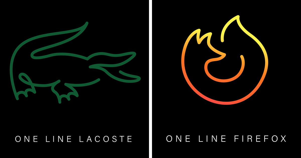
Firefox is a strong candidate because the original logo already has a swirling, circular motion. The challenge is deciding how much of the fox and globe relationship to include. Too much detail makes the line busy. Too little and the design becomes a random spiral. The best version suggests motion, enclosure, and flame-like energy at once.
NASA: A Badge With Built-In Drama
NASA’s logo has a distinct composition: circular form, orbital movement, starry imagination, and a strong institutional feeling. A one-line reinterpretation can focus on the orbit and circular structure, creating a design that feels scientific without drawing every element. It shows how brand identity can be carried by motion and composition, not just lettering.
What Designers Can Learn From This Experiment
This project is more than a clever gallery concept. It is a useful lesson for anyone interested in logo design, branding, visual identity, or creative direction. When you force a logo into one continuous line, you discover what really matters.
First, a logo should be recognizable without relying on decoration. Gradients, shadows, and textures can enhance a design, but they should not be the only reason it works. If a logo collapses when converted to a simple line, it may not be structurally strong enough.
Second, simplicity does not mean generic. The goal is not to make every logo plain. The goal is to make every element necessary. A strong minimalist logo still has personality. It can be elegant, playful, rebellious, luxurious, fast, warm, or futuristic. It simply communicates that personality with fewer ingredients.
Third, scalability matters. A logo should work at multiple sizes, from a large sign to a tiny favicon. Continuous-line reinterpretations exaggerate this truth because they depend on clarity. If the viewer cannot identify the form quickly, the design may be beautiful but ineffective.
Finally, constraints can improve creativity. Giving yourself fewer tools often leads to better solutions. A single line removes the option of hiding behind detail. It forces structure, rhythm, and intention. Designers may complain about constraints, but secretly, constraints are where the magic hides with a tiny notebook.
Why Audiences Love Visual Puzzles
One reason these reinterpreted logos are so engaging is that they invite participation. Viewers do not passively consume them; they solve them. The brain compares the simplified line with stored brand memories, then celebrates when recognition clicks. That “aha” moment is small but satisfying.
This makes single-line logo art especially shareable. People enjoy testing themselves and others: “Can you guess this one?” “How did they make that with one line?” “Why did I know it was Amazon before I knew I knew?” In digital culture, this kind of visual puzzle performs well because it is quick, clever, and conversation-friendly.
It also gives familiar brands a fresh emotional texture. We are used to seeing famous logos in polished corporate environments. Seeing them redrawn as delicate continuous lines makes them feel handmade, playful, and slightly vulnerable. The corporate armor comes off, and the skeleton of the design steps forward.
The Legal and Ethical Side of Reinterpreting Logos
Because famous logos are usually protected trademarks, reinterpretation should be handled thoughtfully. A creative study, commentary, educational article, or artistic homage is different from using a famous mark to sell competing products or mislead consumers. Designers should avoid presenting reinterpretations as official brand redesigns unless they have permission.
That distinction matters. Logo experiments can be valuable as design analysis and artistic exploration, but they should not create confusion about ownership. A good rule of thumb is simple: admire, analyze, and transformbut do not pretend the brand hired you if the brand did not even know you existed. Awkward emails are not a business strategy.
How to Try a Single-Line Logo Exercise Yourself
If you want to experiment with one line logos, start with a familiar symbol that has a strong silhouette. Print it out or place it on a digital artboard. Then identify the essential features. Do not start drawing immediately. Stare at it for a while like a detective in a design-themed crime drama.
Next, sketch several possible routes. Try beginning at different points. Look for places where the line can loop naturally. Use negative space to imply details instead of drawing everything. After that, simplify again. Then simplify the simplification. Then, when you think you are done, remove one more unnecessary wiggle. The wiggle knows what it did.
Finally, test recognition. Show the drawing to someone without telling them what it is. If they recognize it quickly, the design works. If they squint, rotate the paper, and ask whether it is a confused shrimp, you may need another pass.
Experience Notes: What It Feels Like to Reinterpret Recognizable Logos With One Line
Working on a single-line logo reinterpretation feels a little like trying to pack a whole vacation into one carry-on bag. At first, everything seems essential. You want the curves, the corners, the shadow logic, the spacing, the historical detail, the emotional tone, and maybe even the brand’s entire advertising budget somehow squeezed into one elegant stroke. Then reality taps you on the shoulder and says, “You get one line. Choose wisely.”
The first experience is usually frustration. A famous logo looks simple until you try to redraw it without lifting your hand. Suddenly, the obvious path is not obvious at all. The line reaches a corner and gets trapped. A loop creates an ugly knot. A beautiful curve ruins the proportion. You discover that many iconic logos are not just attractive; they are carefully balanced systems. Change one angle and the whole thing loses its accent.
Then comes the fun part: finding the gesture. Every strong logo has a movement hidden inside it. With Nike, the movement is fast and upward. With Apple, it is round and calm. With Adidas, it is rhythmic and directional. With Firefox, it is circular and fiery. Once you find that inner movement, the drawing begins to breathe. The line stops being a technical restriction and starts feeling like a guide.
The most surprising experience is realizing how much the viewer contributes. You do not have to draw every detail because the audience brings memory to the image. A tiny bite can suggest Apple. A few arches can suggest McDonald’s. Interlocking circles can suggest Audi. This makes the process feel collaborative, even when the viewer is not in the room. The designer creates a hint; the audience completes the meaning.
There is also a strange emotional satisfaction in reducing a powerful corporate logo to something that feels handmade. These marks usually arrive in our lives through advertising campaigns, product launches, packaging, sponsorships, and enormous marketing machines. But in a single-line version, they become quiet. They feel more like sketches in a notebook than assets in a brand manual. That contrast is part of the charm.
For designers, the exercise builds discipline. It teaches restraint, proportion, visual memory, and respect for negative space. It also teaches humility, because one line is very good at exposing weak decisions. You cannot hide behind gradients, textures, or “let’s add a glow.” The line either works or it does not.
For viewers, the experience is playful. You recognize something familiar through an unfamiliar form, and that small moment of discovery creates delight. It is the design equivalent of hearing a song played on one instrument and still knowing the chorus immediately. The melody survives because it was strong all along.
That is the real beauty of reinterpreting 38 recognizable logos with a single unbroken line. It is not only about showing off clever drawing. It is about proving that the strongest visual identities have a core idea sturdy enough to survive radical simplification. Strip away the polish, and the best logos still introduce themselves.
Conclusion
Reinterpreting famous logos with a single unbroken line is a brilliant reminder that great design does not always need more. Sometimes it needs lessbut better. This minimalist logo design experiment reveals the hidden architecture behind recognizable logos: silhouette, motion, proportion, memory, and negative space. It shows why certain brand marks remain powerful even when color, typography, and detail disappear.
For designers, it is a masterclass in restraint. For branding enthusiasts, it is a fresh way to understand visual identity. For everyone else, it is simply fun to look at. And in a world overflowing with visual noise, a single confident line can feel surprisingly loud.
Note: This article is an original, publication-ready synthesis based on real design, branding, UX, and trademark concepts, written in standard American English with no copied source text.