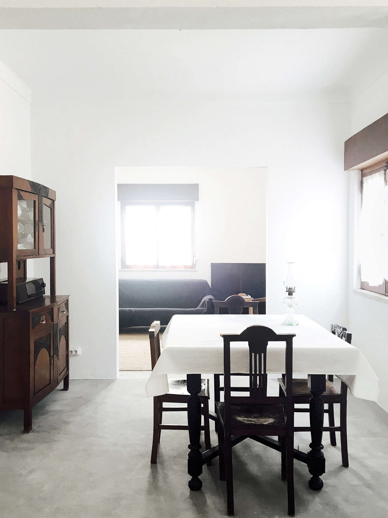
There are houses that try very hard to impress you. They fling marble at your feet, brass at your eyeballs, and sculptural chairs at every innocent corner. Then there are houses like this rural Portuguese home: quiet, black and white, almost monkish in its restraint, and somehow ten times more memorable because it never raises its voice. It does not scream luxury. It barely clears its throat. And that is exactly why it works.
Set in the Portuguese countryside, this house feels like a design lesson wrapped in white plaster and shadow. Its palette is reduced to the essentials: bone-white walls, matte black details, warm wood, simple shelving, and light that moves through the rooms like it was invited personally. The mood is spare, but not bleak. Clean, but not clinical. The whole place carries a calm authority that makes you want to put away half your belongings and apologize to your junk drawer.
The most intriguing part is the whisper of Shaker influence. Not in a theme-park, “look, a peg rail!” sort of way. More in the deeper attitude of the rooms: utility without fuss, craftsmanship without showboating, and beauty that emerges because every object has a purpose. This is where the house becomes more than a pretty rural retreat. It becomes a case study in how less can feel richer, warmer, and smarter when the editing is done well.
Why This Black and White House Feels So Powerful
Black and white is one of the oldest tricks in the design book, but it is also one of the easiest to ruin. Go too stark and the room feels like a law office with commitment issues. Go too soft and the entire palette drifts into oatmeal territory. What this Portuguese house gets right is contrast with restraint. The black details do not dominate the rooms; they punctuate them. A dark frame, a black fitting, a shadow line, a simple object on an open shelf: each one acts like a comma in a very well-written sentence.
White, meanwhile, does the heavy lifting. It expands space, bounces light, and makes every texture matter more. Suddenly, plaster is not just plaster. It is atmosphere. Wood shelving is not just storage. It is relief, warmth, and rhythm. A ceramic bowl is not filler. It is sculpture with a job. In a stripped-down house, the humble things become stars, which is both charming and slightly terrifying if your humble things are ugly.
The Palette Is Minimal, But the House Is Not Cold
That is the genius of the design. Sparseness here does not mean emotional austerity. The home avoids the biggest mistake of many minimalist interiors: confusing emptiness with elegance. Instead, it layers in subtle warmth through natural materials, handmade character, and the softness of lived-in imperfection. Wood shelves, plaster walls, oil lamps, woven elements, and handmade objects keep the black-and-white scheme from becoming severe.
In other words, the house understands a truth many homeowners learn too late: a minimalist room still needs texture, or it will feel like a dentist’s waiting area with better taste. Texture is what turns restraint into comfort. It is what keeps a white room from becoming a void and a black accent from feeling too sharp. Here, texture does the work color usually does in louder interiors.
The Rural Setting Keeps the Design Honest
This house would not feel the same in the middle of a flashy urban tower. Rural Portugal gives it a different kind of credibility. The surrounding landscape, the slower rhythm, the agricultural context, and the vernacular simplicity all reinforce the architecture’s quiet mood. The home does not look stripped down for social media. It looks stripped down because the land itself does not need extra decoration.
That matters. In rural settings, overdesigned houses can feel like overdressed dinner guests. But a restrained home, one that respects light, climate, and daily rituals, feels grounded. It belongs. This Portuguese example captures that beautifully. The sparseness is not an aesthetic stunt; it feels like the natural result of living close to weather, time, and routine.
The Shaker Echoes: More Than a Style Reference
The Shaker comparison is not just about furniture silhouettes or plain cabinetry. It is about values translated into space. Shaker design has long been admired for its belief that utility, simplicity, and quality are not compromises. They are ideals. A well-made object should earn its place. Ornament should never outrun purpose. Craft should be visible in the joinery, the proportion, and the honesty of materials.
That spirit lives in this Portuguese house. The rooms are not packed with statement pieces begging for compliments. Instead, they rely on proportion, placement, and usefulness. Shelves are simple. Openings are strong and sculptural. Storage feels integrated rather than bulky. The overall effect is deeply composed without ever looking precious.
Purpose Becomes the Main Decoration
One of the most Shaker-like ideas in the home is that usefulness becomes a visual language. A shelf, a stool, a bench, a rail, a lamp: these are not hidden away because they are practical. They are elevated because they are practical. In many contemporary homes, function gets disguised under styling. Here, function is styling.
That is a lesson worth stealing. A row of hooks can be beautiful. A built-in bench can feel poetic. A simple dining table can become the emotional center of a home if the room around it is calm enough to let it breathe. When a house stops chasing novelty, ordinary necessities suddenly look incredibly elegant.
Honest Materials Always Win
Shaker design has endured because it respects materials instead of forcing them into costume. Wood should look like wood. Metal should age with dignity. Plaster should show light and shadow. This house follows the same logic. It does not depend on glossy tricks or fake patina. Its beauty is rooted in real surfaces that improve when touched, used, and noticed in changing daylight.
That honesty is increasingly refreshing in a world full of fast furniture and design trends that expire before your credit card bill arrives. A house like this suggests a different tempo. Buy less, choose well, and let the materials carry the mood. It is almost annoyingly sensible.
What This House Teaches About Minimalism Today
Minimalism is often misunderstood as deprivation. People hear “less” and imagine a joyless room with one chair, one bulb, and the emotional energy of unsalted rice cakes. But the best minimalism is not about subtraction for its own sake. It is about clarity. It removes distractions so the important things can finally be seen.
This Portuguese home offers a version of minimalism that feels human. It is calm, not sterile. Deliberate, not uptight. The architecture is allowed to speak. The furniture is allowed to support daily life. The decorative moments, when they appear, land with more force because the rooms are not already crowded with visual noise.
Lesson One: Limit the Palette, Not the Feeling
A restrained palette can make a home feel coherent, but coherence should not come at the expense of warmth. The smartest black-and-white interiors use wood, linen, plaster, stone, greenery, and soft light to create mood. This house does that beautifully. The colors may be few, but the sensations are many.
For homeowners, the takeaway is simple: if you want a black-and-white room to feel inviting, focus less on adding more color and more on adding better texture. A rough ceramic vase, a hand-brushed wood shelf, a woven seat, or a limewashed wall can do more for atmosphere than a random “pop of color” pillow ever will.
Lesson Two: Give Everything a Reason to Exist
The house also reminds us that editing is not about making a room empty. It is about making it legible. When every object serves a role, rooms become easier to read and easier to live in. Storage improves. cleaning gets simpler. Daily rituals feel smoother. Your eye knows where to rest.
That principle is especially useful in kitchens, entryways, and bedrooms. Instead of piling on decorative extras, invest in pieces that solve problems beautifully: a well-placed shelf, a sturdy table, a good lamp, a bench that catches bags without becoming a dumping ground for life’s tiny disasters.
Lesson Three: Let Architecture Do Some of the Work
Too many homes rely on decor to create personality because the rooms themselves have been visually overstuffed. This house takes the opposite path. Doorways, wall thickness, light, proportion, and negative space all play leading roles. When architecture carries more presence, decoration can relax.
This is a useful reminder for renovations. Before buying accessories, look at the bones. Could a doorway be widened? Could shelving be built in? Could the cluttered corner become a niche? Could the walls be simplified so the room breathes better? The answer is not always “buy something.” Sometimes it is “remove three things and repaint the fourth.”
Why the House Feels So Current Right Now
The timing of this aesthetic makes sense. People are tired of homes that look optimized for scrolling rather than living. They want spaces that support cooking, resting, reading, and being slightly less overwhelmed by modern life. A sparse house in rural Portugal, shaped by old principles and modern discipline, lands as an antidote to visual overload.
It also bridges several styles without getting trapped by any single one. There is a little vernacular rural architecture here, a little warm minimalism, a little monastic calm, and yes, a little Shaker logic. But the house never feels like a mash-up board of trends. It feels coherent because the values align: simplicity, usefulness, restraint, and respect for materials.
That is why the house lingers in the mind. Not because it is loud, but because it is resolved. Every room seems to know what it is doing. Frankly, that is more than some people can say about their group chats.
How to Borrow This Look Without Moving to Rural Portugal
Start with the Bones
Paint walls in warm whites rather than icy ones. Choose black accents with intention, not by accident. Use them to define shapes, not clutter them. Keep lines crisp, but let the room include evidence of real life.
Choose Fewer, Better Pieces
A plain dining table with good proportions beats a trendy one with too much attitude. Open shelves work best when what goes on them is useful and beautiful. If an item does neither, it may be time for a polite farewell.
Favor Craft Over Flash
Handmade ceramics, wood stools, simple linen curtains, and built-in storage create more lasting atmosphere than decorative gimmicks. If something looks better after five years of use, you are on the right track.
Let Quiet Be Part of the Design
Not every wall needs art. Not every surface needs styling. Not every corner needs proving. Some of the most beautiful rooms succeed because they leave space for shadow, light, and thought.
Final Thoughts
“Lessons in Sparseness” is a perfect title because this house really does teach. It teaches that black and white can be tender. That minimalism can be warm. That rural architecture can feel both ancient and modern. And that the Shaker legacy still matters, not because people want homes that look historical, but because they still crave homes that feel purposeful.
In the end, this house is not about emptiness. It is about precision. It is about making room for the right things: light, texture, use, silence, proportion, and ritual. It asks a hard but useful question of every object and every design move: are you helping, or are you just taking up space?
That question may be the most luxurious design tool of all.
Experiences of Living With This Kind of Sparseness
Spend a few days in a house like this and the first thing you notice is not what is in the room, but what is missing. There is no visual static. No pile of accessories pretending to be personality. No furniture performing gymnastics to prove it is “statement-making.” At first, the quiet can feel almost suspicious. You keep expecting the room to reveal a hidden layer of clutter. It never does. Instead, your senses begin to adjust. You notice the grain of wood, the thickness of a wall, the way morning light crawls across a white surface and turns it honey-colored for ten minutes before slipping away.
Then daily life starts to feel different. Coffee tastes slower. A meal at a plain table feels more intentional. You become oddly grateful for shelves that hold only what they need to hold. Even cleaning is less annoying, which may be the least glamorous sentence ever written about architecture, but it matters. In a sparse house, maintenance becomes part of the pleasure. You can wipe a counter and actually see the result. You can put away a bowl and feel the room reset itself.
There is also a mental shift. In a visually crowded home, your attention gets chopped into tiny pieces. In a spare home, attention stretches out. You read longer. You sit longer. You look out the window more. Silence feels less like absence and more like an ingredient. That is one of the most surprising emotional effects of minimal interiors done well: they do not empty your life; they return it to you.
But the experience only works when sparseness is paired with warmth. If the materials are cold, the house feels punishing. If the proportions are off, it feels severe. What makes a black-and-white rural house like this one so compelling is that it never crosses into harshness. The wood softens the contrast. The handmade pieces soften the geometry. The countryside softens the discipline. You feel edited, not scolded.
And maybe that is the real appeal. A house like this does not ask you to become a different person. It simply asks you to live a little more deliberately. Put one good bowl on the shelf. Keep the lamp that actually gives beautiful light. Let the coat hook be enough. Let the room breathe. After a while, the restraint stops feeling like a design choice and starts feeling like relief. You leave with the same thought many great spaces inspire: I do not need more. I need better.