Kitchen cabinet colors are having a personality glow-up in 2026. After years of safe whites, cool grays, and the occasional polite navy island, designers are seeing homeowners ask for kitchens that feel warmer, richer, more personal, and less like they were assembled by a very stylish cloud. The big shift is not about choosing the loudest color in the paint aisle. It is about choosing shades with depth: smoky greens, grounded blues, creamy neutrals, plummy accents, golden ochres, and natural wood tones that make a kitchen feel collected rather than copied.
That matters because cabinets are not a tiny design decision. They are the largest visual surface in most kitchens, which means the color you choose sets the mood before the coffee maker even blinks awake. In 2026, design pros are leaning toward kitchen cabinet colors that pair beautifully with natural stone, warm metals, textured tile, white oak, walnut, and lived-in finishes. The sterile all-white kitchen is not exactly gone, but it has definitely taken off its lab coat and put on a cashmere sweater.
Below are six kitchen cabinet colors expected to dominate 2026, along with practical design tips, pairing ideas, and real-life ways to use each shade without accidentally turning your kitchen into a paint experiment with plumbing.
Why Kitchen Cabinet Colors Are Getting Warmer in 2026
The 2026 kitchen is moving toward comfort, texture, and character. Homeowners still want clean lines and timeless materials, but they also want rooms that feel human. That explains the rise of warm neutrals, natural wood cabinetry, earthy greens, soft blue tones, and statement islands. These colors work because they are expressive without being exhausting. They add personality while still making sense with popular materials like quartzite, marble, butcher block, handmade tile, unlacquered brass, bronze, and stainless steel.
Another reason color is gaining ground: open-concept homes need kitchens that relate to the rest of the house. A flat white kitchen can feel disconnected beside a cozy living room filled with wood, textiles, and layered decor. A mushroom cabinet, olive island, or smoky jade pantry creates a smoother visual bridge. In other words, the kitchen is finally invited to the interior design party. It brought snacks.
1. Smoky Jade Green: The New Sophisticated Neutral
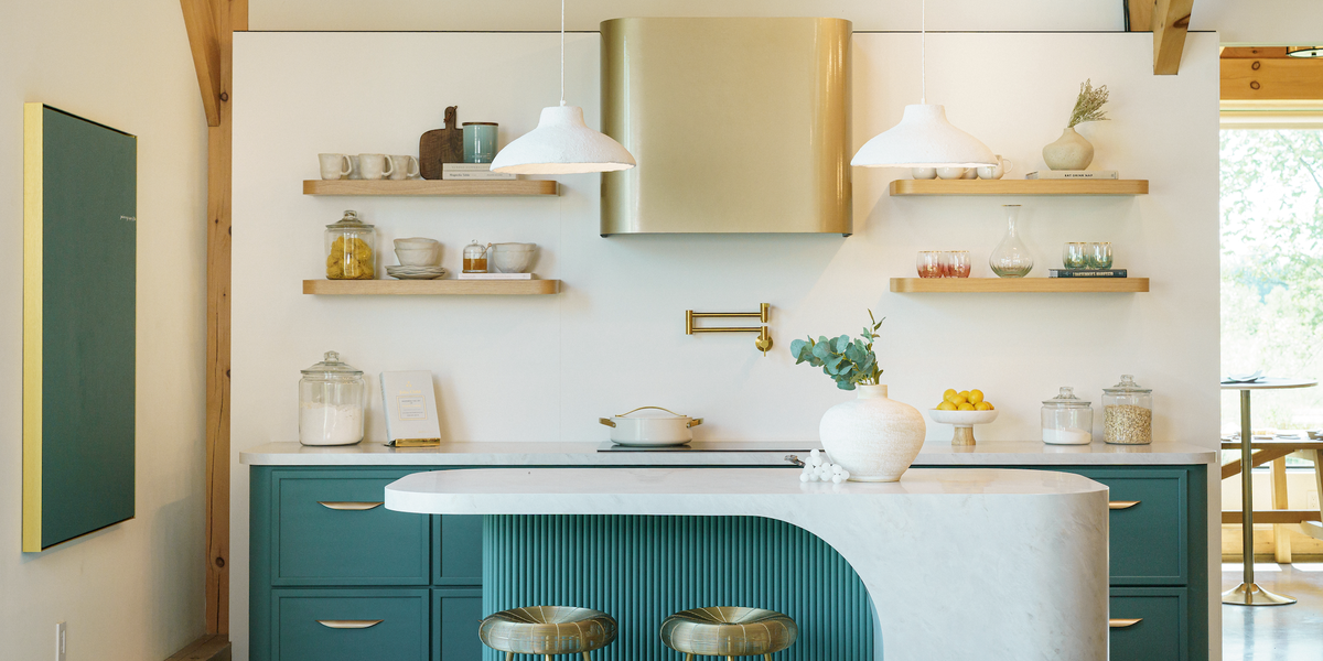
Smoky jade green is one of the most important kitchen cabinet color trends for 2026 because it hits that rare sweet spot between color and calm. It is not emerald, not mint, and definitely not the avocado appliance green your grandparents may remember from the 1970s. This version is deeper, grayer, and more refined. Think green with a soft foggy filter: earthy, elegant, and surprisingly easy to live with.
This color works especially well for homeowners who want something beyond white but are nervous about going too bold. Smoky jade has enough color to make a statement, but its muted base keeps it grounded. It pairs beautifully with light oak floors, creamy quartzite countertops, white zellige tile, brushed brass hardware, and warm bronze lighting. In a small kitchen, smoky jade can create a jewel-box effect. In a larger kitchen, it gives the cabinetry depth without making the room feel heavy.
How to Use Smoky Jade Cabinets
For a full kitchen, use smoky jade on Shaker or slim-frame cabinet doors with a satin finish. The slight sheen helps bounce light while still looking sophisticated. If you are hesitant, try it on a kitchen island, pantry wall, coffee bar, or lower cabinets. This shade is also excellent for homes with garden views because it visually connects the kitchen to the outdoors.
Best pairings include creamy white walls, light oak shelving, honed marble, Taj Mahal quartzite, antique brass pulls, and linen Roman shades. Avoid pairing smoky jade with icy gray floors or stark blue-white walls, which can make the color look colder than intended. The goal is calm luxury, not “moody dentist office.”
2. Gray-Green: The Traditional-Meets-Modern Favorite
Gray-green cabinets are expected to remain huge in 2026 because they blend classic restraint with modern softness. This is the kind of cabinet color that looks good in a historic home, a new-build kitchen, or a small city apartment where every design choice needs to earn its rent. Gray-green has enough neutrality to age gracefully, but enough personality to keep the kitchen from feeling plain.
Design pros often recommend gray-green because it plays well with both warm and cool materials. It can sit beside espresso-stained wood, white oak, limestone, marble, soapstone, nickel, brass, or bronze. That flexibility makes it one of the safest “not white” choices for homeowners who want a kitchen cabinet color trend that will not feel outdated in two years.
How to Style Gray-Green Cabinets
Gray-green works beautifully with tumbled limestone countertops, creamy backsplashes, antique bronze hardware, and warm wood accents. It is particularly strong in transitional kitchens, where the goal is to avoid anything too farmhouse, too modern, or too “I copied this from a showroom while panicking.”
Use gray-green on perimeter cabinets with a natural wood island for a layered look. Or reverse the formula: warm white perimeter cabinets and a gray-green island. This color also loves texture, so consider handmade tile, fluted glass cabinet inserts, woven counter stools, and natural fiber rugs. Because gray-green changes with light, always test a sample on multiple cabinet doors before committing. Morning light may bring out the green, while evening light may make the shade look more charcoal or sage.
3. Warm Cream and Putty: The New White Kitchen
White kitchens are not disappearing in 2026, but the version that feels current is much warmer. Instead of crisp, cool white cabinets, designers are favoring cream, putty, cashmere, mushroom, and soft beige tones. These colors still give you a bright kitchen, but they have more depth and less of that “brand-new refrigerator standing in an empty room” feeling.
Warm cream cabinets are ideal for homeowners who want timeless style without the sharpness of pure white. They make kitchens feel softer, especially when paired with natural stone, warm wood, and mixed metals. Putty and mushroom tones go a step deeper, creating a tailored look that feels expensive even when the budget is behaving like it has trust issues.
How to Make Warm Neutrals Feel Fresh
The secret is contrast. Warm cream cabinets need texture and depth around them so they do not look flat. Pair them with white oak floors, walnut accents, unlacquered brass hardware, creamy stone with golden veining, or a handmade tile backsplash. If your kitchen gets strong natural light, a putty cabinet can look incredibly elegant. If your kitchen is darker, choose a creamier shade with a higher light-reflecting quality.
Warm neutrals also work well in two-tone kitchens. Try cream upper cabinets with mushroom lower cabinets, or putty perimeter cabinets with a walnut island. This layered approach creates dimension while staying calm and sophisticated. It is perfect for people who want their kitchen to whisper “custom design” instead of shout “I bought every trendy thing in one weekend.”
4. Saturated Blue: Confident, Classic, and Fresh
Blue kitchen cabinets are not new, but the 2026 version feels more saturated and intentional. Designers are moving beyond safe navy into brighter sky blues, smoky denim tones, and deep blue-green shades that feel elegant without being predictable. Blue is popular because it offers color while still feeling familiar. Most people are comfortable with blue, which makes it a smart choice for homeowners who want personality without scaring future buyers, relatives, or themselves.
Saturated blue cabinets can make a kitchen feel fresh, polished, and slightly coastal without relying on seashells, rope decor, or signs that say “Beach Vibes” in a house located three states from the ocean. The key is choosing a blue with sophistication. Look for shades with gray, green, or black undertones rather than primary blue, which can feel too playful for permanent cabinetry.
Best Ways to Use Blue Cabinets in 2026
Blue is especially strong on kitchen islands, bar cabinets, butler’s pantries, and lower cabinets. Pair saturated blue with walnut, white oak, matte black hardware, polished nickel, soft white tile, or marble countertops. For a more dramatic look, use blue cabinets with dark soapstone counters and warm brass lighting. For a lighter look, combine blue lowers with cream uppers and pale oak floors.
If you are painting a full kitchen blue, keep the surrounding materials simple. A subtle backsplash, quiet countertop, and streamlined hardware will allow the color to feel elegant rather than busy. Blue already has main-character energy. It does not need a competing backsplash doing jazz hands in the corner.
5. Plum, Merlot, and Brown-Purple: The Bold Accent Color
Plum and merlot cabinet colors are coming in strong for 2026, especially as accent shades for islands, wet bars, pantry cabinets, and built-in storage walls. These colors are rich, moody, and grown-up. They have the drama of black cabinets but with more warmth and originality. A muted plum can look luxurious beside dark wood, marble, bronze, and creamy walls.
This trend also connects to the broader move toward brown-based colors. Instead of cool jewel tones, designers are favoring shades with earthy undertones: raisin, aubergine, wine, fig, and cocoa-plum. These hues feel cozy and sophisticated rather than flashy. Used well, they can make a kitchen look custom, layered, and memorable.
How to Use Plum Without Overdoing It
Plum is best used strategically. A plum island with warm cream perimeter cabinets can be stunning. So can a merlot wet bar in a dining area or a pantry wall framed by walnut shelving. Keep the backsplash simple, especially if the cabinet color is deep. A glossy white tile, honed marble slab, or quiet stone surface lets the plum shine without turning the kitchen into a color wrestling match.
For hardware, try antique brass, oil-rubbed bronze, or aged nickel. Avoid overly shiny chrome, which can make the palette feel less warm. Lighting matters here, too. Plum cabinets need warm bulbs and good task lighting so they read as rich and inviting rather than dark and mysterious in a “where did I put the cutting board?” way.
6. Ochre Yellow and Golden Brown: The Happy Heritage Shade
Ochre yellow is one of the most cheerful cabinet colors rising for 2026, but it is not bright lemon yellow. The trend is deeper, earthier, and more golden, with brown undertones that make it feel grounded. Think old-world pantry, sunny breakfast room, European cottage kitchen, or a golden spice jar that somehow became cabinetry.
This color works because people want kitchens that feel welcoming. Ochre brings warmth and optimism, but it is more sophisticated than a simple bright yellow. It can lean traditional with marble and brass, rustic with butcher block and terracotta, or modern with flat-panel doors and black accents. The brown undertone gives it flexibility, which is why designers see it working across different styles.
Where Ochre Yellow Looks Best
Use ochre on lower cabinets, a freestanding hutch, a coffee station, or a pantry cabinet if you want a smaller dose. For a bolder kitchen, paint all cabinets ochre and balance the look with creamy walls, stone countertops, simple tile, and natural wood. This color looks especially beautiful with unlacquered brass, aged copper, deep green accents, and warm white walls.
Ochre is also a great choice for kitchens that need personality but do not get much natural light. While dark colors can sometimes make a shadowy kitchen feel smaller, ochre adds warmth and glow. Just test carefully: some yellows can turn too orange under artificial light. Choose a muted golden shade rather than a highlighter with cabinet doors.
Bonus Trend: Natural Wood Cabinets Are Bigger Than Ever
Although this article focuses on painted kitchen cabinet colors, natural wood deserves a major mention. Wood cabinetry is one of the strongest design directions for 2026. Medium oak, white oak, walnut, and darker brown stains are replacing flat white and cold gray in many remodeled kitchens. The appeal is obvious: wood adds instant warmth, texture, and natural variation.
Wood also works beautifully with every color on this list. Smoky jade looks softer beside light oak. Gray-green becomes richer with espresso wood. Warm cream feels more dimensional with walnut. Blue gains elegance from oak or dark-stained accents. Plum becomes more sophisticated beside deep brown cabinetry. Ochre feels grounded with natural wood shelves or beams.
If you are not ready for full wood cabinets, add a wood island, range hood, open shelving, pantry doors, or interior cabinet detail. Even a small amount of wood can make painted cabinets feel more expensive and less flat. The best 2026 kitchens are not one-note. They mix color, texture, stone, metal, and wood into a room that feels like someone actually lives there and occasionally makes pancakes.
How to Choose the Right 2026 Cabinet Color for Your Kitchen
Before choosing a cabinet color, look at the permanent elements in your kitchen. Floors, countertops, backsplash, appliances, and natural light will affect how any paint color appears. A smoky green that looks perfect online may look dull beside a cool gray floor. A cream cabinet may look yellow next to a bright white countertop. A plum island may look luxurious in daylight and almost black at night.
Start by collecting three to five cabinet color samples and testing them vertically, not just flat on a table. Cabinet doors catch light differently than walls. View samples in the morning, afternoon, and evening. Then compare them beside your countertop, backsplash, flooring, and hardware. The winning color should make the other materials look better, not start a design argument before breakfast.
Also consider your risk level. If you want timeless and safe, choose warm cream, putty, mushroom, or gray-green. If you want color with broad appeal, choose smoky jade or saturated blue. If you want a standout kitchen, consider plum or ochre. If you are remodeling for resale, use bolder colors on islands or smaller zones rather than every cabinet surface. If you are designing your forever kitchen, choose what makes you happy. You are the one unloading the dishwasher at 10:43 p.m., not an imaginary buyer from the future.
Real-Life Experience: What These Colors Feel Like After the Paint Dries
One of the biggest lessons from working with kitchen color ideas is that cabinet colors feel different once they cover an entire room. A tiny paint chip can be charming. Thirty cabinet doors in that same color can be a full personality test. That is why the best 2026 kitchen cabinet colors are not just trendy; they are livable.
Warm cream and putty cabinets tend to be the easiest to adjust to. They brighten the room, hide minor dust better than stark white, and pair well with changing decor. In everyday life, these colors feel calm and forgiving. You can switch from brass to nickel hardware, add colorful dishes, change bar stools, or update lighting without repainting the entire kitchen. For busy families, warm neutrals are the design equivalent of a friend who always brings snacks and never creates drama.
Green cabinets create a different experience. Smoky jade and gray-green often make a kitchen feel more connected to nature, especially when there are windows, plants, wood floors, or stone surfaces nearby. They also tend to make white dishes, brass hardware, and wood cutting boards look more intentional. However, green is sensitive to lighting. In north-facing kitchens, it can look cooler and grayer. In warm afternoon light, it can become richer and more earthy. The practical tip is simple: sample generously before painting.
Blue cabinets are usually easy to love, but the undertone matters. A blue with gray or green undertones feels mature and design-forward. A bright primary blue can feel fun for a month and loud by month three. In real homes, blue works especially well when balanced by wood. A walnut island top, oak floors, or woven counter stools can stop blue cabinets from feeling too crisp or formal.
Plum and merlot shades are the most dramatic. They can make a kitchen feel expensive, intimate, and memorable. They are also best for homeowners who enjoy moodier interiors. If your entire home is light, airy, and beige, a deep plum kitchen island may feel like it wandered in from another house wearing velvet. But when paired with warm neutrals, dark wood, simple stone, and soft lighting, plum can be stunning. It is especially effective in smaller feature areas, such as a bar cabinet or pantry wall.
Ochre yellow is the color people underestimate. On paper, yellow cabinets can sound risky. In real kitchens, a muted ochre can feel sunny, historic, and surprisingly elegant. It is a smart choice for older homes, cottage kitchens, breakfast nooks, and spaces that need warmth. The trick is avoiding anything too neon or too orange. A golden, slightly browned yellow is much easier to live with than a bright yellow that looks like it has had three espressos.
Another experience-based tip: cabinet finish matters almost as much as color. Matte finishes look soft and modern but can show fingerprints, especially in dark shades. Satin finishes are often the sweet spot because they are easier to clean and reflect just enough light. High-gloss cabinets can look sleek, but they also reveal smudges with the confidence of a detective. For most 2026 cabinet colors, satin or low-sheen enamel is the practical winner.
Hardware can also change the personality of a cabinet color instantly. Smoky jade with brass feels warm and organic. Smoky jade with matte black feels more modern. Cream cabinets with polished nickel feel classic. Cream with bronze feels old-world. Blue with brass feels tailored; blue with chrome feels coastal; blue with black feels contemporary. Before replacing cabinets, try changing hardware. It is cheaper than a remodel and less emotionally intense than choosing between twelve nearly identical shades of beige.
Finally, the best kitchen cabinet color is the one that supports how you actually live. If your kitchen is the family command center, choose a forgiving color and durable finish. If it is a small apartment kitchen, use color to create charm and identity. If it is a high-end remodel, layer painted cabinetry with wood, stone, and mixed metals. Trends are useful, but your daily routine gets the final vote.
Conclusion
The kitchen cabinet colors design pros say will be huge in 2026 all point in the same direction: warmer, richer, more personal kitchens. Smoky jade, gray-green, warm cream, saturated blue, plum, and ochre yellow offer homeowners more expressive choices than the all-white kitchens of the past decade. At the same time, these shades remain grounded enough to work with timeless materials like wood, stone, brass, bronze, and handmade tile.
The smartest approach is not to chase a trend blindly. Instead, use these 2026 kitchen cabinet color trends as inspiration for a room that fits your home, light, lifestyle, and appetite for color. Whether you choose a soft putty cabinet, a moody green island, or a golden ochre pantry, the goal is the same: a kitchen that feels warm, useful, beautiful, and unmistakably yours.