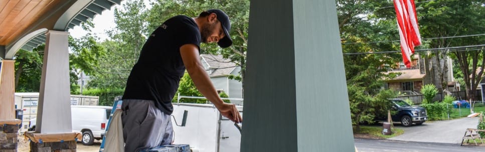
Choosing an exterior color palette sounds easy right up until you are actually forced to do it. Then suddenly you are staring at stain samples like they are final exam questions, wondering whether “soft gray coastal charm” is timeless or just code for “my house disappeared into the fog.” That is exactly why the color conversation around the TOH 2018 Idea House is so interesting. This was not a plain box begging for a safe beige. It was a layered, Craftsman-inspired home in Narragansett, Rhode Island, with clapboard siding, cedar shingles, stone veneer, handcrafted trim, warm cedar details, and black muntins already bringing plenty of personality to the party.
In other words, this house already had opinions.
And that is what made the palette decision so important. The exterior color could not just be pretty on a paint chip. It had to connect a lot of moving parts: the coastal setting, the Craftsman roots, the mixed materials, the modern touches, and the relaxed “staycation” mood that defined the house. The winning choice, Steely Sea, is a smart answer. But the real fun is in studying the other contenders and asking the question This Old House wanted readers to ask in the first place: Which one would you have chosen?
Why the TOH 2018 Idea House Was a Tricky Color Puzzle
The TOH 2018 Idea House was not designed as a generic showcase home. It was a 2,700-square-foot cottage less than a mile from the beach, with classic Craftsman curb appeal and a more modern interior attitude. That combination matters because Craftsman homes traditionally lean into natural materials and earthy, grounded colors, while coastal houses often invite breezier blues, grays, weathered woods, and sun-washed neutrals.
So right away, the design team had to balance two instincts that do not always agree. One says, “Honor the architecture.” The other says, “Let the location speak.” The home’s exterior materials made that balancing act even harder. Smooth clapboards, rough-hewn shingles, stone, cedar railings, cedar porch ceilings, cedar brackets, and black window muntins all bring their own texture, weight, and temperature. Add too many competing tones, and the façade feels fussy. Go too quiet, and all that craftsmanship starts whispering when it should be singing.
That is why the palette search was not about finding a “nice color.” It was about finding the right relationship between color, texture, and mood. The team also wanted a solid stain with enough durability for a coastal community, while still preserving the visual beauty of the cedar elements. That alone rules out a lot of lazy color thinking. You cannot slap one loud color everywhere and call it character. Well, you can, but the house may never forgive you.
The Four Color Directions TOH Considered Before Choosing a Winner
1. Gray Over Gray
This option made perfect sense on paper. Gray-shingled homes are deeply familiar in coastal New England, and for good reason. They feel weathered, classic, relaxed, and regionally appropriate. On the TOH house, the gray-on-gray approach would have helped the home blend effortlessly into Narragansett’s visual language.
But that was also the problem. It was too expected. The TOH team felt the palette became a little choppy because the siding, shingles, and trim each had their own gray-based treatment. Instead of reading as unified, the house started to break into parts. That is a risk with heavily nuanced neutral palettes: if the tones are too close but not close enough, the eye reads the shifts as busyness rather than harmony.
If your taste runs classic coastal and low-drama, Gray Over Gray is still a respectable pick. It is the oatmeal sweater of exterior design: dependable, flattering, and never looking like it is trying too hard. But for an Idea House meant to inspire, it did not have quite enough spark.
2. Nature Inspired
This palette probably had the strongest Craftsman credentials of the bunch. Traditionally, Craftsman homes work beautifully in earthy greens, warm browns, muted grays, and tones that seem borrowed from bark, stone, moss, and soil. Better Homes & Gardens and Benjamin Moore both point to nature-based, earthy, and muted colors as especially compatible with the Craftsman style, and that logic tracks perfectly here.
The problem was not that the palette looked wrong. It looked almost too right. TOH felt it blended too seamlessly into the surroundings and lacked the modern edge they wanted. That is a subtle but important distinction. A house can be beautifully appropriate and still fail to create the visual energy you want. This palette honored the home’s architecture, but it may have underplayed its personality.
I can imagine many homeowners choosing this option and living happily ever after with it. It is thoughtful, grounded, and mature. It says, “I enjoy natural materials and probably own at least one excellent throw blanket.” But if the goal is to make cedar details, black muntins, and bleached shingles stand out with a bit more attitude, this scheme stays a little too polite.
3. Stormy Slate
Now we are talking. Stormy Slate brought drama to the curb without going full haunted-lighthouse chic. The dark purplish-black columns and trim, paired with cloudy gray siding, created a handsome, moody contrast. TOH also noted that the warm cedar railings really popped against this cooler backdrop, which is exactly what good contrast is supposed to do. When natural wood meets a cool, saturated body color, the result often feels richer and more intentional.
This option is the best argument for a bolder exterior on a Craftsman-meets-coastal home. It plays well with black windows, stone, and cedar, and it gives the home a stronger silhouette from the street. Official window brands like Pella and Andersen regularly describe black frames as a way to create contrast and modern appeal, and this palette clearly leaned into that same idea.
So why did TOH pass on it? Because it was too close to the palette used on a nearby Jamestown project house. That is a practical editorial decision, but as a pure design choice, Stormy Slate is excellent. If you like exteriors with a little mystery and a little swagger, this was probably your favorite.
4. Regal in Red
Regal in Red was the wildcard. Deep burgundy on a Craftsman house can be gorgeous when it is balanced by natural shingles, stone, and warm wood. Historically, earthy reds and coppery tones do have a place in Craftsman language, so this was not some random left-field stunt. It had roots.
TOH described it as rich and distinctive, and I agree. In fact, it may have been the most memorable option emotionally. The bleached-oil cedar shingles against the dark red body would have created a warm, layered, almost storybook exterior. The issue was setting. TOH felt it belonged better in a more rural environment than in this particular coastal neighborhood.
That makes sense. Coastal homes often feel best when their colors echo sea, sky, driftwood, dunes, or storm clouds. Burgundy can absolutely work near the water, but it introduces more visual weight and old-world formality. For some readers, that is a plus. For this specific house, it pushed the mood away from easygoing coastal freshness and toward countryside romance.
Why Steely Sea Was the Right Winner
TOH ultimately chose Steely Sea, and honestly, it is hard to argue with the result. The name alone sounds like a weather report you would gladly frame. More important, it solved nearly every challenge the house presented.
First, it respected the location. A blue with shifting gray undertones feels entirely at home near the water, but it does not scream “beach house” in a cartoonish way. This is not flip-flop turquoise. It is a mature coastal blue, the kind of tone that can look quiet in shade, silvery in cloud cover, and lively in bright sun. HGTV’s coastal palettes often lean into maritime blues, breezy grays, and soft greens for exactly this reason: they feel fresh without becoming novelty colors.
Second, Steely Sea respected the architecture. Craftsman homes thrive when their exterior colors support natural materials instead of competing with them. Because the TOH house already had stone, cedar, shingles, and sturdy trim details, the best body color was one that unified those textures rather than flattening them. Steely Sea gave the house an identity while letting the cedar railings, enviro-bleached shingles, and black muntins pop.
Third, it handled contrast beautifully. The blue-gray body made the cedar accents feel warmer, the black muntins feel sharper, and the lighter shingle elements feel more intentional. That is a big reason the façade feels cohesive instead of crowded. Good exteriors are not just about the prettiest single color. They are about what every material looks like next to every other material.
And finally, Steely Sea had range. It was distinctive without being disruptive, which was exactly how TOH described it. That may be the most useful phrase in the whole debate. Homes need character, but they also need staying power. An exterior should still feel smart five years later, after the hydrangeas have bloomed and died back a dozen times and your neighbors have made at least three questionable porch-furniture decisions. Steely Sea had that balance.
Which Palette Would I Have Chosen?
If I had been on the decision team, I still would have chosen Steely Sea.
Stormy Slate would have been my runner-up because it is striking, elegant, and wonderfully moody. But Steely Sea is the better all-around answer for this house. It bridges the gap between Craftsman tradition and coastal modernity better than any of the other options. It feels rooted in place, flattering to the materials, and flexible in changing light. It also gives the home a memorable identity without turning the exterior into a one-note performance.
Gray Over Gray is lovely but too safe. Nature Inspired is true to Craftsman logic but a touch too quiet. Regal in Red is beautiful but slightly off-message for the setting. Steely Sea lands in the sweet spot: enough color to feel fresh, enough gray to feel sophisticated, and enough depth to make the house look designed rather than merely painted.
What Homeowners Can Learn from the TOH 2018 Palette Debate
Start with architecture, not impulse
Exterior color is not a solo act. Your siding, trim, roof, windows, stone, porch ceiling, and landscaping are all in the band. Craftsman homes, especially, reward palettes that acknowledge natural materials and structural details.
Context matters more than the paint chip
House Beautiful makes a good point when it emphasizes climate, surroundings, and fixed exterior elements. A color that looks perfect in isolation can look wrong once you place it beside black windows, cedar railings, or a cool-toned stone veneer.
Texture changes everything
TOH’s palette page is a reminder that clapboards, shingles, stone, and cedar do not absorb color the same way emotionally, even if they technically sit in the same palette. Texture is why “almost matching” can sometimes look more chaotic than intentionally contrasting.
Let wood be wood when you can
One of the smartest moves in this house was preserving the visual warmth of the cedar. Stain systems and cedar guides alike emphasize that the right finish can protect wood while still honoring its grain, texture, and natural beauty. That warmth became one of the exterior’s most important supporting characters.
Choose a mood, not just a color
Do you want the house to feel grounded, moody, breezy, formal, relaxed, historic, or fresh? TOH did not just choose blue. They chose a mood: coastal, calm, refined, and alive in changing light. That is the real lesson.
A Longer Reflection on the Experience of Choosing a Palette for This House
What I love most about this topic is that it captures the emotional side of design that homeowners rarely talk about honestly. We all pretend exterior color choices are rational. We use phrases like “undertone,” “contrast,” and “architectural appropriateness,” which are useful, yes, but also slightly suspicious. Because what really happens is this: you look at one palette and think, That house seems confident. You look at another and think, That one feels peaceful. You look at a third and think, I would absolutely spill coffee on myself while trying to live up to that level of drama.
The TOH 2018 Idea House is such a good case study because it is easy to imagine standing outside it and feeling each option differently. Gray Over Gray would have made the house feel like it had always been there, as though fog and salt air had quietly collaborated on its behalf for decades. Nature Inspired would have made it feel grounded and tucked into the landscape, the kind of house that belongs to someone who knows all the birds by sound and owns very sensible outdoor lanterns. Stormy Slate would have made the house look like the smart, stylish person at the party who somehow wears dark colors near the ocean and still looks relaxed. Regal in Red would have turned it into the memorable one, the house everyone talks about on the walk home.
Then there is Steely Sea, which feels like the version that understands the assignment without acting smug about it. It has movement. It changes. It gives the exterior atmosphere. You can imagine it early in the morning looking soft and misty, then stronger by midday, then moodier again in late afternoon. That kind of color is satisfying because it does not reveal everything at once. It keeps participating in the life of the house.
And that, to me, is what separates a good palette from a great one. A great palette does not just coordinate. It interacts. It lets sunlight, shadow, wood grain, stone texture, and surrounding landscape all have a turn. It rewards a second glance. It makes the front porch feel warmer, the windows look sharper, and the whole house seem more settled into itself.
If I were walking through the decision process for this home in real life, I know I would have gone through the usual emotional roller coaster. First, I would have admired the sensible options. Then I would have briefly fallen in love with the dramatic one. Then I would have tried to convince myself I was bold enough for the red. Then, after one more look at the cedar, the shingles, the black muntins, and the Rhode Island light, I would have come right back to Steely Sea.
Because some colors do not just look good on a house. They explain the house. And in the end, that is what the winner did here.
Conclusion
If the question is which color palette I would have chosen for the TOH 2018 Idea House, my answer is clear: Steely Sea. It captured the coastal setting without becoming cliché, respected the Craftsman bones without feeling heavy, and gave every exterior material room to look its best. More than anything, it proved that the smartest exterior colors are not always the boldest or the safest. They are the ones that make architecture, materials, and place feel like they were meant to be together all along.