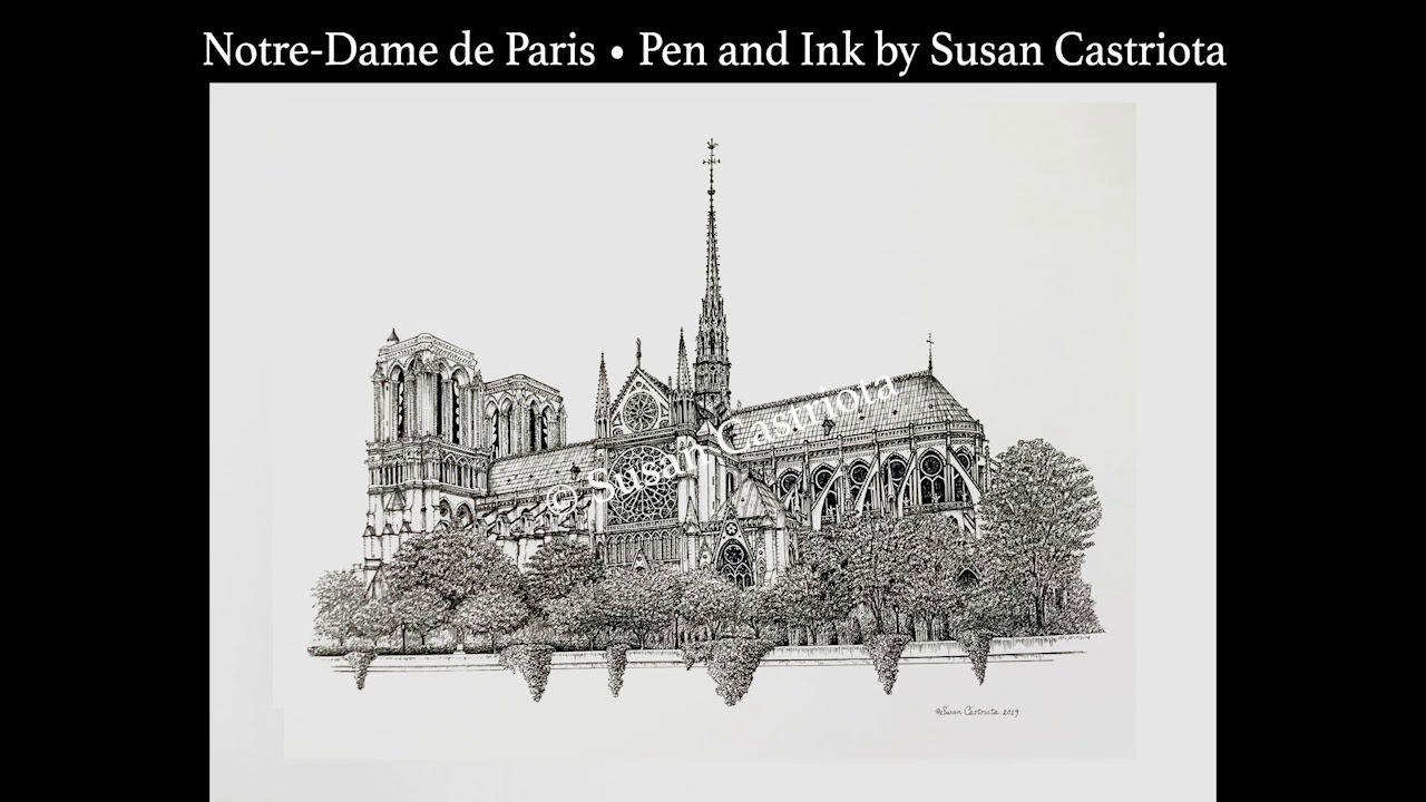
Some buildings simply refuse to be quiet. Notre-Dame de Paris is one of them. Even when viewed from a postcard, a travel book, a news broadcast, or a careful pen-and-ink illustration, the cathedral seems to speak in stone, shadow, bells, buttresses, and the occasional dramatic gargoyle who clearly knows everyone’s secrets. That is why Susan Castriota’s pen-and-ink rendering of Notre-Dame de Paris Cathedral feels so fitting: the medium matches the monument. Both depend on structure, patience, precision, and the kind of details that reward a second look.
Castriota, an award-winning American artist known for hand-drawn illustrations of historic buildings, private homes, landmarks, and city skylines, has created a signed pen-and-ink print of Notre-Dame de Paris based on her original rendering. The work stands at the intersection of architectural portraiture, heritage art, and visual storytelling. It is not merely a drawing of a famous cathedral. It is a tribute to a landmark that has survived revolutions, restorations, literature, tourism, fire, and the intense scrutiny of people who believe every roofline deserves an opinion.
For art lovers, architecture fans, Paris dreamers, and collectors of detailed black-and-white illustration, the appeal is easy to understand. Pen and ink strips away color and asks the viewer to focus on line, rhythm, light, and form. With Notre-Dame, that means the eye travels across pointed arches, towers, tracery, sculptural niches, rose windows, and flying buttresses. The result is both historical and intimate, as if the cathedral has paused long enough for its portrait.
Who Is Susan Castriota?
Susan Castriota is an accomplished illustrator whose body of work includes hundreds of custom drawings of homes, historical landmarks, city skylines, and meaningful places. Her background includes training at the Art Institute of Pittsburgh and fine art study in Florence, Italy, a city that knows a thing or two about turning buildings into visual poetry. Over the years, her illustrations and greeting card designs have reached a wide audience, including clients connected to businesses, institutions, political figures, and collectors of architectural art.
One of the defining qualities of Castriota’s work is her attention to places that carry personal or cultural memory. A house is not just siding and shingles. A skyline is not just vertical shapes trying to out-tall each other. A cathedral is not simply a tourist attraction with excellent lighting at sunset. In her hands, architecture becomes biography. Buildings appear as witnesses: to family history, civic pride, national identity, or in the case of Notre-Dame de Paris, centuries of faith, art, politics, disaster, and renewal.
Why Notre-Dame De Paris Is an Ideal Subject for Pen and Ink
Notre-Dame de Paris sits on the Île de la Cité, the historic island at the heart of Paris. Construction began in the 12th century, traditionally associated with Bishop Maurice de Sully, and continued across generations. The cathedral became one of the great achievements of French Gothic architecture, known for its ribbed vaults, pointed arches, sculpted portals, flying buttresses, towers, and stained-glass rose windows. It is the kind of building that makes a ruler nervous and an artist delighted.
Pen and ink is especially well suited to Gothic architecture because Gothic buildings are, in a sense, drawings already made out of stone. Their vertical lines lift the eye upward. Their arches create repeating rhythms. Their carved details invite close inspection. Their shadows deepen under portals and around columns. A pen-and-ink artist can translate these features into hatch marks, cross-hatching, stippled textures, and delicate outlines. Where a painter might use color to create mood, the ink illustrator builds atmosphere through density, spacing, and contrast.
In Castriota’s Notre-Dame illustration, the viewer can imagine the discipline required to balance the cathedral’s massive presence with its lace-like details. Too few lines, and the building loses its Gothic richness. Too many lines, and the whole thing becomes a very elegant bowl of spaghetti. The success of an architectural ink drawing depends on control: knowing where to define, where to suggest, and where to let the white of the paper breathe.
The Cathedral Behind the Drawing
Notre-Dame is not famous by accident. Its west facade, with two massive towers, three portals, and a gallery of kings, is one of the most recognizable architectural compositions in the world. The cathedral’s flying buttresses helped support high walls and large windows, allowing medieval builders to pursue height and light in daring ways. Inside, the nave once created a dramatic passage of stone columns, vaults, chapels, glass, and sacred space.
The cathedral’s history also includes major moments far beyond architecture. Napoleon Bonaparte crowned himself emperor there in 1804. Victor Hugo’s 1831 novel, often known in English as The Hunchback of Notre-Dame, helped renew public interest in the neglected cathedral. In the 19th century, architect Eugène Viollet-le-Duc led a major restoration that added the famous spire later destroyed in the 2019 fire. Notre-Dame became part of the UNESCO-listed “Paris, Banks of the Seine” World Heritage area in 1991, further recognizing its role in the broader cultural landscape of Paris.
Then came April 15, 2019. The fire that tore through the cathedral’s roof and brought down the spire shocked the world. For many people, watching the flames felt strangely personal, even if they had never visited Paris. That reaction says something powerful about heritage: certain places belong to a city, but they also belong to the shared imagination. Notre-Dame’s reopening ceremonies in December 2024 marked not just the return of a building, but the return of a symbol.
Pen and Ink as a Language of Memory
Pen-and-ink illustration has a long relationship with architecture. Before digital renderings, 3D modeling, drone photography, and phones that take better pictures than many old cameras, artists and draftspeople used line to record structures with clarity and feeling. Ink can be technical, romantic, documentary, or expressive. It can show a building exactly, or it can reveal how the building feels when the light hits it just right.
Common techniques include hatching, cross-hatching, contour lines, stippling, and line-weight variation. Hatching can suggest shade along a wall. Cross-hatching deepens shadow under arches or inside recessed doorways. Stippling can soften stone texture without turning the paper into a gray fog. Stronger outlines can pull a tower forward, while lighter lines can push distant details back. In other words, a skilled pen-and-ink artist does not merely draw lines; she conducts them.
This matters in a subject like Notre-Dame because the cathedral is both monumental and intricate. A camera can capture detail instantly, but a drawing reveals decisions. Every line is a choice. Every omitted line is also a choice. That handmade quality gives Castriota’s Notre-Dame print its charm. It offers a slower way of seeing a landmark that is usually photographed by crowds moving at tourist speed.
What Makes Castriota’s Notre-Dame Illustration Stand Out?
Castriota’s Notre-Dame print is described as a signed pen-and-ink work based on an original art rendering. Signed prints are appealing because they preserve the accessibility of reproduction while keeping a direct connection to the artist. The 18-by-24-inch format gives the cathedral enough room to breathe, which is important when the subject contains enough architectural detail to keep a patient viewer busy for a very pleasant afternoon.
The illustration also benefits from Castriota’s experience with historical buildings. Drawing architecture is not the same as drawing a vase, a face, or a sleeping dog, although sleeping dogs have their own Gothic moods. A landmark requires proportion, perspective, and respect for recognizable forms. With a building as famous as Notre-Dame, viewers know the silhouette. They know the towers. They expect the drawing to feel truthful, even if the artist uses interpretation and stylization.
That is where architectural illustration becomes a balancing act. The artist must be accurate enough to honor the subject, but expressive enough to make the work feel alive. Castriota’s pen-and-ink approach is effective because it treats Notre-Dame as both structure and story. The cathedral is presented not as a flat icon, but as a living monument shaped by centuries of craftsmanship and public affection.
Notre-Dame After the Fire: Why the Image Feels Even More Meaningful
After the 2019 fire, images of Notre-Dame gained new emotional weight. Before the disaster, many people saw the cathedral as permanent, almost too famous to be vulnerable. The fire reminded the world that even stone legends need care, funding, scaffolding, firefighters, carpenters, conservators, engineers, and people willing to argue passionately about oak beams.
The restoration brought together traditional craft and modern preservation science. Rebuilding the roof and spire required architectural research, skilled carpentry, masonry work, cleaning, conservation, and enormous coordination. The reopened cathedral now stands as a symbol of resilience, but also of human labor. It took centuries to build, hours to burn, and years to restore. That timeline gives any artistic representation of Notre-Dame a deeper resonance.
Castriota’s illustration, though created as an artwork rather than a construction report, belongs naturally within this renewed appreciation. A pen-and-ink drawing slows down the act of looking. It asks viewers to notice buttresses, towers, openings, and ornamental rhythms. In a culture that often scrolls past images in half a second, that is practically a heroic act of rebellion. Tiny lines, big cathedral, zero apologies.
Why Collectors Love Architectural Prints
Architectural prints appeal to people for many reasons. Some buyers collect them as travel memories. Others use them as decor because black-and-white line art fits easily into many interiors. Some choose architectural illustration because a specific building matters to them: a childhood home, a university hall, a church, a courthouse, a favorite city block, or a landmark visited during a once-in-a-lifetime trip.
A Notre-Dame print carries several layers of meaning at once. It can represent Paris, Gothic architecture, European history, Catholic heritage, artistic endurance, or personal memory. It can also simply represent beauty, which is allowed. Not every wall decoration needs to deliver a dissertation before breakfast.
For collectors, a signed print by an artist known for hand-rendered architectural work offers a more personal alternative to mass-produced tourist imagery. It suggests craft. It suggests care. It suggests that someone looked at the cathedral long enough to understand its visual grammar and then translated that grammar into ink.
How to Display a Pen-and-Ink Notre-Dame Print
A detailed pen-and-ink print works beautifully in spaces where viewers can approach it closely. A hallway, study, reading nook, library wall, office, entryway, or quiet corner can all be good choices. Because the artwork is likely monochrome or nearly monochrome, framing choices matter. A simple black, white, walnut, or antique gold frame can emphasize the cathedral without competing with it.
Matting can also help. A generous mat gives the print visual breathing room, especially when the illustration contains dense linework. Good lighting is important, but direct sunlight should be avoided to protect the paper over time. If the piece is being displayed as part of a travel wall, it can pair well with maps, Paris photography, vintage postcards, or other architectural prints. Just try not to crowd it with twelve Eiffel Towers and a neon croissant sign. Restraint is chic. The croissant may file a complaint, but it will survive.
Art, Architecture, and the Pleasure of Looking Slowly
One reason Susan Castriota’s Notre-Dame illustration feels relevant today is that it encourages slow looking. Notre-Dame itself rewards patience. From a distance, it is a grand silhouette. Up close, it becomes an encyclopedia of stone: saints, kings, arches, windows, columns, shadows, and carved creatures with faces that seem to say, “Yes, I have been watching Paris longer than your entire family tree.”
Pen-and-ink drawing mirrors that experience. At first glance, the viewer sees the cathedral. Then the eye begins to separate the facade into patterns. The towers become vertical weight. The windows become light. The shadows become depth. The linework becomes evidence of the artist’s hand. The longer you look, the more the drawing opens.
This is the quiet power of architectural art. It does not need to shout. It invites attention and then rewards it. In a world full of high-speed images, a hand-rendered Notre-Dame print offers a refreshing reminder that some subjects deserve time, care, and maybe a comfortable chair.
Related Experiences: Living With the Image of Notre-Dame
Experiencing a pen-and-ink illustration of Notre-Dame de Paris is different from seeing a photograph of the cathedral. A photograph often says, “Here is what was in front of the lens.” A drawing says, “Here is what the artist chose to understand.” That difference becomes especially meaningful when the subject is a place as layered as Notre-Dame. Many people first encounter the cathedral through travel dreams, literature, history lessons, movies, or news coverage. By the time they see it in art, they may already carry their own emotional version of it.
Imagine standing before Castriota’s Notre-Dame print in a quiet room. At first, the piece might feel familiar: the twin towers, the formal facade, the unmistakable Gothic presence. Then the smaller details begin to appear. The eye follows lines across stonework, pauses at windows, moves under arches, and senses the depth created by repeated ink marks. The experience becomes almost meditative. You are not being rushed by a tour group, bumped by a backpack, or forced to crop out someone’s selfie stick. The cathedral is yours to study.
For someone who has visited Paris, the print may bring back specific memories: the approach across the Seine, the sound of footsteps on nearby streets, the view from the bridges, the feeling of suddenly realizing that a building known from books is standing right there in actual stone. For someone who has never visited, the illustration can function as an invitation. It says that travel begins not only with tickets and luggage, but also with curiosity.
The artwork may also speak to people who remember the 2019 fire. Many watched live footage with disbelief as flames rose from the roof and the spire fell. The event made the cathedral feel newly fragile. After that, any careful representation of Notre-Dame carries a sense of preservation. A hand-drawn image becomes more than decor; it becomes a small act of witness. It reminds viewers that cultural landmarks survive because people keep looking, caring, repairing, documenting, and retelling their stories.
There is also a personal side to living with architectural art. A Notre-Dame pen-and-ink print can make a home feel more thoughtful. It can sit above a desk where someone writes, plans, studies, or daydreams about France during a very ordinary Tuesday. It can become a conversation starter: “That’s Notre-Dame,” someone says, and suddenly the room is discussing Paris, Gothic architecture, Victor Hugo, restoration, travel, or whether gargoyles would be good neighbors. Probably not, but they would be excellent at neighborhood watch.
Most importantly, Castriota’s illustration shows how an artist can turn a famous monument into a personal visual experience. Notre-Dame belongs to world history, but a drawing lets it enter a private room. It becomes close, quiet, and human-scaled. That is the magic of pen and ink: with enough skill, patience, and carefully placed lines, a cathedral can fit on paper without losing its soul.
Conclusion
Notre-Dame De Paris Cathedral Illustrated By Susan Castriota Using Pen & Ink is more than a description of an artwork. It is a meeting point between one of the world’s most beloved Gothic cathedrals and a traditional illustration method built on discipline, detail, and expressive line. Susan Castriota’s signed pen-and-ink rendering honors Notre-Dame as architecture, memory, and symbol. It captures the cathedral’s recognizable form while inviting viewers to slow down and appreciate the small details that make historic buildings feel alive.
In the years after the 2019 fire and the cathedral’s restoration and reopening, images of Notre-Dame carry renewed meaning. They remind us that heritage is not permanent by default. It survives through attention, craftsmanship, preservation, and love. A pen-and-ink print may be modest in size compared with the real cathedral, but it can hold an enormous amount of feeling. Sometimes a single line can do the work of a bell.
Note: This article is based on synthesized public information about Susan Castriota’s architectural illustration work, Notre-Dame de Paris Cathedral, Gothic architecture, pen-and-ink drawing techniques, and the cathedral’s restoration history. It is written as original editorial content for web publication.