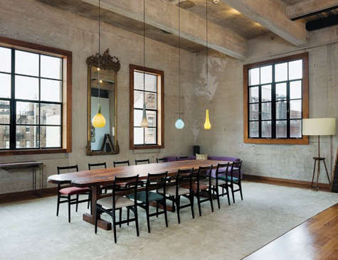
There is a special kind of joy in walking into a kitchen, dining room, or entryway and seeing lighting that looks collected instead of copied-and-pasted from a showroom. That is the charm of mismatched glass pendants. They are stylish, personal, slightly rebellious, and just polished enough to keep your home from looking like a lighting store had a garage sale in your ceiling.
Mismatched glass pendant lights are exactly what they sound like: pendant fixtures with glass shades that are intentionally different from one another. They may vary in shape, size, glass tint, texture, height, or hardware finish. The magic is in the word “intentionally.” Done well, mismatched pendants add rhythm, movement, warmth, and character. Done carelessly, they can look like three fixtures met at a bus stop and decided to move in together.
The good news? You do not need a designer’s secret handshake to make this look work. You need a few practical rules, a little restraint, and a willingness to let your lighting have a personality. Whether you are styling pendant lights over a kitchen island, above a dining table, in a hallway, or over a bedside reading nook, mismatched glass pendants can turn everyday lighting into a design feature with actual soul.
What Are Mismatched Glass Pendants?
A pendant light is a fixture that hangs from the ceiling, usually by a cord, chain, rod, or stem. Glass pendants use clear, frosted, ribbed, seeded, smoked, milk, colored, or hand-blown glass shades to diffuse or direct light. When these pendants are mismatched, they are not identicalbut they still belong together visually.
Think of them as cousins, not strangers. One pendant may be a clear globe, another a ribbed cone, and another a smoky teardrop. They differ, but they share a design language. Maybe all three have brass hardware. Maybe they are all rounded forms. Maybe they all use warm-toned glass. That shared element is what keeps the arrangement looking curated rather than chaotic.
This approach works especially well in homes that mix vintage and modern furniture, rustic and refined materials, or clean architecture with playful decor. Glass keeps the look airy, while the mismatching adds interest. It is the lighting version of wearing excellent shoes with a slightly unexpected jacket.
Why Mismatched Glass Pendant Lights Work So Well
They Add Personality Without Overpowering the Room
Glass pendants are visually lighter than heavy metal shades, oversized drums, or bulky chandeliers. Clear and translucent glass allows the eye to travel through the fixture, which is helpful in kitchens and open-concept rooms where you do not want lighting to block sightlines. When the pendants are mismatched, the room gains personality without becoming crowded.
They Make Builder-Basic Spaces Feel Custom
Many kitchens come with generic pendant lights that technically do the job but emotionally feel like elevator music. Replacing standard fixtures with mismatched glass pendants instantly creates a more custom look. Even a simple island can feel more considered when the lighting has variation in shape, height, or glass texture.
They Support Layered Lighting
Good lighting is rarely just one fixture. A well-designed room usually combines ambient lighting, task lighting, and accent lighting. Glass pendant lights can contribute to all three, depending on the bulb, shade, and placement. Over a kitchen island, they provide task lighting for chopping vegetables, reading recipes, or pretending the takeout containers are part of your meal prep. In a dining area, they create atmosphere. In an entryway, they become a welcoming focal point.
The Golden Rule: Mismatched Does Not Mean Random
The most important rule for styling mismatched glass pendants is simple: choose one or two shared features. That common thread keeps the fixtures connected. Without it, the look can quickly drift from “designer collected” to “I clicked too fast during an online sale.”
Good shared features include:
- Matching metal finish: brass, black, bronze, chrome, or nickel hardware across all pendants.
- Similar glass tone: all clear, all smoked, all amber, or all milky white.
- Related shapes: round globes, soft cones, cylinders, or organic hand-blown forms.
- Consistent scale: different shapes, but similar visual weight.
- Repeated bulb style: matching warm LED bulbs or frosted bulbs for cohesion.
For example, three different glass shapes can look cohesive if all have matte black canopies and cords. Two pendant sizes can work beautifully together if both are made from ribbed glass. A cluster of colored glass pendants can feel intentional if the palette stays within warm earth tones, such as amber, smoke, champagne, and soft bronze.
How to Choose the Right Glass for Mismatched Pendants
Clear Glass
Clear glass is crisp, bright, and visually quiet. It works well in smaller kitchens, modern spaces, and rooms where you want the shape of the fixture to show without adding heaviness. The catch? Clear glass exposes the bulb, so choose attractive bulbs and be prepared to clean fingerprints and dust. Clear glass is beautiful, but it does not believe in hiding your housekeeping secrets.
Seeded Glass
Seeded glass has tiny bubbles that create texture and sparkle. It is great for farmhouse, cottage, coastal, and transitional interiors. In mismatched arrangements, seeded glass can soften modern shapes and make new fixtures feel slightly vintage.
Ribbed or Fluted Glass
Ribbed glass is having a long design moment because it adds texture without shouting. It diffuses light more gently than clear glass and can make simple pendant shapes feel architectural. If you want mismatched pendants that still look refined, fluted glass is a strong choice.
Smoked Glass
Smoked glass brings drama. It works well with black, bronze, and dark wood finishes. Because smoked glass reduces brightness, use it where mood matters more than intense task light, or pair it with strong but warm LED bulbs.
Milk Glass
Milk glass gives a soft, classic glow. It is especially good for dining areas, breakfast nooks, and kitchens with vintage-inspired or traditional details. Mismatched milk glass pendants can feel charming and timeless, especially when the forms vary slightly.
Colored Glass
Amber, green, blue, blush, and champagne glass can add personality without requiring a full room makeover. The key is moderation. If your pendants are colorful, keep another element consistent, such as shape or hardware. Otherwise, your ceiling may begin to look like a tasteful jellybean convention.
Best Places to Use Mismatched Glass Pendants
Over a Kitchen Island
The kitchen island is the most popular location for pendant lighting because it needs both function and style. Mismatched glass pendants can define the island, add vertical interest, and visually separate the kitchen from nearby living or dining areas.
For most kitchen islands, pendants are commonly hung about 30 to 36 inches above the countertop. This height keeps the light useful without blocking conversation across the island. When using multiple pendants, spacing them about 24 to 30 inches apart from center to center is a reliable starting point. Larger glass shades may need more breathing room.
Two pendants often work well over a smaller island. Three pendants can balance a longer island. If you are using mismatched fixtures, three is usually the safest number because it creates rhythm: small, medium, small; round, cone, round; clear, ribbed, clear. Odd numbers often feel natural because the middle fixture gives the eye a resting point.
Above a Dining Table
Dining rooms are perfect for a more artistic arrangement. Instead of one chandelier, try a group of mismatched glass pendants hung at slightly different heights. Keep the lowest point high enough that guests can see each other across the table. Nobody wants to make eye contact with a pendant shade all night, no matter how gorgeous it is.
For dining tables, pendant lights are often placed around 30 to 36 inches above the tabletop, with adjustments for ceiling height and fixture size. A cluster works best when it feels centered over the table and does not extend too far beyond the table’s edges.
In an Entryway
An entryway is where your home shakes hands with visitors. A mismatched glass pendant cluster can make that handshake memorable. In foyers or hallways, make sure the bottom of the fixture leaves comfortable head clearance. In many spaces, the lowest point should sit at least about seven feet above the floor, and higher if tall people live in your home or visit often.
Beside the Bed
Glass pendants can replace bedside table lamps, freeing up surface space and adding a boutique-hotel feeling. For a mismatched look, use related pendants on each side of the bed rather than identical twins. For example, one side could have a ribbed glass globe and the other a ribbed glass cylinder. It is balanced but not boring.
Over a Bathroom Vanity
Glass pendants can be lovely near a vanity, but bathroom lighting needs extra care. Choose fixtures rated for damp locations where appropriate, and make sure the light falls evenly on the face. Clear or ribbed glass can look elegant, but avoid harsh bulbs that create unflattering shadows. Bathroom lighting should help you get ready, not interrogate you.
How to Mix Shapes Without Making a Mess
Shape is where mismatched glass pendants become fun. The easiest method is to choose one dominant shape family. Rounded forms are the most forgiving: globes, ovals, domes, and teardrops usually play nicely together. Cylinders and cones feel more architectural and modern. Organic hand-blown shapes are ideal for eclectic, artisan, or coastal interiors.
Try these combinations:
- Modern soft mix: clear globe, clear oval, clear dome with brass hardware.
- Vintage-inspired mix: milk glass globe, fluted bell shade, small opal cylinder.
- Moody kitchen mix: smoked glass cone, smoked globe, smoked cylinder with black hardware.
- Collected coastal mix: seeded glass jar, clear ribbed pendant, pale blue glass globe.
- Warm organic mix: amber hand-blown glass in three different rounded shapes.
The trick is to vary enough to be interesting, but not so much that every pendant seems to be auditioning for a solo career.
Choosing Hardware Finishes
The hardware finish is the glue of a mismatched pendant arrangement. Brass adds warmth and works beautifully with clear, milk, amber, and ribbed glass. Matte black creates contrast and helps different shapes feel unified. Polished nickel and chrome suit modern and transitional spaces, especially with clear or frosted glass. Bronze feels rich and works well with smoked or seeded glass.
You do not need every metal in the room to match perfectly. In fact, a little variation can look more natural. But the pendants should relate to something nearby: cabinet pulls, faucet finish, bar stool legs, appliance trim, door hardware, or even picture frames. Repetition makes the choice look deliberate.
Bulbs Matter More Than People Think
The bulb can make or break glass pendant lighting. Because glass often reveals or diffuses the bulb, pay close attention to color temperature, brightness, shape, and dimmability.
Warm white bulbs, usually around 2700K to 3000K, tend to flatter kitchens, dining rooms, and living spaces. Cooler bulbs can work in utility spaces but may feel harsh in rooms meant for gathering. If your glass is clear, decorative LED bulbs can look attractive, but avoid bulbs that glare directly into your eyes. Frosted bulbs often produce softer light and are easier to live with.
LED bulbs are a smart choice because quality LEDs use far less energy than traditional incandescent bulbs and last much longer. They also produce less heat, which is helpful inside glass shades. For best results, use dimmable LED bulbs with compatible dimmer switches. A dimmer lets your pendants shift from “serious dinner prep” to “soft evening glow” without changing fixtures.
Common Mistakes to Avoid
Mistake 1: Choosing Pendants That Are Too Small
Tiny pendants can disappear over a large island or dining table. Glass is already visually light, so scale matters. If you love delicate fixtures, use more of them or group them closely enough to create presence.
Mistake 2: Hanging Them Too High
Pendants hung too high can look disconnected from the island or table. They also may fail to provide enough task light. Use standard height guidelines as a starting point, then adjust based on your ceiling, shade size, and sightlines.
Mistake 3: Ignoring Glare
Clear glass looks beautiful until a bare bulb turns into a tiny indoor sun. Use frosted, opal, or lower-glare bulbs if the fixtures are at eye level or near seating.
Mistake 4: Mixing Too Many Finishes
Different glass shapes plus different colors plus different hardware finishes can become overwhelming. If the pendants vary in shape, keep the finish consistent. If the glass colors vary, keep the shapes related. Design is a conversation, not everyone yelling at once.
Mistake 5: Forgetting Maintenance
Glass pendants show dust, grease, and fingerprints, especially in kitchens. Choose shapes that can be cleaned without needing circus-level balance. Removable shades are helpful. Smooth glass is easier to clean than heavily textured glass, though textured glass hides smudges better between cleanings.
Specific Styling Examples
Example 1: White Kitchen With Warm Brass
In a white kitchen with shaker cabinets and a marble-look island, use three mismatched clear glass pendants with brass hardware. Choose one globe in the center and two smaller bell-shaped pendants on the sides. The brass warms up the white palette, and the clear glass keeps the room open.
Example 2: Modern Black-and-Wood Kitchen
For a kitchen with walnut cabinets, black accents, and stone countertops, try smoked glass pendants in different shapes. Use matte black hardware for cohesion. Hang them at the same bottom height for a tailored look, or stagger them slightly if the island is more casual.
Example 3: Vintage Cottage Dining Nook
Over a round table, cluster three milk glass pendants: one globe, one scalloped shade, and one small cylinder. Keep the hardware aged brass or bronze. The look feels collected, soft, and charming without turning the room into a museum of grandma’s best lamps.
Example 4: Coastal Entryway
In a bright entry with pale walls and natural wood, use seeded glass pendants in a loose cluster. Vary the heights slightly and keep the hardware simple. The bubbles in the glass catch natural light during the day and create sparkle at night.
Experience Section: Living With Mismatched Glass Pendants
One of the best things about mismatched glass pendants is that they make a room feel lived-in from day one. A matching set can look polished, but a thoughtfully mixed set suggests a story. It feels as though the homeowner found one pendant in a boutique, another during a renovation, and a third after finally admitting that the old fixture over the island looked like it belonged in a dentist’s waiting room.
In everyday use, the most noticeable benefit is atmosphere. Glass pendants change throughout the day. In the morning, clear or ribbed glass catches sunlight and almost disappears into the room. At night, the same pendants glow and become focal points. Smoked glass feels dramatic in the evening, while milk glass gives a softer, calmer light. If the fixtures are on dimmers, the room becomes far more flexible. Bright light works for cooking, homework, and cleaning; low light works for dinner, conversation, and pretending the dishes are invisible.
Another real-life advantage is that mismatched pendants are forgiving when your style evolves. If you buy three identical fixtures and later change cabinet hardware, stools, or wall color, the lighting may suddenly feel too specific. With a mixed arrangement, there is already some variety, so future changes feel less disruptive. A brass-and-clear-glass combination can lean modern, traditional, coastal, or vintage depending on what surrounds it.
There are practical lessons, too. First, measure before falling in love. Many gorgeous glass pendants are larger in person than they appear online. A 14-inch globe can feel elegant over a large island but surprisingly bossy over a small breakfast bar. Second, check the bulb visibility. A clear pendant with the wrong bulb can create glare that makes everyone at the counter squint like they are being questioned by kitchen police. Third, confirm whether the cord or rod is adjustable. Mismatched pendants often look best when their bottom edges align or when their heights are staggered with purpose. Adjustable hanging lengths make that possible.
Cleaning is also part of the experience. In kitchens, glass pendants collect airborne grease and dust. It is not glamorous, but neither is a cloudy pendant glowing sadly above your island. A microfiber cloth and gentle glass cleaner usually do the job. For ribbed or seeded glass, a soft brush can help with texture. If you cook often, place pendants high enough and far enough from the range to reduce buildup.
The emotional payoff is worth it. Mismatched glass pendants create a small moment of delight every time you enter the room. They show that design does not have to be stiff to be beautiful. They let you mix elegance with personality, function with playfulness, and order with a little wink. In a world where too many interiors look algorithm-approved, mismatched pendants remind us that homes should feel human.
Conclusion
Lighting: Mismatched Glass Pendants is more than a design trend; it is a practical way to add character, depth, and warmth to a room. The key is not to throw random fixtures together and hope the ceiling forgives you. Instead, choose pendants with shared features such as finish, glass tone, shape family, or scale. Pay attention to height, spacing, bulb choice, and cleaning needs. Use dimmers whenever possible. Let glass do what it does best: brighten the room without weighing it down.
When styled thoughtfully, mismatched glass pendants can make a kitchen feel custom, a dining room feel intimate, an entryway feel memorable, and a bedroom feel quietly luxurious. They are functional, decorative, and flexible enough to grow with your home. Matching may be safe, but mismatchingdone wellis where the personality lives.
Note: This article is written for web publication and synthesizes widely used American residential lighting guidelines, interior design practices, and energy-efficient lighting recommendations.