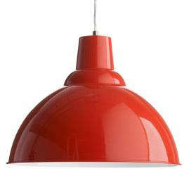
A ceiling light has two jobs: illuminate the room and avoid looking like it was selected during a five-minute panic at the hardware store. The Bristol Pendant Light at BoConcept handled both assignments with unusual confidence. Its curved industrial shade, compact proportions, and memorable color palette turned a practical fixture into a cheerful piece of Danish-inspired design.
Originally introduced as part of BoConcept’s lighting collection, the Bristol pendant blended workshop-style utility with softer, more livable colors. Archival descriptions list coral, dusty gray, vintage blue, ochre, and jade among the available finishes. At approximately 12.75 inches high and 16.75 inches wide, it was large enough to command attention without looming over the furniture like a suspicious metal moon.
Although the Bristol is no longer consistently featured in BoConcept’s main pendant collection and may now be encountered through outlet inventory or the resale market, its design remains relevant. It offers a useful lesson in choosing an industrial pendant light, placing it correctly, matching color to a room, and creating lighting that works after sunsetnot merely in a beautifully staged photograph.
What Made the Bristol Pendant Light Distinctive?
The Bristol’s appeal came from a simple formula: a familiar factory-lamp silhouette, a restrained Scandinavian attitude, and colors that were much more interesting than standard black or brushed nickel.
A Practical Industrial Shape
The shade had the broad, downward-facing form commonly associated with vintage warehouses, workshops, and early commercial lighting. This shape is not decorative fluff. A metal shade directs much of the light toward the surface below, making the pendant especially suitable for dining tables, breakfast areas, desks, and kitchen islands.
Unlike an exposed bulb, which sends light in every direction and occasionally stages a personal attack on your retinas, a substantial shade controls glare. It establishes a pool of illumination beneath the fixture while leaving the surrounding room slightly softer. That contrast helps a table or work surface become a visual focal point.
Compact but Noticeable Proportions
At roughly 16.75 inches wide, the Bristol occupied a useful middle ground. It was wider than a small accent pendant but less imposing than an oversized dome or chandelier. One pendant could comfortably define a small round table, reading corner, or compact entry. Two or three could be arranged above a longer dining table or island.
This scale also made the design relatively apartment-friendly. A dramatic fixture does not need to be enormous. In fact, a pendant that is too large can interrupt sightlines and make a modest room feel crowded. The Bristol offered visual character without requiring the ceiling height of a converted railway station.
A Color Palette With Personality
The available colors were central to the design. Dusty gray could disappear quietly into a neutral interior, while coral or ochre could function as an energetic accent. Vintage blue and jade sat somewhere between playful and sophisticated, depending on the furniture and wall colors around them.
Muted colors are easier to live with than extremely bright finishes because they introduce contrast without dominating every other object in the room. A jade pendant can enliven warm wood cabinetry. An ochre fixture can bring warmth to gray walls. Coral can wake up a white kitchen that has started to resemble a very clean laboratory.
The BoConcept Design Connection
BoConcept is associated with contemporary Danish furniture and interiors that balance clean lines with customization. The Bristol pendant reflected that philosophy. Its outline was uncomplicated, but the choice of finishes allowed homeowners to make the same basic form feel subdued, nostalgic, or bold.
This adaptability is one reason Scandinavian modern lighting works in many decorating styles. It can complement streamlined furniture, but it does not require a room to become a museum of pale oak and perfectly folded blankets. Industrial pendants also work with farmhouse tables, vintage storage pieces, colorful contemporary art, and even traditional interiors that need one less predictable element.
The Bristol was particularly effective because it did not imitate an antique fixture too literally. Its industrial influence was obvious, yet the refined colors gave it a more contemporary identity. It looked as though a factory lamp had taken a long vacation in Copenhagen and returned with better manners.
Where a Bristol Pendant Works Best
Above a Dining Table
A dining area is the most natural setting for this style of pendant. The shade directs light toward plates, serving dishes, flowers, and faces while visually anchoring the table. For a small round or square table, one Bristol pendant could create a clear center point. For a rectangular table, two fixtures would usually provide more even coverage.
A common starting point is to position the bottom of a dining pendant approximately 30 to 36 inches above the tabletop. This range is not a law handed down by the lighting police. The ideal height also depends on the fixture’s size, the ceiling, the brightness of the bulb, and the height of the people using the room.
Sit at the table before finalizing the cord length. The shade should not block conversation or force diners to lean sideways to see one another. At the same time, hanging it too high can weaken the intimate effect and make the fixture appear disconnected from the furniture below.
Over a Kitchen Island
The Bristol’s downward-facing shade would also be well suited to a kitchen island, particularly when installed as a pair or trio. Repetition creates rhythm and spreads light across the work surface more effectively than one undersized fixture.
Keep the group centered over the island rather than the entire room. Leave enough space between the outer pendants and the island’s ends so the arrangement does not appear squeezed. Depending on the island length and number of fixtures, approximately 24 to 30 inches between pendant centers can provide a balanced starting point.
Because an opaque metal shade limits the amount of light traveling sideways, Bristol-style pendants should not be expected to illuminate a whole kitchen by themselves. Under-cabinet lights, recessed fixtures, or ceiling-mounted ambient lighting should support them.
In an Entryway
A single colorful pendant can give a small entry immediate identity. The Bristol’s moderate width makes it more practical than a sprawling chandelier in a narrow space. In an open walkway, however, it must be mounted high enough to preserve head clearance. A minimum clearance of about seven feet beneath the fixture is a sensible target in ordinary traffic areas.
Beside a Bed or Reading Chair
A pendant can replace a bedside or side-table lamp when surface space is scarce. Hung near a reading chair, a Bristol-style shade would create concentrated light and add sculptural interest to an otherwise empty corner.
This application requires careful positioning. The bulb should not be visible from the normal seated or reclining angle, and the switch must remain convenient. A wall switch, smart bulb, or accessible cord control is far better than performing an evening expedition across the room every time you want to turn off the light.
How to Choose the Right Bristol Color
Dusty Gray for Quiet, Flexible Rooms
Dusty gray is the least demanding option. It works with white, charcoal, beige, natural wood, concrete, and stainless steel. In a minimalist room, it continues the restrained palette while allowing the shape of the fixture to remain visible.
To prevent gray from feeling cold, pair it with warm-toned LED light, wood furniture, woven textiles, or brass details. Gray plus cool blue-white illumination can make dinner feel as cozy as an appointment in a parking garage.
Vintage Blue or Jade for Calm Color
Blue and green shades are useful when a room needs color but not visual shouting. Vintage blue suits light oak, walnut, white cabinetry, and muted red accents. Jade works beautifully with terracotta, cream, tan leather, and indoor plants.
These finishes can also connect separate areas in an open-plan home. A jade pendant over the dining table might repeat the green of a sofa cushion or a painting across the room, creating continuity without buying an entire matching furniture set.
Ochre or Coral for a Strong Focal Point
Ochre introduces warmth and has a natural relationship with midcentury furniture, walnut, navy, olive, and earthy neutrals. Coral is livelier and can sharpen a room built around white, pale gray, or light wood.
When using a bold pendant, allow it to be the main color statement at ceiling level. There is no need to match it with coral curtains, coral chairs, coral dishes, and a coral toaster. Repeating the hue once or twice in small accessories is usually enough.
Bulb Selection: Making the Light as Good as the Lamp
A handsome pendant with the wrong bulb is merely an attractive mistake. The bulb determines brightness, color, dimming performance, glare, and how accurately food, furniture, and finishes appear.
Use Lumens, Not Old Wattage Habits
Modern LED bulbs produce more light with less electricity than traditional incandescent lamps, so brightness should be judged in lumens. For a pendant over a small dining table, an LED producing approximately 600 to 900 lumens can be a reasonable starting range. A multi-pendant arrangement may use lower-output bulbs because the combined light adds up quickly.
Always follow the fixture’s maximum lamp rating and socket requirements. If an original Bristol pendant is purchased secondhand, inspect the label, wiring, socket, canopy, and cord before selecting a bulb.
Choose a Warm Color Temperature
For dining and living spaces, 2700K usually creates a warm, familiar glow. A 3000K bulb appears slightly cleaner while remaining comfortable in most homes. Cooler temperatures can be useful for detailed work, but they may make a colorful metal shade and surrounding wood finishes feel less inviting.
Look for Good Color Rendering
A bulb with a Color Rendering Index of at least 80 is acceptable for general household use, while 90 or higher is preferable when accurate color matters. High color quality helps food look appetizing, wood retain its richness, and skin tones appear natural. Nobody wants a pendant that turns a carefully prepared dinner into evidence from a science-fiction investigation.
Add Dimming When Compatible
Dimming dramatically expands what a pendant can do. Bright light supports homework, food preparation, and cleaning. Lower light creates a more relaxed atmosphere for dinner or conversation. Confirm that the LED bulb, dimmer, and fixture are compatible; otherwise, flickering and buzzing may arrive as uninvited design features.
Layering Light Around the Bristol Pendant
A pendant should be part of a lighting plan, not the entire plan. Effective rooms generally combine ambient, task, and accent lighting.
The Bristol pendant can supply decorative and task light over a specific surface. Ambient illumination may come from recessed lights, a ceiling fixture, or indirect sources. Accent lighting can include wall sconces, picture lights, or small lamps that highlight artwork and architectural details.
In a dining room, consider placing a lamp on a sideboard or using sconces on a nearby wall. These additional sources reduce the harsh contrast between the bright tabletop and the darker perimeter. In a kitchen, combine pendants with under-cabinet lighting so counters remain usable without turning the island into the brightest object in the county.
Keeping the color temperature reasonably consistent across fixtures helps the layers feel intentional. A 2700K pendant next to a 5000K under-cabinet strip can produce an odd visual split, as though two completely different afternoons are occurring in one room.
Installation, Condition, and Secondhand Buying
Because the Bristol may now be found through outlet sellers or secondhand marketplaces, condition deserves careful attention. Request photographs of the canopy, cord, socket, shade interior, mounting hardware, labels, and any dents or chipped paint.
A small mark on the upper shade may be invisible after installation. Damage near the socket, wiring, or strain relief is more serious. Electrical components should not be improvised, taped together, or trusted because a seller describes the fixture as “probably fine.”
Hardwired pendant installation should be completed according to local electrical requirements. When the existing ceiling box, wiring, fixture rating, or mounting hardware is uncertain, use a qualified electrician. The shade must be supported by appropriate hardware rather than by the electrical conductors themselves.
Before installation, verify that the fixture is suitable for the local voltage and electrical system. This is particularly important when buying a pendant imported from another country. Decorative compatibility is wonderful; electrical compatibility is better.
Cleaning and Maintaining a Metal Pendant
Turn off the light and allow the bulb and shade to cool before cleaning. Use a soft microfiber cloth to remove dust from the exterior. For greasy kitchen residue, wipe gently with a slightly damp cloth and a small amount of mild soap, then dry the surface immediately.
Avoid abrasive pads, aggressive solvents, and enthusiastic scrubbing. Matte or powder-coated finishes can become shiny in isolated spots if polished too forcefully. Clean the shade interior periodically because dust reduces reflected light and becomes increasingly noticeable when the lamp is on.
Check the cord, canopy, and visible hardware during cleaning. A pendant hangs overhead for years, which makes occasional inspection more useful than waiting for it to express dissatisfaction through wobbling.
Experience Notes: Living With a Bristol-Style Pendant
The first experience most people have with a Bristol-style pendant is not the light itself but the color. During the day, the fixture behaves like a suspended piece of decor. A vintage blue or ochre shade can remain visible from several rooms, especially in an open-plan layout. This gives the dining or kitchen zone a clear identity even when the lamp is switched off.
After dark, the experience changes. Because the metal shade directs light downward, the table becomes brighter than the surrounding walls. Dinner feels more intimate, books and dishes gain contrast, and the furniture beneath the pendant appears deliberately placed. The effect is especially successful when a dimmer allows the brightness to move from practical to atmospheric.
Placement tends to be the biggest adjustment. A pendant that looks perfectly positioned while standing can feel too low after everyone sits down. The best approach is to temporarily support or loosely install the fixture, then test it from every chair. Look across the table, stand at the kitchen sink, and enter the room from nearby doorways. A small height adjustment can improve both sightlines and visual balance.
Using one pendant over a compact table feels focused and calm. Using three in mixed colors feels more playful and creates a stronger graphic statement. The latter arrangement works best when the rest of the room is relatively controlled. When colorful pendants compete with patterned wallpaper, numerous open shelves, bright chairs, and a heroic collection of refrigerator magnets, the room may begin hosting several conversations at once.
The opaque shade also teaches an important lesson about expectations. A Bristol-style pendant is excellent at illuminating what is directly below it, but it does not wash the ceiling or walls with light like a translucent globe. In a room with no lamps or secondary fixtures, the corners may remain darker than expected. Adding a floor lamp, sideboard lamp, or wall light usually solves the problem and makes the pendant appear more sophisticated.
Warm LEDs tend to produce the most comfortable result. At 2700K, ochre and coral finishes appear richer, wood gains warmth, and the dining area feels relaxed. At 3000K, the room becomes slightly crisper and may suit a modern kitchen with white counters. Very cool bulbs can flatten the pendant’s muted colors and exaggerate the industrial character.
Maintenance is generally simple, although kitchen placement introduces grease and airborne cooking residue. The broad upper surface collects dust, while the interior can develop a thin film that reduces reflection. A gentle monthly wipe takes only a few minutes and prevents the annual discovery that the lamp has quietly been storing half the kitchen’s history.
Over time, the strongest experience is the fixture’s ability to make an ordinary area feel intentional. A basic table becomes a dining zone. A kitchen island becomes the center of the room. A neutral interior gains color without repainting a wall. That is the lasting strength of the Bristol Pendant Light: it combines a familiar form with enough personality to make lighting feel like part of the furniture rather than an electrical afterthought.
Final Thoughts on the Bristol Pendant Light at BoConcept
The Bristol Pendant Light represented an appealing chapter in BoConcept lighting: industrial in shape, Scandinavian in restraint, and unusually confident in color. Its approximately 16.75-inch width made it versatile enough for apartments, dining rooms, kitchens, reading corners, and grouped installations.
Today, finding one may require checking outlet availability or searching the secondhand market. Buyers should confirm condition, wiring, electrical ratings, mounting hardware, and compatibility before installation. Once safely installed with a warm, high-quality LED bulb and supported by layered lighting, the Bristol can still look fresh rather than dated.
Most importantly, it demonstrates that practical lighting does not have to be anonymous. A pendant can direct useful light, establish a focal point, introduce color, and make a room more enjoyableall without becoming so dramatic that guests need to discuss it before sitting down.