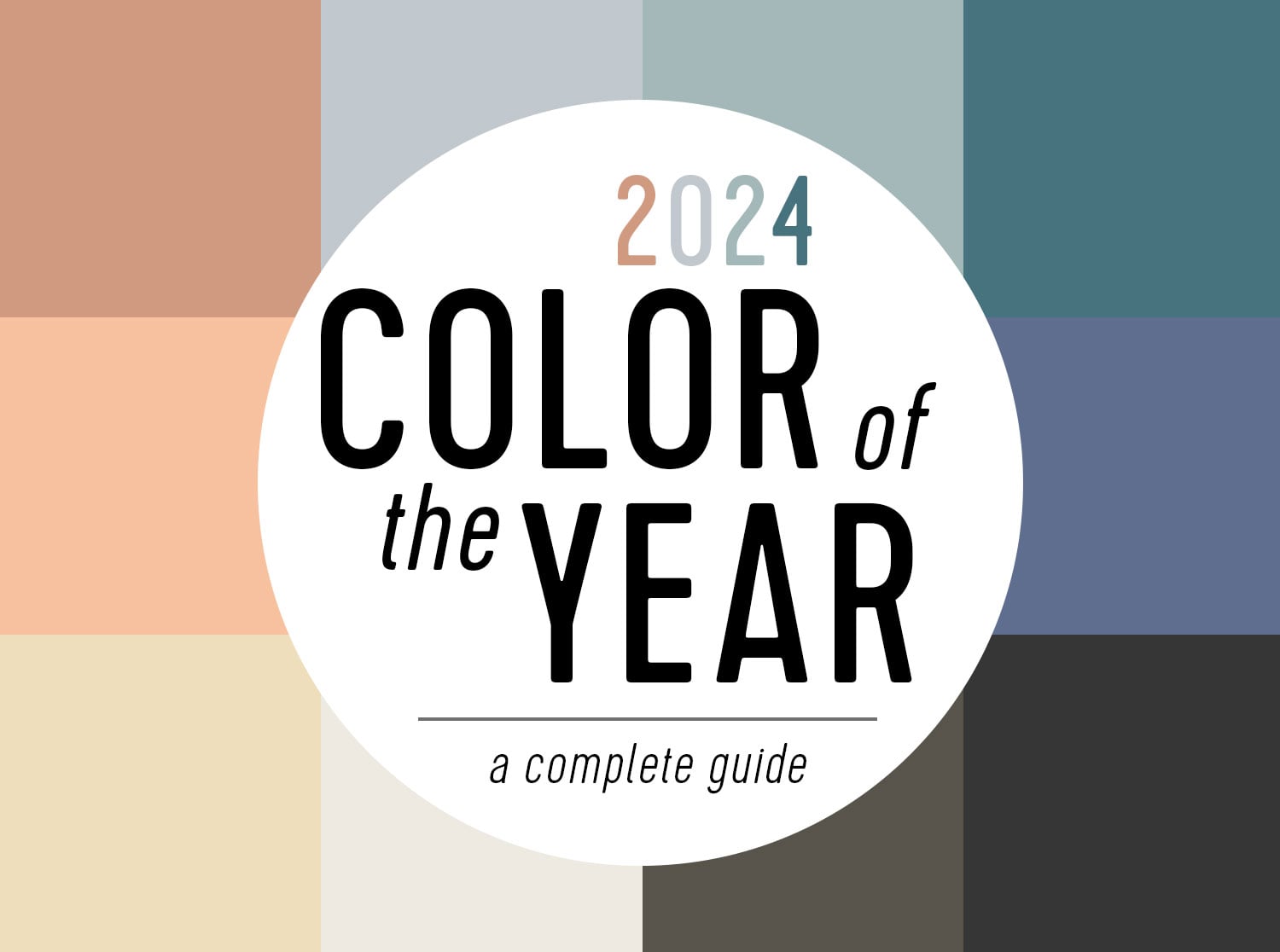
The 2024 Color of the Year announcements delivered something for nearly every decorating personality. There were misty blues for calm-seekers, deep charcoals for dramatic souls, earthy greens for plant lovers, and a soft peach for anyone who wanted their living room to feel like a warm hug.
There was not one official winner across the entire design industry. Instead, paint manufacturers, color authorities, spray-paint companies, and wood-stain brands each selected a shade that reflected their predictions for the year. The result was less like a single crown and more like a very stylish group chat.
This complete 2024 Color of the Year guide brings the leading selections together, explains what makes each hue distinctive, and offers practical ideas for using them without accidentally turning your home into a paint-swatch convention.
The Complete 2024 Color of the Year List
The following 15 selections represent the major colors announced by widely recognized paint, coating, stain, and color companies:
| Brand | 2024 Color of the Year | Color Code | General Color Family |
|---|---|---|---|
| Pantone | Peach Fuzz | 13-1023 | Soft peach |
| Benjamin Moore | Blue Nova | 825 | Blue-violet |
| Sherwin-Williams | Upward | SW 6239 | Light periwinkle blue |
| Behr | Cracked Pepper | PPU18-01 | Soft black |
| HGTV Home by Sherwin-Williams | Persimmon | HGSW 6339 | Earthy orange |
| Glidden | Limitless | PPG1091-3 | Honey-beige neutral |
| Valspar | Renew Blue | 8003-37D | Blue-green |
| Dunn-Edwards | Skipping Stones | DET567 | Steely blue-green |
| Dutch Boy | Ironside | 422-7DB | Deep olive |
| Krylon | Bluebird | Not applicable | Bright pastel blue |
| Rust-Oleum | Satin French Blue | Product-specific | Mid-tone blue |
| Minwax | Bay Blue | MW1049 | Blue-green wood stain |
| Graham & Brown | Viridis | Product-specific | Muted natural green |
| C2 Paint | Thermal | No. 752 | Crisp sky blue |
| Stainmaster Paint | English Green | Product-specific | Deep forest green |
One pattern is difficult to miss: blue was everywhere. From hazy coastal shades to saturated accent colors, the 2024 paint color trends suggested that homeowners wanted calm, freshness, and a closer connection to the natural world.
The Major 2024 Colors of the Year
Pantone: Peach Fuzz 13-1023
Pantone selected Peach Fuzz, a gentle shade positioned between pink and orange. It has the softness of a vintage powder room without requiring a lace toilet-seat cover. Pantone associated the color with warmth, compassion, comfort, and human connection.
Unlike most companies in this roundup, Pantone forecasts color across fashion, product design, graphics, packaging, beauty, and interiors. Peach Fuzz therefore works beyond wall paint. It can appear on upholstery, bedding, ceramics, clothing, cosmetics, and decorative accessories.
In a home, the shade pairs naturally with cream, warm white, pale wood, soft brown, sage green, and muted blue. It is especially effective in bedrooms, reading corners, and rooms that receive warm afternoon sunlight.
Benjamin Moore: Blue Nova 825
Blue Nova is a grounded mid-tone blue with noticeable violet undertones. It feels richer and more mysterious than a standard navy but remains controlled enough for everyday interiors. Imagine twilight, but with better cabinet hardware.
The color can support both traditional and contemporary design. On kitchen cabinets, it creates depth without looking black. In a dining room or library, it feels enveloping and sophisticated. It also works as an accent against warm white, ochre, rust, walnut, or brushed brass.
Because Blue Nova contains purple, homeowners should test it carefully. Cool LED lighting may emphasize its violet side, while warmer bulbs and natural wood can make it appear more classically blue.
Sherwin-Williams: Upward SW 6239
Upward is a breezy light blue with gray and subtle periwinkle qualities. It was created to feel optimistic, peaceful, and expansive. Compared with Blue Nova, it is much lighter and airier, making it easier to use across an entire room.
Upward is well suited to bathrooms, bedrooms, laundry rooms, ceilings, and kitchen cabinetry. Pair it with crisp white for a coastal look, warm beige for softness, or charcoal for a sharper contemporary contrast.
Its appearance can shift throughout the day. In bright sunlight, it may seem clean and blue. In a shaded north-facing room, it can read cooler and grayer. That flexibility is useful, but it is also why a sample board is more trustworthy than a tiny chip viewed under store lighting.
Behr: Cracked Pepper PPU18-01
Behr moved to the dark side with Cracked Pepper, a soft black designed to act as a flexible neutral. It is dramatic without having the hard visual edge of an extremely pure black.
Cracked Pepper can make pale artwork, light furniture, metallic fixtures, and natural wood stand out. It works beautifully on doors, built-in shelving, fireplace surrounds, bathroom vanities, and accent walls. In a room with sufficient daylight, it may even cover every wall without making the space feel like an abandoned theater basement.
Texture is important when using this shade. Linen, boucle, wool, unfinished wood, stone, and aged metals prevent a dark room from looking flat. A satin or semigloss finish can be useful on trim, while matte paint creates a softer, more architectural effect on walls.
HGTV Home by Sherwin-Williams: Persimmon HGSW 6339
Persimmon balances lively tangerine energy with earthy, neutral undertones. The result is a warm terra-cotta-like orange that feels cheerful but not fluorescent.
This shade is especially appealing in kitchens, breakfast areas, dining rooms, and social spaces. It pairs well with cream, olive green, dark blue, tan leather, medium-tone wood, and handmade pottery. Used on a front door, it offers personality before visitors have even discovered the snack situation.
Persimmon was part of the brand’s Renewed Comfort collection, which emphasized familiar colors with a brighter, more expressive twist.
Glidden: Limitless PPG1091-3
Limitless is a warm honey-beige that sits near pale yellow without becoming a full bowl of lemon pudding. Glidden presented it as an adaptable alternative to cool gray, reflecting the broader move toward warmer neutral paint colors.
It can work on walls, ceilings, cabinets, trim, or exterior details. Pairing it with brown, terracotta, green, dusty blue, or black helps clarify its warmth. In rooms with yellow artificial lighting, however, it may become noticeably more golden, so sampling is essential.
Blue Dominated the 2024 Paint Color Trends
Valspar: Renew Blue 8003-37D
Renew Blue is a soft blue influenced by sea green and gray. Valspar linked the color to mist, clouds, water, balance, and restoration. It is calm enough for large surfaces but colorful enough to avoid looking like another reluctant gray.
Consider it for a spa-style bathroom, a nursery, painted furniture, a kitchen island, or an outdoor seating area. Natural fibers, white tile, pale oak, and sandy neutrals strengthen its relaxed coastal character.
Dunn-Edwards: Skipping Stones DET567
Skipping Stones is a steely blue with green and gray undertones. Inspired by the sea, it was selected to encourage stillness, balance, and a slower approach to living. In practice, it occupies the useful space between an obvious blue and a sophisticated colored neutral.
The shade can complement light oak, limestone, white plaster, gray upholstery, and matte black fixtures. It is particularly effective in bedrooms and offices where a quiet background is more desirable than a high-energy statement.
Krylon: Bluebird
Krylon’s Bluebird is brighter and more playful than the wall-paint blues in the collection. Because it is a spray-paint selection, it is designed for smaller projects and objects rather than necessarily coating four walls and the family dog.
Bluebird can refresh metal chairs, planters, picture frames, lamp bases, outdoor accessories, and thrift-store furniture. It combines the sweetness of a pastel with enough saturation to support dopamine decor and cheerful vintage-inspired spaces.
Rust-Oleum: Satin French Blue
Satin French Blue is a calming mid-tone blue with a slightly romantic, periwinkle-adjacent quality. It is softer than Bluebird and works well when a project needs noticeable color without shouting across the room.
Good candidates include side tables, cabinets, garden pots, storage lockers, and decorative hardware. White, pale gray, brass, and natural wood provide easy pairings.
C2 Paint: Thermal No. 752
Thermal is a clear, energetic sky blue. Although it shares the calming qualities associated with many 2024 blue paint colors, it has a punchier personality. C2 positioned it as a hopeful color connected to openness, confidence, and adventure.
Thermal can energize a home office, child’s bedroom, entryway, or painted ceiling. Used in smaller amounts, it creates a crisp accent beside white, warm gray, orange, or dark wood.
Minwax: Bay Blue MW1049
Bay Blue is not conventional wall paint. It is a blue-green wood stain created to add color while preserving or emphasizing the character of the material beneath it.
It offers an unusual option for furniture, paneling, shelving, doors, and other wood features. Depending on the product opacity, wood grain may remain visible, creating a layered finish that ordinary opaque paint cannot reproduce. Always test stain on scrap wood because species, sanding, and existing finish can substantially change the result.
The Greens and Moody Neutrals of 2024
Dutch Boy: Ironside 422-7DB
Ironside is a deep olive with brown undertones. It belongs to the dark and moody category, but it feels more organic than a conventional charcoal. The color can suggest forest foliage, aged leather, military textiles, or an extremely serious jar of olives.
Use it in a den, bedroom, dining room, office, or compact powder room. It pairs beautifully with camel, burgundy, cream, walnut, muted pink, and antique brass. Good lighting keeps its green undertone visible; in dim conditions, it may appear nearly brown or black.
Graham & Brown: Viridis
Viridis is a muted green with warm undertones, designed to connect interiors with the natural world. It can function as an alternative to greige while adding more personality and depth.
Entryways, living rooms, dining rooms, and garden-facing spaces are natural homes for Viridis. Botanical patterns, woven materials, warm white, clay, and dark wood reinforce its earthy character. It also coordinates with Graham & Brown’s New Eden botanical wallpaper design.
Stainmaster Paint: English Green
English Green was Stainmaster Paint’s first Color of the Year. It is a deep, grounding green suited to homeowners who want nature-inspired color with greater drama than sage.
It can create a club-like atmosphere in a study, define kitchen cabinets, or add weight to a fireplace wall. For contrast, combine it with creamy white, warm metal, light stone, cognac leather, or pale wood.
What the 2024 Colors Had in Common
Nature Was the Main Inspiration
The most prominent shades referenced skies, oceans, forests, stone, fruit, soil, and natural light. Even Cracked Pepper, the darkest selection, was described in earthy rather than industrial terms. The overall message was clear: people wanted homes that felt calmer, warmer, and less detached from the outdoors.
Warm Neutrals Challenged Cool Gray
Limitless, Peach Fuzz, and Persimmon demonstrated the continued movement away from chilly gray interiors. These shades introduced beige, peach, honey, clay, and orange undertones without requiring homeowners to abandon neutral decorating entirely.
Blue Became the New Flexible Neutral
The repeated use of blue was not simply a coincidence. Blue can be fresh, traditional, coastal, modern, playful, or formal depending on its undertones. Upward and Renew Blue offered lightness, Blue Nova brought depth, and Bluebird supplied cheerful saturation.
Color Became More Personal
The 2024 selections encouraged homeowners to choose colors based on atmosphere rather than resale-safe formulas. A room could be restful, joyful, dramatic, intimate, or creative. Beige was still invited to the party, but it was no longer automatically placed in charge of the music.
How to Choose the Right 2024 Color for Your Home
Start With the Mood, Not the Brand Name
Choose the emotional direction of the room before falling in love with a fashionable color. Upward, Renew Blue, and Skipping Stones support relaxation. Persimmon and Bluebird add energy. Blue Nova, Ironside, and Cracked Pepper create drama. Limitless and Viridis provide quieter warmth.
Test Large Samples
A one-inch paint chip cannot reveal how a color will behave across a twelve-foot wall. Paint a large movable sample board and view it near windows, flooring, furniture, and trim. Check it in the morning, afternoon, and evening.
Consider Undertones
Blue Nova may lean violet. Renew Blue may reveal green. Limitless can become yellow. Ironside may look brown in low light. These shifts are not defects; they are normal interactions among pigments, lighting, and surrounding materials.
Use Trend Colors Strategically
A Color of the Year does not need to cover an entire house. Try it on a door, vanity, cabinet, bookcase, ceiling, side table, or collection of accessories. Smaller applications deliver personality while keeping the project manageable.
Real-World Experience: Living With the 2024 Colors
Looking at a digital color chart is entertaining, but living with a color is a different experience. Screens flatten undertones, store lighting creates confusion, and carefully styled promotional photographs rarely include a pile of mail, three charging cables, and yesterday’s coffee cup. The most useful lesson from testing trend colors is that context matters more than popularity.
Light blues such as Upward and Renew Blue usually feel approachable on a sample card. Once placed on a large wall, however, their personalities become more obvious. In sunny rooms, they may look fresh and almost luminous. In a room with limited natural light, gray or green undertones can move forward. This is why a blue that appears peaceful in one home can feel chilly in another. Testing it beside flooring and trim provides a much more accurate impression than viewing it alone.
Dark colors create the opposite surprise. Cracked Pepper and Ironside may initially appear intimidating, yet they can make a room feel more finished and intentional. A dark bookcase often gives ordinary objects greater visual importance, while a deep wall can make pale art and furniture look brighter. The challenge is balance. Without layered lighting and tactile materials, a dark room may feel heavy. Add warm lamps, wood, textiles, and reflective details, and the same color becomes cozy rather than cave-like.
Warm colors require their own patience. Persimmon can look playful and earthy beside cream, but much stronger next to a cool white. Peach Fuzz may appear soft and flattering in a bedroom while becoming surprisingly pink in a bright bathroom. Limitless is especially dependent on light temperature. Warm bulbs can pull out its honey character, while cooler daylight may make it seem closer to beige. The experience is a useful reminder that neutral does not mean undertone-free.
Small projects are often the safest and most enjoyable way to explore the bolder 2024 Colors of the Year. A Bluebird planter, Bay Blue table, or Satin French Blue metal chair can change the mood of a space without creating a weekend-long painting marathon. These projects also allow colors to move around the home. If a blue side table feels too energetic in the living room, it may be perfect in a child’s room or on a covered porch.
The final lesson is that trend forecasts work best as inspiration, not instructions. A successful room does not need the official shade, the official coordinating collection, or an official blessing from the decorating authorities. The value of the 2024 palette lies in its range. It gave homeowners permission to explore softness, depth, nature, and warmth. The best selection is ultimately the one that looks good in the actual room and still makes you happy after the paint has dried and the drop cloth has finally been folded.
Conclusion
The complete 2024 Color of the Year collection was dominated by blue, but it was far from repetitive. Pale sky tones, blue-greens, violet-blues, and saturated accent shades each offered a different decorating experience. Peach Fuzz and Persimmon added warmth, Limitless refreshed the neutral category, and dark choices such as Cracked Pepper and Ironside proved that dramatic color could still feel livable.
These colors captured a shared desire for calmer, more personal, and nature-connected interiors. Some are ideal for full rooms, while others shine on cabinets, furniture, trim, wood, or decorative objects. Whichever shade catches your eye, test it in the intended space before committing. Paint has a habit of changing its personality when nobody is looking.
SEO Information
Note: Product names, color codes, and trend descriptions were checked against official brand announcements and established U.S. home-design publications. Physical color appearance varies by lighting, surface, finish, screen settings, and paint formulation.