Note: This article discusses edgy humor and mild profanity in the context of art, design, and internet culture.
At first glance, a cute alphabet sounds like something that belongs on a kindergarten wall, a baby shower banner, or a sticker pack designed by a person who owns seven pastel highlighters and uses all of them daily. Then comes the twist. A cute and offensive alphabet takes those soft, cheerful letterforms and pairs them with rude, sharp, or deliberately rebellious language. The result is funny, jarring, a little immature, weirdly clever, and impossible to ignore.
That clash is the whole magic trick. It is visual sugar with verbal hot sauce. It looks sweet enough to pat on the head, then opens its mouth and says something that would make a school librarian drop her coffee. And somehow, that exact contradiction is why people love it.
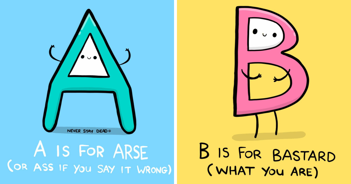
The phrase “Cute And Offensive Alphabet” has been associated online with a 2018 art series built around the juxtaposition of adorable styling and confrontational language. But the appeal of the idea goes beyond one project. It taps into several larger forces at once: the psychology of humor, the emotional power of typography, the cultural charge of profanity, and the internet’s never-ending appetite for things that are both charming and chaotic.
What Is a Cute and Offensive Alphabet, Exactly?
In simple terms, it is an alphabet-based design concept that makes letters look playful, cuddly, rounded, or candy-colored while attaching them to language that feels rude, sarcastic, dark, or socially inappropriate. Think bubble letters saying something unhinged. Think storybook shapes delivering a verbal eye-roll. Think an adorable visual style behaving like it missed anger management and found a glitter pen instead.
That contrast matters because alphabets are not just tools for spelling. They are visual systems. The shape, size, spacing, slant, weight, and texture of letters all affect how readers feel before they even process the words themselves. A bubbly lowercase word feels different from a blocky all-caps warning. A hand-drawn pastel phrase feels different from a stenciled command. In other words, letters have tone before tone has a chance to introduce itself.
So when a designer builds an alphabet that looks innocent but carries an offensive or rude message, the viewer experiences two reactions at once: visual comfort and verbal disruption. That tension creates the emotional snap.
Why This Style Works So Well
1. It runs on surprise
One of the oldest explanations of humor is incongruity: we laugh when our expectations get yanked sideways. A cute alphabet sets up one expectation. The offensive phrase destroys it. That tiny mental collision is what makes the work land. Your brain walks in expecting cupcakes and gets handed a flamethrower in a bow.
This does not mean every rude phrase is automatically funny. Timing, context, and delivery matter. But in visual humor, the contrast between form and message can do a lot of the heavy lifting. Even before the viewer reads the full phrase, the design is already telling one story while the text tells another. That mismatch creates comic tension almost instantly.
2. Cute design lowers the reader’s guard
Soft curves, rounded shapes, bright colors, and handmade textures tend to read as friendly and approachable. People often associate curvier visual forms with warmth and comfort. So when offensive language appears inside a design that looks harmless, the insult or swear feels less like a blunt instrument and more like a prank with excellent kerning.
That does not make it polite. It just makes it more absorbable. Cute styling can soften impact, create irony, or make an edgy line feel knowingly theatrical rather than aggressively hostile.
3. Offensive language carries real rhetorical force
Profanity is not just random noise people use when they step on a Lego. It is emotionally loaded language. It can intensify a message, create intimacy, signal rebellion, or establish honesty and informality. In design, that means offensive wording can function like a visual amplifier. It makes the piece feel louder, riskier, and more memorable.
That is also why creators often replace explicit profanity with partial censorship, symbols, or implied wording. The famous comic-strip stand-in for swearing, sometimes represented by a mess of symbols, proves that viewers do not even need the full word to understand the emotional temperature. Suggestion alone can do the job.
4. The internet rewards contradiction
Online culture loves combinations that should not work but somehow do. Cute but cursed. Cozy but feral. Polite-looking but emotionally exhausted. The cute and offensive alphabet fits perfectly into that ecosystem because it is built on contradiction. It is highly shareable because it delivers a double take in a single frame.
That is the secret sauce of meme-era design: clarity, surprise, and personality. A viewer gets the joke quickly, feels a reaction immediately, and can forward it to a friend with the digital equivalent of “This is so you.”
The Role of Typography in the Joke
Typography is not decoration glued onto language after the fact. It is part of the meaning. Good designers know that letterforms can whisper, flirt, shout, sulk, or throw a tantrum. A cute and offensive alphabet depends on that expressive range.
Rounded letters feel friendlier
Designers often rely on rounded forms, inflated shapes, and soft contours to create a sense of cuteness. These letterforms can feel toy-like, youthful, and approachable. When paired with rude or aggressive wording, they create emotional whiplash, which is exactly the point.
Case, weight, and spacing change the mood
Lowercase letters often feel casual and conversational. Uppercase letters can feel sharper, louder, and more confrontational. Thick strokes feel heavy and emphatic. Loose spacing can feel airy and playful, while tight spacing can feel intense or crowded. In this genre, those choices are not technical details hiding in the basement; they are co-writers of the joke.
Texture makes the message feel handmade
Many successful cute-and-offensive designs use hand lettering, brush textures, sticker-like outlines, or deliberately imperfect forms. That handmade look adds personality. It makes the piece feel less like corporate snark and more like a human being had a very specific mood and a set of markers.
Why People Connect With It
Part of the appeal is emotional honesty. A cute and offensive alphabet gives people a way to express irritation, sarcasm, burnout, or rebellion without sounding flat. It turns a bad mood into a designed object. And once frustration gets wrapped in bright colors and goofy curves, it becomes easier to laugh at.
There is also a social function. Edgy humor can create in-group recognition. People who enjoy this kind of work often respond not just to the words, but to the attitude behind them: irreverent, self-aware, unserious on the surface, and surprisingly precise underneath. It says, “Yes, life is ridiculous, and I brought a cute marker set to document the collapse.”
Still, the line between playful offense and mean-spirited offense matters. The strongest examples punch up, joke about everyday frustration, or satirize cultural absurdity. The weakest examples are lazy, cruel, or shocking just for the sake of shock. Cute lettering cannot rescue bad judgment. A pastel palette is not a moral waiver.
How Artists and Designers Pull It Off
Use contrast on purpose
The best work in this style is intentional. The sweetness of the alphabet is carefully chosen to heighten the sting, absurdity, or humor of the message. If everything is chaotic, nothing feels surprising. Contrast needs control.
Keep the composition readable
This kind of design lives or dies on immediate readability. The joke should land fast. That means clear hierarchy, strong letter recognition, smart spacing, and a composition that guides the eye. A rebellious message is much less effective when viewers need a decoder ring and a nap.
Match the visual voice to the emotional voice
Not every offensive phrase belongs in every cute alphabet. Some messages are better with childish whimsy. Others work better with sugary sweetness, retro cartoon energy, or fake innocence. The stronger the emotional match, the stronger the piece.
Know the audience
What works on a personal art page, a sticker shop, or a social feed may flop in a workplace, classroom, or family brand context. Designers need to think about platform rules, audience expectations, and how much ambiguity they want. Edgy humor is a spice, not a food group.
Examples of Where This Style Shows Up
You can see versions of the cute-and-offensive alphabet logic across posters, apparel, stickers, social graphics, greeting cards, meme pages, and hand-lettered prints. Sometimes the language is explicit. Sometimes it is censored, softened, or implied. Sometimes the joke comes from sarcasm rather than profanity. But the formula stays familiar: adorable form, disruptive content.
It also connects to a broader tradition in graphic design and art where text itself carries strong emotion. Bold text-based art, provocative poster language, expressive lettering, and politically charged typography all prove that words do not sit quietly on the page. They perform. The cute and offensive alphabet simply performs in a more mischievous costume.
When the Joke Goes Wrong
Like any edgy format, this one can misfire. If the language targets vulnerable groups, leans on slurs, or confuses cruelty for wit, the design stops being sharp and starts being cheap. Even the funniest visual contradiction cannot fix a message that feels lazy or ugly in the wrong way.
There is also the issue of fatigue. Once the contrast becomes predictable, the effect weakens. If every sweet-looking letter says the same recycled rude phrase, the audience stops laughing and starts scrolling. Novelty matters. So does craftsmanship.
The most memorable versions usually reveal more than a naughty word. They capture a mood, exaggerate a truth, or package a familiar frustration in a way that feels fresh. That is where the design becomes more than a gag. It becomes commentary with glitter on it.
Why “Cute And Offensive Alphabet” Still Feels Fresh
Because it speaks fluent internet and fluent design at the same time. It understands that people crave personality, contradiction, and emotional immediacy. It also understands that letters are not neutral. They are expressive objects capable of carrying sweetness, menace, silliness, tenderness, and rage all at once.
And maybe that is why this concept lasts. Modern life is full of mixed signals. We want softness and honesty. Comfort and rebellion. Charm and chaos. A cute and offensive alphabet captures that contradiction in one visual move. It is childish and clever, ridiculous and strategic, decorative and confrontational. Basically, it is the graphic-design version of smiling politely while muttering something spicy under your breath.
Experiences Related to “Cute And Offensive Alphabet”
One reason this style sticks with people is that the experience of seeing it is surprisingly physical. You do not just read it. You react to it. First comes the visual cue: rounded letters, bright color, soft outlines, maybe a hand-drawn wobble that feels warm and familiar. Your brain prepares for something gentle. Then the message lands, and there is a tiny emotional skid. Some people laugh immediately. Some do a double take. Some gasp, then laugh because they know they were just ambushed by a bubble letter.
That reaction is part of the fun. In a social setting, the experience gets even better. A friend spots the print across the room and starts smiling before they have fully read it. Someone else reads it out loud and suddenly the whole table has opinions. One person says it is hilarious. Another says it is unhinged. A third says they would absolutely buy it for their home office but definitely not for their grandmother’s hallway. That mix of delight and debate is exactly what gives the format life.
There is also a familiar creator experience behind it. Designers who experiment with this style often describe the joy of making something visually sweet while emotionally sharp. It feels like bending two moods into one object. You get to play with color, rhythm, shape, and texture, but you also get the satisfaction of landing a joke. It is not just lettering. It is attitude management through aesthetics.
For viewers, the strongest experiences often come from recognition. The rude phrase is funny not only because it is offensive, but because it expresses something people already feel: annoyance, exhaustion, sarcasm, social fatigue, or that very modern condition of being cheerful on the outside and one unread email away from melodrama on the inside. The cute alphabet becomes a mask, and the offensive message becomes the truth slipping through.
That is why these pieces travel so well online. People screenshot them, send them to friends, save them for later, or post them with captions like “my entire personality today.” The experience is personal but also communal. It feels like a private joke wearing public clothes. And when the design is especially good, people remember not just the phrase, but the exact feeling it gave them: surprise, relief, wicked delight, and the strange comfort of discovering that even bad moods can look adorable in the right font.
Conclusion
The cute and offensive alphabet works because it turns contradiction into a design language. It borrows the friendliness of cute typography, the force of offensive wording, and the structure of alphabet art to create something instantly readable and hard to forget. At its best, it is not just crude for the sake of being crude. It is playful, controlled, self-aware, and sharp enough to say something about humor, taste, rebellion, and modern visual culture.
In other words, it proves that even the sweetest-looking letters can have a wicked little side hustle.