Note: This is body-only HTML prepared for direct publishing. Verification citations appear in the chat draft for accuracy and can be removed before posting.
Some lamps brighten a room. The Buffer Lamp by Wieki Somers does something a little sneakier: it brightens the room and quietly improves your taste level without asking permission. First designed in 2002 for Pols Potten, the lamp has survived shifting design trends, social-media lighting fads, and enough beige interiors to qualify for hazard pay. That staying power is not an accident. The Buffer Lamp works because it is simple, strange, warm, and deeply well considered all at once.
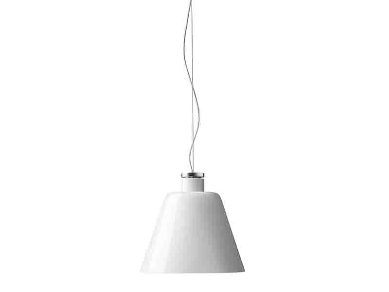
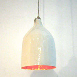
At first glance, it looks like a clean porcelain pendant with the sort of restraint that makes minimalists nod approvingly. Look longer, though, and the details start whispering. The interior glaze throws a soft metallic glow. The bell-like shape feels familiar without being boring. Official descriptions call out the warm ambiance produced by its lustre-coated inner wall, while retailer notes compare its silhouette to mid-century electrical insulators. Put differently, the Buffer Lamp is what happens when industrial memory, domestic comfort, and Dutch imagination all end up at the same dinner party.
What Exactly Is the Buffer Lamp?
The official Studio Wieki Somers page identifies the piece as Buffer lamp, 2002, made of porcelain, gold lustre, and textile cable for client Pols Potten. The studio lists dimensions around 240 mm in diameter with heights of 350 and 450 mm, while Museum Boijmans Van Beuningen records a collection example as porcelain with gold lustre and electrical cable, dating from 2002. In other words, this is not some vague internet design legend floating around Pinterest without papers; it is a documented, collected object with a clear place in contemporary design history.
The lamp is also commonly described in commerce and editorial listings as a white porcelain pendant with either a gold or silver glazed interior. Remodelista’s product notes, drawn from Lekker Home, describe a bell-shaped white porcelain lamp with a hand-applied metallic interior glaze that casts warm ambient light. Pols Potten’s catalog materials likewise identify the Bufferlamp as a porcelain lighting design by Wieki Somers. So while the piece looks poetic, its identity is refreshingly concrete: porcelain shell, lustrous interior, pendant format, and a mood that lands somewhere between sculpture and shelter.
Who Is Wieki Somers, and Why Does That Matter?
Understanding the Buffer Lamp gets easier once you understand Studio Wieki Somers. The studio was established in 2003 by Wieki Somers and Dylan van den Berg, both Design Academy Eindhoven graduates from the late 1990s. On its official biography page, the practice says it focuses on providing “an enlightened reading of the everyday environment,” distinguishing itself through sensitivity to materials, technological ingenuity, and fantasy. That sentence may sound lofty, but it explains the Buffer Lamp perfectly: ordinary object, elevated by material intelligence and just enough magic.
Other sources describe the studio in similar terms. Galerie kreo says the pair earned international recognition by introducing extraordinary fantasy into everyday objects, while Boijmans notes that ordinary things in their hands become stimuli for a more poetic take on daily life. Even when the studio makes practical objects, the work rarely feels merely practical. That is the real point. Somers is not interested in designing a lamp that just hangs there like an obedient little appliance. She is interested in a lamp that changes how a room feels and how you notice the act of living inside it.
Why the Buffer Lamp Still Looks Fresh
The Buffer Lamp still feels relevant because its form is disciplined, but not sterile. The outer shell is calm and almost archetypal. It has the visual clarity of a traditional pendant, but without the clichés that often make “timeless” lighting look suspiciously like hotel-lobby leftovers. Remodelista notes that the shape nods to mid-century electrical insulators, and that comparison matters. Insulators are tools, yes, but they are also beautiful pieces of functional ceramic engineering. The Buffer Lamp borrows that memory and turns it into domestic atmosphere.
Then there is the interior. On the official studio page, Somers explains that the reflecting inner wall generates a warm glow and a “peculiar ambient,” adding that light has the power to make us feel safe and confident. She even describes the lamp as creating “a house inside the house,” inspired by the quality of harbor light at dusk seen from the studio window. That is one of the strongest design ideas behind the piece. The lamp is not simply an object that emits light. It is a small architectural event, a hanging micro-shelter made out of brightness.
That emotional intelligence is a big reason the design has aged so gracefully. Plenty of contemporary lamps are visually loud for about six minutes and then spend the rest of their lives apologizing. The Buffer Lamp avoids that fate because it is expressive without showing off. Its charm is in the contrast: hard porcelain, soft glow; clean outline, rich interior; familiar pendant language, slightly uncanny personality. It is polite enough for modern interiors and weird enough to keep them from becoming bland.
Materials, Shape, and the Quiet Drama of Porcelain
Porcelain is a particularly smart choice here. It gives the lamp a matte, almost chalky calm on the outside, while the metallic glaze on the inside acts like a hidden stage curtain. From some angles, the lamp reads as pure, minimal, and almost monastic. Switch it on, and suddenly it has a pulse. Retail descriptions emphasize that the metallic glaze is hand applied, which helps explain why the light feels less industrial than many metal pendants and less flimsy than paper lanterns. The lamp does not scream for attention; it simmers.
The proportions help too. The studio lists compact, useful dimensions, and multiple sources place the common pendant size around 9.5 inches in diameter and 15 inches in height. That makes the Buffer Lamp large enough to matter, but not so oversized that it starts acting like the room’s needy main character. It can work over a dining table, beside a bed, in an entry sequence, or in a reading corner where softer, lower light is more welcome than raw brightness. In design terms, it has presence. In practical terms, it knows how to share.
There is also a satisfying honesty in the way the lamp handles decoration. The exterior stays restrained, and the surprise is reserved for the inside. That is a classic Somers move: the story is embedded in the object rather than stapled onto it. You do not need elaborate ornament, heroic scale, or twelve awkward brass arms trying to look expensive. You need a clear idea and the confidence to let that idea breathe. The Buffer Lamp has both.
How the Buffer Lamp Fits into Dutch Design
When people talk about Dutch design, they often focus on conceptual wit, material experimentation, and an ability to make everyday objects feel just a little bit smarter than the rest of us. The Buffer Lamp fits squarely into that tradition. Dwell’s overview of Dutch design places Somers among notable designers working from a culture that prizes daring small-scale experimentation, while Metropolis points to Design Academy Eindhoven as a launchpad for key figures of the Dutch design movement, including Somers. The lamp does not just belong to the category of “nice lighting.” It belongs to a broader design conversation about how objects can be useful, poetic, and intellectually playful at the same time.
But what makes Somers stand out within that tradition is her refusal to choose between concept and comfort. Some experimental design can feel like it would rather be admired from a safe distance, preferably by people wearing black turtlenecks and discussing “materiality” in hushed tones. Somers often sidesteps that trap. Her work may be thought-provoking, but it still wants to be lived with. The Buffer Lamp embodies that balance beautifully: it has a strong concept, but it also flatters a room at night, which is a very useful talent for a hanging object made of porcelain.
Where It Works Best in an Interior
Because of its white exterior and contained silhouette, the Buffer Lamp can slip into several interior styles without losing its identity. In a minimal apartment, it reads as a sculptural essential rather than decoration. In a warmer, layered home, the metallic interior helps it converse with wood, linen, plaster, and brass. In more eclectic spaces, it acts as a visual pause between bolder furniture pieces. This is one of its greatest strengths: the lamp does not flatten a room into a style cliché. It adds character while leaving plenty of oxygen around everything else.
Editorial usage supports that flexibility. Remodelista has featured the Buffer Lamp in product roundups and interior stories, including a cabin where a pair of white porcelain Buffer Lamps illuminates the bedroom area. Another Remodelista feature highlighted the design among porcelain lamps with reflective interiors, emphasizing the warm glow created by the silver or gold glaze. These placements matter because they show the lamp doing real-world work in interiors, not just posing heroically in a studio shot like a design-world celebrity who insists on perfect side lighting.
It also works especially well in spaces that need emotional softness more than visual noise. Bedrooms, breakfast nooks, calm dining rooms, and intimate hospitality settings are ideal. The official studio description leans heavily on safety, confidence, and dusk-inspired atmosphere, and those are not random words. They describe what the lamp does best: it turns light into reassurance. In a culture that often treats lighting like a contest to see who can install the most dramatic fixture, that quiet reassurance feels downright luxurious.
Why Museums and Collectors Care
The Buffer Lamp is not important only because it photographs well. It also carries institutional weight. Museum Boijmans Van Beuningen lists the Bufferlamp in its collection, recording the work as a 2002 design distributed by Pols Potten and acquired in 2010. The studio’s own page also notes the piece in the Boijmans collection. Once a design object crosses from retail life into museum holdings, it becomes easier to see it not just as décor, but as a cultural statement about materials, use, and form in its moment.
More broadly, Studio Wieki Somers has strong museum and gallery recognition. MoMA’s artist page lists Somers in exhibitions including Rough Cut: Design Takes a Sharp Edge and Applied Design, and Galerie kreo notes that the studio’s works are represented in major museum collections including MoMA, the Centre Pompidou, Boijmans, and the Victoria and Albert Museum. The Buffer Lamp benefits from that wider reputation. Even if this specific lamp is the gentler, more accessible cousin in Somers’s body of work, it still carries the DNA of a studio taken seriously by top design institutions.
Buffer Lamp by Wieki Somers in Today’s Design Market
One reason the Buffer Lamp remains appealing is that it resists the disposable mood of trend-driven home shopping. It is not trying to be a dopamine-hit purchase. It is not aggressively retro, not hyper-futuristic, not obviously “for now.” Even the price history visible in older editorial listings suggests it has floated through the market as a serious design object rather than a mass-market novelty. That makes it appealing to buyers who want a piece with authorship and staying power instead of another pendant destined to become an awkward resale listing three years later.
There is also something refreshing about its refusal to overcomplicate luxury. No app connection. No color-changing spectacle. No theatrical cluster arrangement that requires a small engineering degree and the patience of a saint. Just porcelain, glaze, cord, light, and mood. In a world crowded with overdesigned objects, the Buffer Lamp’s confidence feels almost radical. It knows exactly what it is, and it does not need to juggle to prove its worth.
A Longer Look: The Experience of Living With the Buffer Lamp
To understand the Buffer Lamp fully, it helps to imagine what it feels like not in a showroom, but in everyday life. Morning arrives, and the lamp is off. In daylight, it looks crisp and self-contained, almost like a ceramic bell suspended in thought. It does not dominate the room, which is one of the nicest things about it. Many “designer lamps” wake up every day determined to be the center of attention. The Buffer Lamp is more mature than that. It is happy to be part of the room’s rhythm, letting natural light do the talking while it waits for its own moment.
Then late afternoon rolls in, and the personality shifts. The sky goes flatter, corners soften, and suddenly this quiet porcelain pendant becomes useful in a deeply emotional way. Switch it on, and the metallic interior begins to glow rather than glare. The light is not merely practical; it feels gathered. That is the best word for it. Gathered light. Light with edges softened by material. Light that does not blast a surface into submission, but coaxes the room into becoming more intimate. You can see why Somers connected the design to the harbor at dusk and to the feeling of safety inside the home. The lamp makes evening feel intentional.
Over a dining table, the Buffer Lamp would likely create the kind of atmosphere that makes simple food seem slightly smarter. A bowl of pasta looks more delicious. Bread looks more noble. Even takeout earns a touch of dignity. In a bedroom, the piece would feel calmer still, particularly if used in a pair. The outer porcelain keeps the object visually clean during the day, while the lustrous inner surface gives nighttime light a sense of warmth that many industrial fixtures never achieve. It is the difference between illumination and hospitality.
There is also an interesting psychological effect to its shape. Because the exterior is closed and quiet, the warm interior reads almost like a secret. You do not experience the lamp all at once. You discover it in layers: outline first, glow second, atmosphere last. That makes it especially satisfying in homes where the owner cares about objects that reveal themselves slowly. The Buffer Lamp does not deliver all its charm in a single glance. It rewards repeat attention, which is another way of saying it ages well in daily life.
In a creative studio or a reading corner, the lamp would likely do something similar. It would frame the zone rather than merely light it. Designers often talk about “zoning” a room, but the Buffer Lamp handles that task without visual aggression. It defines a place by warmth and downward focus. You get the sense that something meaningful can happen beneath it: reading, sketching, talking, lingering, maybe even having one of those suspiciously cinematic late-night conversations where everyone suddenly becomes wiser under the right lighting.
Perhaps that is the design’s greatest achievement. The Buffer Lamp is memorable without being exhausting. It carries authorship without turning into a lecture. It feels collectible without becoming precious. You can admire it as an example of Dutch design intelligence, as a porcelain object, as a museum-recognized piece, or simply as a lovely pendant that makes a room feel better after sunset. The best designs usually manage at least two of those things. The Buffer Lamp manages all four, which is why it still feels relevant more than two decades after its debut.
Conclusion
The Buffer Lamp by Wieki Somers endures because it solves a deceptively hard design problem: how to make a practical household object feel emotionally rich without becoming sentimental or flashy. Its porcelain body keeps the form crisp. Its metallic interior turns light into atmosphere. Its concept is strong, but its usefulness never disappears. That balance places it in the sweet spot where collectible design, everyday comfort, and sculptural clarity all overlap.
If you are drawn to lighting that does more than fill darkness, the Buffer Lamp is still an excellent case study in why good design outlives trends. It reminds us that warmth can be designed, that simplicity can still surprise, and that a lamp does not need to perform gymnastics to be unforgettable. Sometimes a porcelain shell and a golden glow are enough. Honestly, that is more than enough.