Note: This original article is written for web publication as a creative tribute inspired by the documented legacy of Prince, Purple Rain, fan art, painting, music history, and the emotional language of color. It is not affiliated with or endorsed by Prince’s estate.
When a Song Becomes a Color
Some songs live in your ears. Some live in your memory. And then there is Purple Rain, which somehow moved into the paint aisle, rented a permanent corner of the color wheel, and made purple feel like an emotion with excellent stage lighting.
Painting a tribute to Prince is not as simple as grabbing violet paint, turning up the volume, and hoping genius drips from the brush. Believe me, I tried the “just add purple” method first. It looked less like Prince and more like a dramatic eggplant having a spiritual crisis. A real Prince tribute needs rhythm, contrast, mystery, elegance, rebellion, and at least one moment where the canvas seems to ask, “Are you sure you can handle this much fabulousness?”
The title Purple Rain carries more than nostalgia. Prince’s 1984 album and film helped turn him from an already daring musician into a cultural force. The project blended rock, funk, pop, soul, R&B, gospel feeling, and cinematic drama into something that still refuses to sit politely in one category. Prince did not merely cross genres; he strutted across them in heels, leaving sparks on the floor.
That is why a painting inspired by Purple Rain cannot be flat fan art. It has to feel alive. It has to carry the strange glow of a final guitar solo, the tension between heartbreak and celebration, and the royal mischief of an artist who understood that style could be a philosophy.
Why Prince Still Inspires Artists
Prince Rogers Nelson was born in Minneapolis, and that city never really left his sound. He became known as a singer, songwriter, producer, guitarist, keyboardist, performer, bandleader, and creative architect. Listing his talents feels a little unfair to ordinary humans. Most of us are proud when we remember where we parked.
What made Prince extraordinary was not just technical ability. It was control. He built entire sonic worlds and then dressed them in lace, leather, silk, smoke, and electric confidence. His music could be sensual, spiritual, playful, furious, delicate, and explosivesometimes before the chorus arrived. That range makes him irresistible to visual artists. A Prince portrait is never only a portrait. It becomes a study in motion, sound, identity, and attitude.
For painters, Purple Rain is especially rich territory. The era gave us iconic silhouettes, smoky stage lights, the famous motorcycle image, ruffled shirts, sharp jackets, and that unforgettable emotional mixture of glamour and ache. Purple itself became part of Prince’s visual language so deeply that Pantone later created a custom shade, Love Symbol #2, in honor of him. When a musician gets a color, you know the branding department of the universe has surrendered.
The Cultural Power of Purple Rain
Released in 1984, Purple Rain was both a soundtrack album and the musical heart of the film of the same name. It produced major hits, won prestigious awards, and helped make Prince one of the defining artists of the 1980s. The album’s success was not a polite ripple; it was a purple tidal wave with eyeliner.
The film Purple Rain was later selected for the National Film Registry, while the soundtrack was recognized by the Library of Congress National Recording Registry. Those honors matter because they show that Purple Rain is not just a fan favorite. It is part of American cultural memory. It captured a moment when music videos, cinema, fashion, live performance, and pop mythology were blending into a new kind of superstar language.
The title track itself has the scale of a hymn and the drama of a storm rolling over a city at night. It does not rush. It blooms. That patience influenced how I approached the painting. Instead of making the composition loud immediately, I wanted the image to rise slowlydark background first, then violet atmosphere, then highlights like stage lights cutting through fog.
Planning the Tribute Painting
Choosing the Mood Before the Image
Before sketching, I asked one question: What should this painting feel like? Not what should it copy, not which exact photo should it imitate, but what emotional weather should it create? A Prince tribute has to respect the myth without turning into a museum label. It should feel intimate and electric at the same time.
I decided the mood would be “after the encore.” Not the loudest part of the concert, not the flashiest pose, but that suspended second after the last note rings out and the audience realizes they have witnessed something rare. That mood gave the painting its foundation: deep purples, soft blacks, glowing magenta edges, and a little silver-white light around the figure.
Building the Color Palette
Purple was the obvious star, but purple alone can become heavy. To keep the piece alive, I mixed violet with blue-black shadows, wine-red undertones, lavender haze, and small golden accents. Gold matters in a Prince tribute because purple suggests mystery, while gold suggests royalty. Together, they whisper, “Yes, this jacket costs more than your sofa.”
I avoided making the background too clean. Prince’s music had polish, but it also had heat. So I added textured brushworkthin streaks, cloudy washes, and rougher dry-brush marksto make the air around the subject feel like sound vibrating. The goal was not realism alone. It was atmosphere.
Capturing the Silhouette
Prince’s silhouette is one of the most recognizable in popular music: slim, poised, sharp, theatrical. A strong tribute painting can suggest him even before the facial details appear. I focused on posture first. The angle of the head, the curve of the shoulder, and the placement of the guitar-like shape mattered more than tiny details at the beginning.
That was a helpful reminder for any artist: start with the energy. Details are decoration if the energy is wrong. You can paint the perfect ruffled shirt, but if the pose has no rhythm, it will look like laundry with ambition.
Painting Prince Without Flattening the Legend
The challenge with painting an icon is avoiding the postcard effect. A famous face can easily become stiff because the artist is afraid to take risks. But Prince’s entire career was proof that playing safe is not exactly where the magic lives.
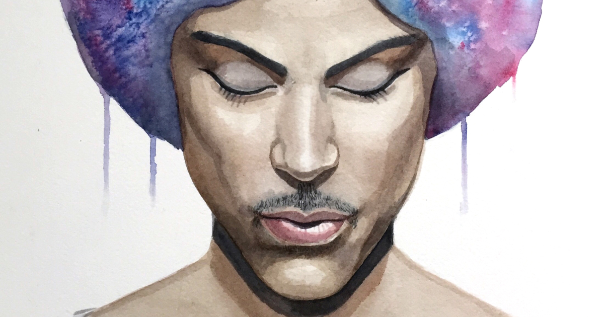
So I let some areas stay loose. The background remained abstract. Some highlights were exaggerated. The purple glow was more emotional than realistic. I wanted the painting to feel like memory: vivid in certain places, blurred in others, glowing at the edges.
I also kept the facial expression understated. Prince could project more with one glance than many performers could with a fireworks budget. Instead of painting a huge dramatic expression, I leaned into calm intensity. The result felt more powerful. It suggested someone listening to a sound only he could hearand possibly judging my brush technique from another dimension.
What Purple Rain Teaches About Art
Purple Rain endures because it combines opposites. It is personal but theatrical, polished but raw, romantic but wounded, spiritual but sensual, mainstream but gloriously strange. That combination is a lesson for painters, writers, musicians, designers, and anyone trying to make work that lasts.
Good tribute art should not merely say, “I like this person.” It should say, “This person changed the way I see.” Prince changed how people heard genre, how they understood stage presence, and how they thought about artistic independence. For visual artists, he also changed how a single color could become an identity.
That is why this painting became less about copying a celebrity and more about honoring a creative principle: be unmistakable. Prince was unmistakable in sound, fashion, performance, and attitude. A tribute to him should aim for that same clarity. Not imitation, but boldness.
The Details That Made the Painting Work
Light Like a Stage Cue
The lighting became the emotional engine of the piece. I used a strong violet glow from one side and a softer pale highlight from above. This created a stage-like effect, as if the subject had just stepped into the beam before the first note. The contrast helped the figure emerge from darkness without losing mystery.
Texture Like Music
I treated the brushstrokes like rhythm. Smooth areas created calm, while rougher strokes suggested guitar distortion and applause. Around the edges, I allowed paint to blur and streak downward, a small nod to rain without turning the canvas into a weather report. Nobody needs a Prince tribute that looks like the forecast for Minneapolis at 9 p.m.
Symbols Without Overcrowding
It was tempting to include every Prince-related symbol: the guitar, the motorcycle, the flowers, the stage, the lights, the famous colors, the royal flourishes. But too many references can turn a painting into a trivia contest. I chose restraint. Purple atmosphere, elegant posture, luminous highlights, and a feeling of performance did more than a crowded collage would have done.
Why Fan Art Matters
Fan art sometimes gets dismissed as simple admiration, but at its best, it is cultural conversation. It shows how art continues to live inside people after the original performance ends. A musician writes a song. A listener hears it during heartbreak, joy, grief, or late-night creative panic. Years later, that listener paints, writes, dances, or designs something in response. That is not copying. That is resonance.
Prince understood transformation. He transformed funk, rock, pop, and soul into something distinctively his. He transformed stagewear into armor. He transformed mystery into marketing before everyone had a ring light and a personal brand strategy. A tribute painting participates in that chain of transformation by turning sound into image.
My Experience Painting the Prince Tribute
Painting this tribute was more emotional than I expected. At first, I treated it like a technical project: choose the palette, sketch the figure, block in shadows, add highlights, refine the details. Sensible. Organized. Very adult. Then I played Purple Rain while working, and suddenly the painting stopped feeling like a project and started feeling like a conversation.
The first layer was dark, almost too dark. I covered the canvas with deep blue-black and violet tones, leaving only a faint shape where the figure would appear. It looked like a storm before the lightning. That stage was uncomfortable because nothing looked impressive yet. Every painting has an awkward teenage phase, and this one was wearing too much black eyeliner and refusing to make eye contact.
Then came the purple washes. I layered transparent violet over the shadows, letting some areas remain uneven. That unevenness became important. It created movement, almost like stage smoke. When I added magenta near the edges, the whole piece began to warm up. It no longer felt like a dark portrait. It felt like music entering the room.
The most difficult part was the face. With an icon like Prince, even a slight mistake changes the mood. Too much detail made the image stiff. Too little made it vague. I had to step away several times, which is artist language for standing across the room and staring dramatically while pretending this counts as problem-solving. Strangely, it does. Distance helped me see which features mattered most: the eyes, the line of the nose, the controlled expression, and the sense of inward focus.
One of my favorite moments came when I added a thin highlight along the shoulder and hair. It was a small stroke, but it changed everything. Suddenly the figure separated from the background. The painting had presence. It felt like the lights had come up. That is the addictive part of painting: hours of uncertainty, followed by one tiny mark that makes you forgive the entire process.
I also learned that purple is trickier than it looks. Too much red, and the mood becomes heavy. Too much blue, and it turns cold. Too much white, and suddenly the painting looks like a lavender cupcake attending a memorial concert. The balance had to be rich, moody, and luminous. I mixed several purples rather than relying on one tube, because Prince deserves better than “generic craft-store grape.”
By the end, the painting felt less like a portrait and more like a tribute to creative courage. Prince’s work reminds artists to be specific, fearless, and a little unreasonable in the best possible way. He built a world around his sound. He made mystery feel modern. He proved that a color, a chord, a look, and a performance could merge into one unforgettable identity.
When I finally signed the painting, I did not feel finished in the usual sense. I felt grateful. Grateful for the music, for the color, for the strange pressure that comes with honoring someone brilliant, and for the reminder that art does not have to explain itself politely. Sometimes it can simply glow purple, turn up the volume, and dare the room to keep up.
Conclusion: Let the Purple Speak
Purple Rain: I Painted A Tribute To Prince is more than a story about making a painting. It is a reminder that great art keeps generating new art. Prince’s legacy lives in records, films, performances, archives, museums, fashion, color, and countless fan-made tributes created by people who still feel that electric pull.
A painted tribute cannot capture everything Prince was. No single canvas can hold that much music, style, rebellion, humor, sensuality, spirituality, and guitar sorcery. But it can capture a feeling. It can honor the atmosphere of Purple Rain: the glow after the storm, the elegance inside the ache, and the confidence of an artist who made purple sound like destiny.
And if the painting makes someone pause, smile, remember the song, or feel inspired to create something bold of their own, then the tribute has done its job. The rain keeps falling. The color keeps shining. The music, somehow, is still in the room.