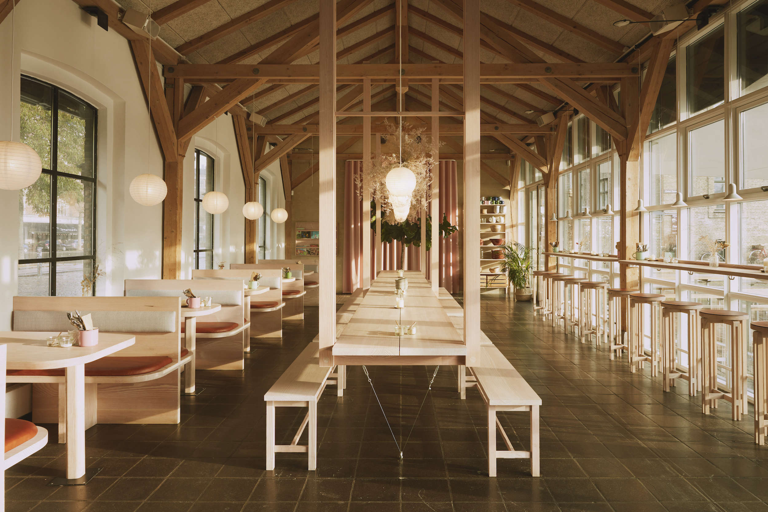
Some restaurant interiors try so hard to impress you that they practically demand applause before the appetizers arrive. Hverdagen in Copenhagen takes the opposite route. Designed by Danish studio Vermland, the space feels warm, useful, and quietly clever rather than dressed up for a design-magazine audition. Its ingredients are simple: pale timber, a restrained color story, humble textiles, soft paper lighting, and a large communal table that turns dinner into an event without making anyone wear a name tag.
Located near Copenhagen’s Kødbyen district, Hverdagen was conceived as a restaurant for everyday social dining. Vermland, founded by cabinet maker Joakim Tolf Vulpius and architect Anton Bak, designed the interior around furniture made from a single Douglas fir tree and joinery inspired by Japanese craftsmanship. The result is a lesson in Scandinavian restaurant design that feels neither cold nor overly precious.
The good news is that you do not need a Copenhagen lease, a woodworking studio, or an alarming number of Danish vowels to borrow the best parts of the look. These eight Danish light ideas can bring warmth, rhythm, and a little restaurant-level charm into a dining room, kitchen, apartment, café, or backyard gathering space.
Why This Copenhagen Restaurant Design Feels So Inviting
At first glance, Hverdagen looks minimal. Look again, and it is full of small decisions working together. The wood has visual warmth. The colors are limited but cheerful. The lighting is soft rather than theatrical. Textiles keep the room from becoming too hard or echoey. Even the shelves do double duty by storing ingredients and adding color.
That is the central Danish design lesson: simplicity is not the same as emptiness. A room can be edited without feeling sterile. In fact, the best Scandinavian interiors often create comfort by choosing fewer elements and making each one useful, tactile, and memorable. Think less “museum lobby” and more “a very organized friend who somehow always has great soup.”
1. Let One Communal Table Organize the Entire Room
The boldest move at Hverdagen is also the most social: a long table becomes the visual and functional center of the dining room. Vermland suspended the table from the ceiling structure through custom wood joinery, allowing it to divide the room into smaller zones while remaining a place for shared meals. Reports on the project describe it as a seven-meter communal table with seating for large groups.
At home, the lesson is not “please suspend your dining table from the ceiling this weekend.” Unless a licensed structural engineer is involved, that is how a cozy dinner becomes a dramatic insurance claim. The real takeaway is to give one generous table a clear role as the room’s anchor.
How to Borrow the Idea Safely
Choose a long wood table, a vintage farm table, or even two matching rectangular tables pushed together. Position it so circulation happens around it, not through it. Add a bench on one side if you want a more communal, flexible feeling. A large table works especially well in open-plan homes because it creates a sense of destination without requiring another wall.
The best dining rooms make people linger. A table that comfortably holds platters, candles, elbows, and at least one person explaining sourdough fermentation is more useful than a tiny table that looks good only in photographs.
2. Keep the Color Palette Tight but Not Timid
Hverdagen’s interior uses pale wood as the main backdrop, then layers in terra-cotta, dusty pink, and minty green through seating, ceramics, tableware, tiles, and small accessories. The colors are not fighting for attention; they are more like a well-rehearsed jazz trio. Each has a job, and nobody is playing the triangle too loudly.
A tight color palette is one of the easiest ways to make a room feel intentional. It does not mean every item must match exactly. In fact, exact matching can make a space feel staged. Instead, pick a neutral foundation, one warm accent color, and one cool balancing color.
A Simple Copenhagen-Inspired Formula
Start with light oak, Douglas fir, maple, warm white, beige, or soft gray. Add one earthy color such as rust, cinnamon, clay pink, or muted burgundy. Then introduce a fresher contrast like sage, sea glass, pale blue, or mint. Repeat each accent at least twice in small ways: a cushion and a vase, a mug and a curtain tieback, a bowl and a chair seat.
This approach gives a room personality without turning it into a paint-swatch convention. The goal is visual rhythm, not a rainbow trying to win a talent show.
3. Use a Curtain as a Soft Architectural Feature
One of Hverdagen’s most charming details is a pink curtain that conceals the restroom door. Rather than treating a necessary door as an interruption, the designers turned it into a soft, colorful moment.
This is a brilliant idea for homes because curtains can solve awkward layout problems without expensive construction. They soften hard lines, add texture, improve acoustics, and can visually hide storage, laundry areas, closets, utility doors, or a less-than-glamorous corner that currently houses a vacuum cleaner and three bags of questionable cables.
Where Curtains Work Best
Use a ceiling-mounted curtain track to hide a pantry entrance, cover open shelving, divide a studio apartment, or create a soft backdrop behind a dining table. Choose linen, cotton, wool blend, or another textured fabric instead of something shiny and overly formal. A single solid color often works better than a busy print when the curtain is being used as a wall-like element.
Design publications continue to highlight drapery as a flexible room divider because it can create separation while keeping a space visually lighter than a permanent partition.
4. Choose One Main Wood Species and Let It Tell a Story
Hverdagen’s furniture was made from one Douglas fir tree, transformed into tables, seating, shelving, and other custom pieces. The project used the material consistently, pairing it with Japanese-inspired joinery and the existing timber structure of the building.
Most homes will not source an entire tree for one room, and that is perfectly fine. The principle matters more than the lumberjack backstory. Repeating a primary wood tone creates visual continuity, especially in spaces with several furniture pieces.
Make Material Consistency Feel Natural
Pick one dominant wood family: light oak, maple, ash, walnut, or Douglas fir. Let it appear in two or three major places, such as the dining table, shelf brackets, picture frames, stools, or cabinet pulls. Then add contrast through texture rather than introducing five competing wood finishes.
A room with one consistent wood tone feels calmer because the eye understands the material language. It also makes inexpensive pieces look more connected. A simple pine bench can suddenly feel intentional when it echoes the tone of nearby shelves or a wood-framed mirror.
Consistency does not require perfection. Small shifts in grain, knots, and finish make natural wood more interesting. The point is not to make your home look like a showroom; it is to make it feel like one thoughtful story.
5. Add Texture with Dried Branches Instead of More Stuff
Above Hverdagen’s banquettes, dried branches create a cloud-like layer of texture. They are sculptural, inexpensive-looking in the best possible way, and far more memorable than another generic framed print.
Dried branches work because they introduce organic irregularity. In a room full of straight lines, square tables, and smooth surfaces, a branch brings movement and shadow. It looks alive without requiring watering, repotting, motivational speeches, or an app that reminds you that you have neglected your fern again.
Use Natural Elements with Restraint
Place a few tall branches in a substantial ceramic vase, hang a lightweight dried arrangement over a table, or create a simple seasonal display on an open shelf. Better Homes & Gardens notes that foraged branches and leaves can be affordable, natural decorating materials when properly prepared and displayed.
Choose branches with an interesting silhouette rather than trying to create a miniature forest. One well-placed arrangement can make a room feel layered. Twelve arrangements can make it feel like your dining room was gently reclaimed by a woodland creature.
6. Use a Tiny Check Pattern for Everyday Warmth
At Hverdagen, the booth backs use a checkered textile that references the humble kitchen towel. Leather seat cushions add durability, while the soft checked fabric keeps the room from feeling overly sleek.
This is a wonderfully practical styling trick: use one small, familiar pattern to make a minimalist room feel less serious. A subtle check can bring in nostalgia, softness, and a hint of casual kitchen energy without launching the whole space into farmhouse cosplay.
Easy Ways to Add a Check Pattern
Try checked seat cushions, a bench pillow, cloth napkins, café curtains, a table runner, or one upholstered dining chair. Keep the color contrast low for a refined look: cream and soft gray, pale green and ivory, rust and beige, or navy and flax. Small-scale checks are usually calmer than oversized black-and-white grids.
Checked patterns are versatile in interiors because they can sit comfortably alongside wood, linen, leather, and plain upholstery. The trick is to use the pattern as seasoning, not the entire meal.
7. Hang Paper Lanterns for Soft, Democratic Light
Paper lanterns float above Hverdagen’s dining area, adding brightness without visual heaviness. Their simple round forms soften the timber structure and make the room feel buoyant rather than overly rustic.
Paper lanterns are one of the most affordable ways to make a dining area feel immediately warmer. Unlike a complicated chandelier, they do not demand center-stage attention. They gently diffuse light, soften ceilings, and work beautifully with wood, painted walls, and natural textiles.
Get the Lighting Balance Right
Hang one large lantern above a small dining table, or cluster two to three lanterns over a longer table at varying heights. Use warm bulbs and a dimmer whenever possible. The lantern should illuminate faces and food without making guests feel like they are being interrogated about where they were on the night of the missing tiramisu.
Restaurant interiors often use layered, warm lighting to define tables and create contrast while keeping the overall room comfortable.
8. Turn Useful Ingredients into Everyday Decor
Behind Hverdagen’s bar, shelves hold bundles of chilies, garlic, herbs, and ingredients used in the restaurant’s food. The display feels natural because it is not pretending to be décor. It is storage that happens to look great.
This is one of the smartest kitchen design ideas to borrow because it celebrates objects you actually use. Instead of filling open shelves with decorative bowls that have never met a soup, display the ingredients, cookware, and ceramics that belong in the room.
Make Open Storage Look Intentional
Use matching glass jars for dry goods, group oils and vinegars on a small tray, hang garlic in a cool dry spot, display a few cookbooks, and keep your best-looking mugs within reach. Limit the display to items that are practical, frequently used, or genuinely beautiful.
The key is editing. Open shelves are not a witness-protection program for random clutter. A few repeated containers and a calm color story will make even a modest kitchen feel more collected and useful.
How to Combine These Danish Light Ideas at Home
You do not need all eight ideas in one room. In fact, using every suggestion at maximum volume could make your dining room feel like it is auditioning for a Scandinavian design theme park. Pick three or four elements and let them work together.
For a small apartment dining nook, try a light wood table, one paper lantern, a checked cushion, and a vase of dried branches. For a larger kitchen, add open shelves with useful ingredients, a curtain over a pantry door, and clay-colored ceramics. For a restaurant or café, build the layout around a communal table, repeat one material family, and use soft lighting to make guests feel welcome at different times of day.
The broader lesson from Hverdagen is that hospitality comes from thoughtfulness. A room feels generous when it supports real life: people arriving with bags, chairs being pulled out, shared dishes landing on the table, jackets needing a place to go, and someone inevitably asking whether there is more bread.
The Experience of Danish Light: What This Style Feels Like in Real Life
Imagine walking into a dining room late in the afternoon. The daylight is fading, but the room does not suddenly become gloomy. A paper lantern begins to glow above the table. The wood surface catches a soft amber tone. A muted green glass, a clay-colored bowl, and a pale checked cushion begin to stand out without shouting for attention.
That is the experience behind Danish light. It is not simply a lighting trend or a shopping list of Scandinavian furniture. It is the feeling of a room becoming more welcoming as the day gets darker. Instead of trying to overpower the evening with bright overhead fixtures, the space changes gradually. The lighting gets warmer, the materials look richer, and the room becomes a place where people naturally slow down.
A communal table plays a major role in that feeling. A long table invites people to sit side by side, pass plates, move around, and stay longer than planned. It changes the social script. A formal dining table can make dinner feel like an appointment. A generous shared table makes it feel like an occasion, even when the menu is roasted vegetables, a simple pasta, and a dessert that came from a box but was transferred to a nice bowl.
The material choices matter because people interact with them constantly. Wood is touched. Linen wrinkles. Leather softens. Ceramic mugs hold warmth. Dried branches cast shadows that change throughout the day. These small sensory details make a room feel lived in rather than merely styled. The best interiors do not force you to admire them from a distance. They reward you for using them.
This is also why the restrained color palette works so well. When a room uses only a few related shades, your attention moves toward texture, light, and conversation. A rust-colored napkin does not compete with a minty green glass; it makes the glass feel more alive. A pink curtain does not need to be dramatic because the surrounding materials are calm enough to let it have its moment.
In practical terms, Danish light is forgiving. A slightly imperfect bowl fits in. A branch can lean at an odd angle. A wooden tabletop can collect scratches and still look better with age. This is not a style that demands perfection. It asks for care, usefulness, and a willingness to leave a little room for ordinary life.
That may be the most valuable lesson from Hverdagen. The goal is not to recreate a Copenhagen restaurant exactly. The goal is to design a space where people want to stay for one more drink, one more story, one more slice of cake, and perhaps one more attempt to solve the world’s problems before doing the dishes.
Conclusion: The Warmth Is in the Details
Hverdagen proves that Scandinavian restaurant interiors do not need expensive drama to feel special. A well-placed table, a limited palette, thoughtful woodwork, soft lantern lighting, useful shelves, and a few tactile details can create a setting that feels personal and generous.
Borrow the ideas that fit your home, not every detail at once. Start with one communal surface, one natural material, and one lighting upgrade. Then add color, texture, and storage with restraint. Danish light is not about copying a look. It is about making everyday moments feel a little more considered, a little warmer, and much more inviting.
Note: The suspended table at Hverdagen was a custom architectural feature integrated with the building structure. For home projects, use freestanding furniture or consult qualified structural and design professionals before attempting any ceiling-supported installation.