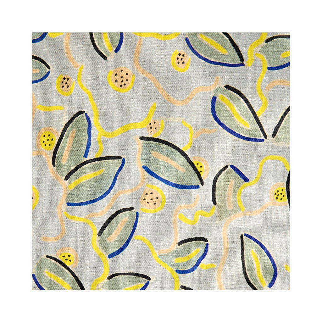
Some floral fabrics whisper politely from the corner. Rebecca’s Garden Linen enters carrying a sketchbook, a vase of unruly flowers, and enough confidence to rearrange the furniture. Designed by artist Wayne Pate in collaboration with Studio Four NYC, this decorative textile combines painterly movement, natural linen texture, and a botanical motif that feels expressive without becoming overly sweet.
That balance is its main attraction. Rebecca’s Garden can soften a tailored room, wake up a neutral interior, or give traditional furniture a contemporary pulse. It is also a premium, print-to-order fabric with a generous repeat and natural variation, so it deserves more planning than a casual one-yard impulse purchase. This guide covers the design, colorways, applications, styling ideas, ordering details, and care considerations that matter before fabrication begins.
What Is Rebecca’s Garden Linen?
An Artist-Led Floral
Rebecca’s Garden is part of the long-running collaboration between Wayne Pate and Studio Four NYC. The studio translates motifs from Pate’s paintings, line drawings, and collages into fabrics and wallpapers while trying to preserve the hand of the artist. The result does not look mechanically perfect or digitally sterile. Loose lines, soft brushwork, and irregular botanical forms give it the feeling of a drawing that has wandered onto linen.
Studio Four describes the pattern as an allover floral made from “languid lines and soft brushstrokes,” and calls it playful yet sophisticated. From across a room, the flowers can read almost like abstract marks. Up close, the slubby linen ground becomes part of the artwork, adding depth and movement even in quieter areas of the print.
Key Product Details
| Content | 100% linen |
|---|---|
| Width | Approximately 54 inches |
| Vertical repeat | Approximately 14.5 inches |
| Horizontal repeat | Approximately 26.7 inches |
| Ordering | Sold by the linear yard |
| Typical minimum | Five yards on the trade listing |
| Typical lead time | Four to six weeks |
Current Studio Four pages identify the textile as 100% linen printed in the United States. Some listings describe the base cloth as Irish linen, while another identifies Belgian linen, so buyers should confirm the specification attached to the current memo sample. Width, repeat, minimum order, and lead time are consistent across the primary product and showroom pages.
Why Rebecca’s Garden Feels Modern
It Sits Between Floral and Abstract
Classic florals often arrive with strong historical associations: polished chintz, tiny cottage roses, formal bouquets, or detailed botanical scenes. Rebecca’s Garden avoids being locked into one category. Its flowers are enlarged, simplified, and loosely drawn. The pattern adds softness, but its graphic scale also works with clean-lined furniture, sculptural lighting, and modern art.
This makes it useful in rooms where a traditional flower print would feel too nostalgic and a rigid geometric would feel too severe. Recent interior-design coverage has highlighted patterned upholstery, expressive florals, and linen grounds because they add personality and a sense of age without making a room feel stuffy.
The Linen Ground Keeps It Relaxed
Linen contributes subtle slubs, tonal variation, and a dry, tactile finish that prevents the print from looking glossy or overproduced. Made from flax, linen is widely used for home textiles because it is strong, breathable, absorbent, and quick drying. It also wrinkles more readily than highly elastic synthetic fabrics, which is either a drawback or a charming personality trait depending on your relationship with steamers.
On curtains, the cloth can form relaxed folds. On pillows, it provides an informal, touchable surface. On tailored furniture, it can soften hard edges. Slight differences in texture and dye lot are expected, so the finished textile should be appreciated as an artisanal material rather than judged like a perfectly uniform poster.
Rebecca’s Garden Colorways
Studio Four and showroom listings have presented the design in colorways including Citron, Camelia, Sky, Pumice, and Spring. Availability can change, but each version gives the same drawing a different mood.
Citron and Spring
Citron is energetic and works especially well in breakfast rooms, sunrooms, creative offices, and guest spaces. Pair it with warm white, olive, tobacco brown, rattan, or a measured touch of cobalt. Spring has a similarly garden-forward spirit but can feel softer when surrounded by faded woods and chalky solids.
Sky
Sky suits airy bedrooms and living rooms. It works with indigo, faded denim, pale oak, creamy white, and muted red. In coastal interiors, it offers a relaxed mood without requiring seashells, rope knots, or a wooden sign announcing that the beach exists.
Pumice and Camelia
Pumice appeals to neutral lovers who want movement without visual shouting. Combine it with stone, putty, cream, walnut, blackened metal, boucle, and woven wool. Camelia can support warm pinks and botanical greens, but darker anchors such as espresso wood or charcoal keep the room polished rather than precious.
Best Ways to Use Rebecca’s Garden Linen
Full-Length Drapery
Drapery gives the large-scale pattern room to breathe. Tall panels allow the floral marks to travel naturally instead of being chopped into tiny fragments. Because the horizontal repeat is substantial, a professional workroom should calculate fullness, matching, motif placement, hems, returns, lining, and possible waste.
Patterned curtains can also act as a room’s main artwork. Keep nearby walls calm and repeat one fabric color in a rug border, painted cabinet, or small accessory. Closed at night, the panels create a soft mural effect; open during the day, they frame the outdoor view like a second, better-behaved garden.
Pillows and Bolsters
Pillows are the easiest low-risk application. A pair of 20-inch cushions can transform a plain sofa, while a long lumbar pillow introduces the print to a bed without starting a pillow convention. Studio Four has offered double-sided Rebecca’s Garden pillows in 100% linen, confirming that the motif translates effectively at this scale.
Headboards and Bed Details
An upholstered headboard gives the repeat a broad surface and creates a clear focal point. Curved or scalloped outlines echo the loose drawing; a crisp rectangle creates sharper contrast. Keep the coverlet mostly solid and introduce one small stripe or check elsewhere so the room feels layered rather than overly matched.
Accent Chairs, Benches, and Ottomans
Rebecca’s Garden can give a compact chair or bench serious presence, but performance should be confirmed before ordering. The published details do not prominently list an abrasion rating. Ask Studio Four, the showroom, or the fabricator whether the cloth suits the expected use. A decorative bedroom chair has a much easier job than a family-room seat occupied nightly by children, pets, popcorn, and someone who believes coasters are optional.
Smaller Decorative Projects
When budget or yardage is limited, consider a lampshade, framed textile panel, table skirt, cabinet curtain, window seat, or dining-chair backs. Small applications still reveal the hand-drawn quality and are easier to relocate if the room later changes.
How to Mix Rebecca’s Garden With Other Patterns
Successful pattern mixing needs one leader and a supporting cast. Rebecca’s Garden is usually the hero because of its scale and movement. Pair it with designs that differ in structure and size rather than adding another equally loose, equally large floral.
- Add a stripe: Ticking, awning stripes, or hand-drawn lines give the floral a visual framework.
- Use a small check: Gingham or a tiny windowpane adds order without competing.
- Include solids: Pull one or two colors from the print for upholstery, trim, paint, or bedding.
- Vary the scale: Combine the large floral with one medium pattern and one very small pattern.
- Limit the palette: Repeating about three dominant colors keeps an eclectic room coherent.
Interior designers often recommend selecting a hero print, varying scale, and maintaining a shared color thread. Florals and stripes are especially dependable partners because organic curves and linear rhythm balance one another.
Ordering and Measuring Tips
Start With a Memo Sample
Screen color is not fabric color. View the sample in morning, afternoon, and artificial light. Hold it vertically for curtains and horizontally for upholstery. Examine it up close and from across the room, because the ground color, texture, and contrast can shift dramatically with distance.
Calculate the Repeat Before Buying
A 26.7-inch horizontal repeat affects matching across multiple widths, cushions, and furniture panels. Matching creates waste, and large repeats generally require extra yardage. Give the exact specification to the workroom instead of relying on a generic calculator.
Order Enough From One Dye Lot
The manufacturer notes that dye-lot and texture variation should be expected. Purchase the full quantity at once whenever possible, including a reasonable reserve for future repair. A later replacement may be close, but “close” becomes remarkably obvious when two curtain panels meet in direct sunlight.
Use an Experienced Fabricator
A professional can plan seam matching, motif placement, lining, interlining, and reinforcement. That matters on pairs of chairs, symmetrical headboards, multiple windows, and any project where a flower landing in an unfortunate location would become impossible to unsee.
Care and Maintenance
Follow the care instructions supplied with the current fabric and finished product. Printed designer linen may require spot treatment or professional dry cleaning even though some plain linen garments are washable. Never assume that advice for a summer shirt applies to lined drapery or upholstery.
For routine care, gently vacuum curtains and furniture with a clean attachment, remove dust before it works into the fibers, and blot spills instead of rubbing them. Test any method in a hidden area. Avoid high heat, bleach, soaking, and enthusiastic homemade chemistry unless the manufacturer or a professional cleaner approves it. Household-fabric guidance consistently emphasizes regular dust removal and compliance with care labels.
Protect the fabric from intense, prolonged sunlight where practical. Curtain lining, cushion rotation, and a secondary shade during the brightest hours can help reduce uneven fading. Natural linen will relax and crease with use; that casual character is part of the appeal, not proof that the fabric has stopped trying.
Is Rebecca’s Garden Linen Worth It?
Rebecca’s Garden is a strong choice for interiors that need artistic movement, natural texture, and a memorable focal point. Its drawing is distinctive enough to define a space but flexible enough to work with antiques, midcentury furniture, relaxed coastal pieces, and clean contemporary forms.
The trade-offs are clear. Premium printed linen requires careful measuring, realistic expectations about variation, thoughtful cleaning, and often professional fabrication. It may not suit buyers seeking machine-washable slipcovers, commercial-grade performance, or a perfectly uniform surface.
Buyer Checklist
- Confirm the current colorway, fiber origin, width, repeat, minimum order, and lead time.
- Review a memo sample in the actual room.
- Ask whether the fabric suits the intended upholstery use.
- Have a workroom calculate yardage and pattern-matching allowances.
- Approve care instructions before fabrication.
- Order the full quantity, plus reserve, in one purchase when possible.
A 500-Word Experience With Rebecca’s Garden Linen
The following design diary is an illustrative composite based on common residential decorating decisions, not a claim of personal ownership. Imagine a small reading room with warm white walls, an old walnut desk, a plain oatmeal loveseat, and one east-facing window. The space is pleasant but has the personality of a very competent waiting area. Nothing is wrong; nothing is memorable. Rebecca’s Garden enters the plan as a pair of full-length curtains.
The first surprise comes from the sample. On a screen, the pattern appears mainly graphic. In the room, the linen ground becomes equally important. Morning light catches the slubs and makes the surface look softer and more dimensional. The floral marks do not read as a literal bouquet from the doorway. Instead, they create a loose rhythm of curves and open areas. That difference reduces the fear that patterned curtains will overwhelm a compact space.
The second lesson is that color cannot be chosen in isolation. The first colorway looks perfect beside the wall paint but slightly flat next to the existing rug. A second option contains a quieter background and one accent color that connects to the rug’s faded border. It is less exciting in the hand and far better in the whole room. This is the mildly annoying truth of decorating: the prettiest individual item is not always the best teammate.
Once installed, the curtains alter the architecture more than expected. Hung close to the ceiling and extending beyond the window frame, they make the opening look taller and wider. Matching the repeat gives the two panels a balanced rhythm, while the folds break up the motif enough to keep it relaxed. Closing them at night turns a formerly blank wall into a soft, mural-like surface.
The next decision is what not to add. Matching pillows seem obvious, but they make the loveseat and window look like a coordinated set. Instead, the sofa receives one striped lumbar pillow and one solid cushion in a color pulled from the floral. A ceramic lamp repeats another tone. The room now feels connected without behaving as though every object attended the same uniform fitting.
Living with the fabric also changes practical habits. The panels are vacuumed gently during regular cleaning, and drinks stay on the opposite side of the room. Strong morning sun leads to using a woven shade behind the drapery during the brightest summer hours. These are small adjustments, but they reinforce an important point: a premium textile is easiest to enjoy when maintenance is planned rather than improvised after the first accident.
After several weeks, the most satisfying quality is not merely the floral drawing. It is how the linen makes the room feel less finished in the showroom sense and more finished in the human sense. Slight irregularities, soft folds, and hand-drawn marks allow vintage wood, books, and ordinary objects to coexist naturally. The room gains energy without losing calm. It looks designed, but it does not look afraid of being lived in.
The experience also proves that one major application can be enough. Matching wallpaper, a second floral chair, and a botanical rug are unnecessary. Rebecca’s Garden works best when it establishes a point of view and lets quieter materials respond. The goal is not a room built entirely around one famous fabric. It is a room where the fabric helps everything else make more sense.
Conclusion
Rebecca’s Garden Linen shows what can happen when an artist’s loose botanical drawing meets the tactile character of natural linen. Depending on the colorway and application, it can feel playful, tailored, quiet, or exuberant. Drapery, pillows, headboards, accent seating, and smaller projects can all showcase the motif when repeat, placement, performance, and cleaning are considered before fabrication.
The smartest approach is simple: sample first, choose the application carefully, let Rebecca’s Garden serve as the hero, and surround it with solids, stripes, natural materials, and breathing room. A great floral should enliven a homenot make visitors wonder whether the sofa is photosynthesizing.
Note: Product specifications, colorways, pricing, and availability may change. Confirm the current memo sample, care instructions, performance suitability, and order details with Studio Four NYC or an authorized showroom before purchasing.